November 24, 2003
World Trade Center Memorial
So here I was, sitting on the plane on our way to LA to see family... and I'm reading about the World Trade Center Memorial Competition Finalists in the NYTimes.
(NYTimes, Thursday, November 20, 2003, A28-29)
I got a little nostalgic for the old architectural crits. I love the whole drama of an architectural presentation, it's a beautiful thing. Reading the series of articles recalled this pleasure for me.
Two issues stood out: Herbert Muschamp had it right, all of the designs were cluttered, frenetic with frou frous and gee gaws. There's a kind of anxiety that induces a nervous chatter in the designs. There are profound whispers in this site. Quiet down people, and we might hear them.
Secondly, everyone acknowledges that the original footprints of the site are sacred. It's kind of like the Pearl Harbour Memorial, few or no designs can substitute for an artifact so charged with the gravitas of history. There was talk about going down to touch bedrock, but I didn't see it in any design.
So... guess what?
I've got this here new fangled drawing program in my laptop.... why not fiddle around to see if I can design the WTC Memorial myself? As we flew enroute to LA, seat 9e on American Airlines, I started drawing, then again the next night as the family conversation settled down, for three hours or so... then again in the flight back to Dallas.
And wala! Here's my design:

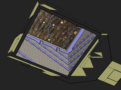
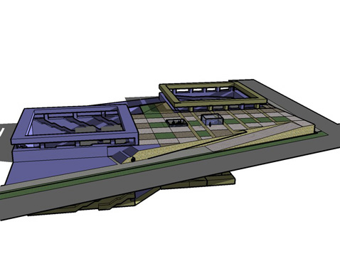
The idea is to keep it simple: to gather the public atop a mesa or plinth to demark and figure the site, to make a way for people to walk into the footprint of the towers and touch bedrock. This design is too ornate, to be sure. This is the first swing at the beast after all. If this was developed, further iterations would polish off the excess.
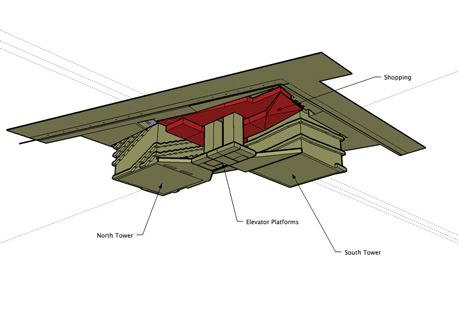
Once people are down touching bottom, they gather and compress into the subterranian lobby (I remember an Alvar Aalto's theater, and Louis Kahn's museum that lowered ceilings and muscularized structure to do this) and plunged up (theatrically) via 25 foot wide elevators, up 83' back to the surface. This procession can be run in either direction for either narrative: to reckon with grief or to embrace hope.

This view illustrates the circulation. Please note that the shopping (yes, there will be a shopping program involved here, this indicated in red) is separated from the memorial entrance on West Streeet (note too, the appropriate associations with the cardinal direction) with an entrance on Liberty Street and another at the opposite corner (Greenwich and Fulton) as it wraps around the elevator shafts like a snake (no particular symbolism intended).

By theatrical, I mean that the mechanics of the elevator is meant to disappear as much as possible. I imagine people would assemble on a grid square and as the platform would initiate a downward movement, a glass wall would emerge simultaneously, finally sliding up high enough to discourage anyone from jumping over it into the resulting 85 foot pit. I recall the super cool doors on the starship Enterprise in TV's StarTrek. Whoosh! As the elevator would come up, the wall would come down simultaneously, resulting in the magical realism of an apprarition of people on the surface.

The experience down in the tower footprint should be simple and stark. I drew stairs on the North Tower and ramps on the South Tower, but I just drew fast and left the fullest expression of this idea for later (if there should ever be a later). There are many permutations (stairs plus ramps, many combinations of numbers of circulation, etc.). The interior of the tower pits should be simple masonry and any ritual scribing of wall surfaces should be on the interior of the circulation spaces where people can touch them.

Indeed the site should be built ancient Egyptian style, monumental blocks of masonry, with the fantasy intention that all of New York could be swept away thousands of years hence and these blocks and pits could remain like StoneHenge.
Ohhh yeaaa, this felt... gooood.
An old muscle stretched and made a little more limber, once again.
Posted by Dennis at November 24, 2003 10:13 AM
feels good sometimes doesn't it....?
Oh yea.
This Sketch up is fun. The geek prerequisite is low.
It's a little blocky, but you've got to start somewhere. Together with this blog, I've got my own private archiverse.