October 5, 2004
Modern City Planning

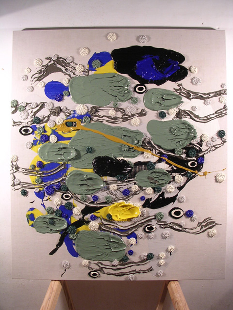
I wanted to finish this painting before Gil and Daryl arrived last week, and since I paint alla prima (within the time it takes for the paint to begin drying), I finished just in time. But the painting bugged me. It lay on its' back in the studio during their whole visit, I would walk by and stare at it, wondering what lack it had that kept the door from closing.
Here's how it looked before:

I was able to capture a good aspect in this jpeg, but it didn't hold up in other lighting conditions. In the shadows, in daylight, with ambient light, the composition washed out. Whatever was good in the skein of forms was flattened by the colors in which the Cad. Yellow Light and lightened French Ultramarine is countered by a green which is actually a mix of those colors. There's something about throwing down a melange of color, scooping it up, mixing it and a reapplication that seems appealing to me now.

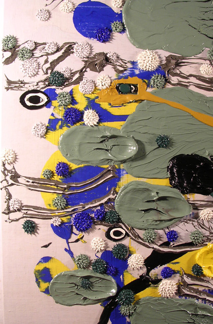
It's not too easy to lay down the fractile (grey) forms, it requires a stiffer carboard (I work with shears and cardboard all the time). Like the work on paper that preceeded it, the bulk of the composition... worked like a bulk would, and the oval stacks tend to punctuate and punch up the composition that by and large relied on other qualities other than color to carry the load.

And as for modern city planning? I paint the cuadros both vertically and horizontally... mostly looking at it vertically and laying a majority of the licks to it whilst it is flat on it's back. I can't deny the appearance of architectural models, especially city plans (I remember Frank Lloyd Wright's Broadacre City model, seen once at MOCA LA). My thoughts about the city tend to align themselves with Leon Krier's distinction between the traditional human scaled city (a city of urban quarters, each no larger than a person can walk in fifteen minute's time) and the modern zoned city (a planned distribution of uses into an urbanism sectored: a bedroom community there, an office park there, an shopping center there, etc.). The words "Modern City Planning" popped into my head, even though I've nursed these ideas before. A rare occurance, this happens now and again... i thought I'd let it stick.
Looking at the painting on its back with the raking daylight, the distribution of pigmented forms evokes an urbanism. And I thought how representation maps cleanly over the "Human City" the former category marked by human scale. In this place, each part defers to the other parts and one moves from one to the other in transitions. Here, the individual defers to the group. In a modern city, each part is articulated and distinguished from the rest. Context is a circumstance rather than the reason for being. And figure dissolves into field (emphasis on the verb as a state forever in process, forever incomplete, in between), in this case, a painting as a suburban spread.
Posted by Dennis at October 5, 2004 6:21 PM
Leave a comment