February 5, 2005
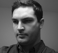
Chris Jagers

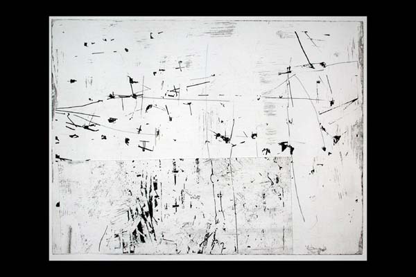
Chris Jager has retooled his website, he's doing a lot of drawings. He kept me posted in a recent email:
...lots has changed with me. Small Work! I'm putting printmaking to work... I created a new site which I think screwed up your link. the url is "www.chrisjagers.net". I've been unable to afford to keep producing those big paintings, but lost the will before I ran out of money anyway. I got sick and tired of having every idea cost two grand and one month of time. I learned that I miss drawing, so I just dove back into it. Now, everytime I sit down, my ideas are spilling out like they never have before. Very exciting time for me. Interestingly, no matter what I do, I realized that I cannot fall out of myself. Even though all my materials changed, process changed, they still look like mine! Everyttime you write about scale in your blog, I perk up. I realized scale is more important that size for me. Things can seem monumental even though they are small. However, I really like your slick=big, thick=small post. Very true. (Terry Winters an exception).
I met Chris when we lived in Dallas. A young lad out of school, I had the privilege to visit his studio and home then. He has an astounding hand and all of his early work is rock solid. I saw no drek at all, and it made me remember all of my own terrible naive early work I deservedly threw out when I was a pup. Chris' threading to art is metal to metal.
He was painting large then (thus his reference to big above), I mean really big, wall sized panels. And he had this technique of laying the abstraction down that was as painstaking as a surgeon. Every painting was hard assed and big... he was carving out this huge cudgel to take on the art world. So it is a surprise... pleasantly so -not necessarily only because of the new direction he took... to see him redirect his attention to scale and his attitude towards the embraceable.
He delivers a New York report:
Went to NY over the holidays for 2 weeks, and was underwhelmed by the galleries. But I'm still thinking about my trip. I saw the east village show in person... Interesting show from a historical perspective, but most of it looked pretty mangy. The gallery scene as well felt a little thin. I agreed with the Jerry Saltz article in Modern Painters blasting NYartworld for its evergrowing commercialism. Also, a very apparent clevage is growing among artists that is being driven by money. The divide is between these giant artists that command millions and legions of assistants, versus the young poor artist struggling to get by. While I love those big high cost installations, I felt most of the work at less famous galleries was small, quick and more a product of convenience that anything else... The highlight was visiting Wynn Kramarsky's collection of abstract drawings (Book: Drawing is another Kind of Language). To look at a little eva hesse on paper blew me away. This little thing that had no production costs was the most powerful thing to see my whole trip. I guess the power came from the intimacy of the thing, her privacy made available. So, I'm inspired!
Ahhhhh so. It was the Eva Hesse that redirected his eye/attitude towards scale. Interesting too, his note about cleavage.

When you look through the archives in his site, compare the 2003 work with the hand in 2005. A nice development.
Posted by Dennis at February 5, 2005 12:14 AM
Leave a comment