February 28, 2005
Flagged

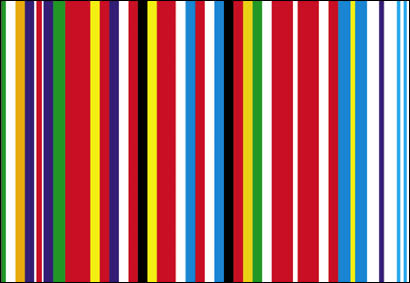
Check out the new EU flag, designed by Rem Koolhaus.
What do you think?
Stylish, sophisticated, good looking, smart. I like it immediately, but shouldn't a flag float above transient style, be simple enough for a school kid to crayon it out, and transmit some value system in a very basic manner? I guess this design actually accomplishes this point for point... but still. Sometimes sophistication can be too sophisticated for the sublties of simplicity. (My fingers forced me to type that last sentence, -shrug-)
I don't know the credentials of designer Bruce Dunlop, but Annanova reports his opinion:
Bruce Dunlop, of Bruce Dunlop and Associates, said: "This is one of those ideas that would seem great around a boardroom table after a couple of Aussie chardonnays, but in practice it doesn't work."
(all this linked from those crazy college kids studying abroad in Barcelona, DemRealists)
Posted by Dennis at February 28, 2005 1:49 PM
Leave a comment