March 14, 2005
Cologne
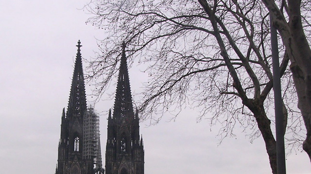
We're back from a great week in Colonge.
Let's see what made it into the Coolpix memory:
![]()
![]()
![]()
![]()
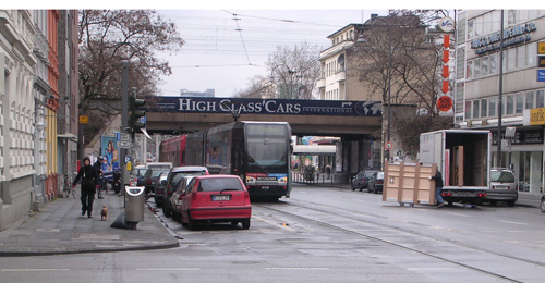
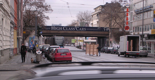
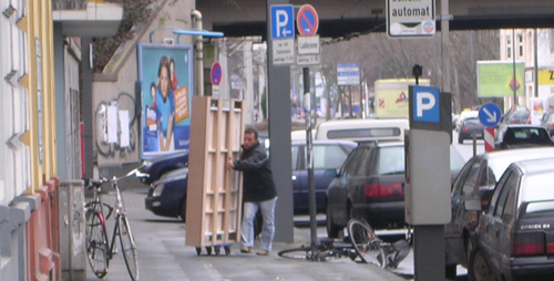
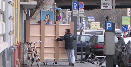
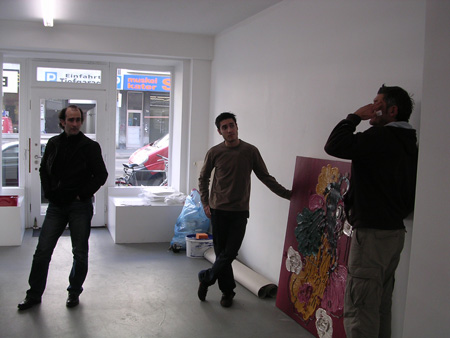
As we arrived, the paintings were being hauled in.
Across the street.
A street with heavy traffic.
What timing.
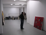
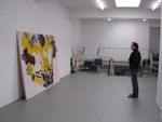
Andr? was getting over a flu.
Despite this, we spent the day installing the show.
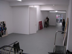
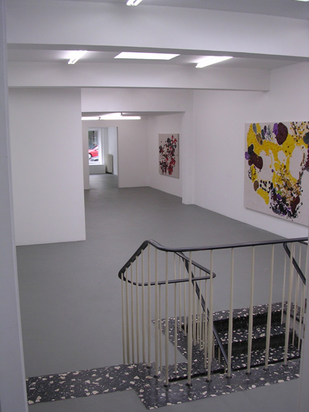
It's an unusual gallery, the spaces telescope larger as you enter it, each getting larger and larger until onje encounters an apparent rear wall... and then there are a slip of stairs to yet a larger space below Andr?'s office.
The installers were interesting guys. The one one the immediate right of Andr? (I've lost his name) is a writer of screenplays who will be studying soon in Israel, the other (Andreas) is writing a book on Peckinpah. He was telling me that there is very little written about this director in German literary media, and none of the films are translated very well at all. I drew him out on the topic and I enjoyed the conversation a great deal.
My philosophy on installations:
Let the gallerist drive the decisions, a light hand. Once the paintings leave the studio they are arranged and hopefully, rearranged by many other agendas than mine.
In this case, hanging a rythmn of works that increase in scale as you proceed is a natural. Everyone will have a different idea about the synchopation (ojala). It's important to me that the gallerist owns the show.
The paintings should be able to survive that.
Nice! Congratulations.
I haven't been to Cologne since I stopped using that city's most famous product.
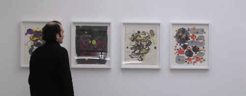
The first pic of the scaffold bandaged steeple makes me wonder if you have ever thought of your paintings as topographical? Sometimes your paintings seem to me as if they are maquettes of landscapes (espescially when viewed from the oblique angles that you sometimes shoot them at). Forest Architecture. Today, with this first pic, I flashed on your spiny polyps as churches on an ancient/future map. The penultimate image looking back through the gallery is a wonderful helix composition. In the last image it looks as if the works on paper are in antiseptic boxes covered in glass. . . can this be?
steve
Bill: Funny. Last night, Stephanie said she smelled "boy smells" in the bedroom, her nose being ultrasensitive. I shrugged, boy smells are better than old man smells, no? Maybe it's time to buy a masking cologne like old spice or it's modern equivilant?
Steve: Yea, people who think about my arch background will think of urban topographies (the mental image of Frank Wrights's "Broadacre City" comes to mind). ?Como no? I think of them as paintings -and of all paintings having a third dimension of material thickness. Nice connect on the Gothic spineyness.
Sounds like it went down real well! I had my favorites. There they are. And they look like they are doin' it with grace and a touch of urgency within the canons of those white walls. If you have a few shots drop them by, Dennis. I'd love to put a few up on TN with a brief text.
Fluorescent lights, oh my aching green eyes or is that color-correction in the long run ?
The shot with the person in front of the works behind glass(plastic)finally put them in a true read perspective>>thanks
Brent: I'll have the gallery send me better installation shots than the ones in my camera, thanks for asking!
Greg: Yea, I'm not so big on fluorescents either, they cool the color off quite a bit. A lot of galleries here in Europe have these kind of fixtures. But, even so, I strive to work so that the paintings can survive any installation. I took notice that K21 had museum-standard warmer lighting (daylight simulation?). Also, my collectors tend to tell me with delight that the paintings glow once they install high angled warmer spots, a good bonus.
As for color correction, color is so shifty (that's why I like it)... but maybe daylight is the only standard to correct against?