May 2, 2005
Thomas Zipp
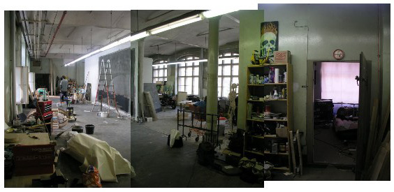
Strap on your set belts for a massive post on a Thomas Zipp studio visit. I've got fourteen plus pics ready to rock...
Thomas Zipp, what a great guy! Joel met both Thomas Zipp and Thomas Winkler via Daniel Hug in Chinatown. Eventually, they got together to make music and print projects. Muy bien, hombres.
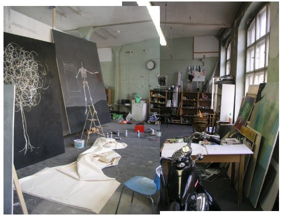
Thomas' studio is located in a huge complex that is so large, it has it's own police sub station. Fortunately, Thomas is one of the few artists there, and there is only one gallery (I will post something on it later), one that happens to represent Thomas Zipp too.
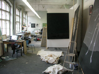
I've heard that Thomas has been compared to Anselm Kiefer, the next generation. I would guess that this is so because of a focus on the nature of German character. This, apparently a question that has become urgent in Germany in the aftermath of the highjinks of the 20th century.
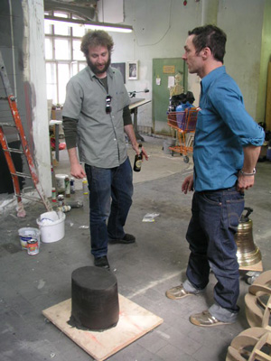
Looking at all of these large thin stretched canvases, I ponder the significance of my heavy furniture-like supports. Supports such as we see here in this studio point in the direction of big surface installations, environments of art, painting into installation.
My stuff in terms of how art occupies/defines space, seems to point the other way.
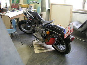
Thomas seems at first glance to be quite a roughneck. Witness the Harley, for example. A fine bike. And check this out:
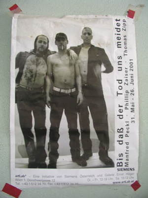
He might seem like a real head banger. And he might well be, but I found Thomas Zipp to be a generous, open, curious and honest guy. A very fine fellow he is, and I look forward to seeing him again.
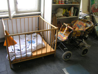
Baby on board.
His wife and the mother of his daughter is painter Hannah-Marie Blenke (I'll post images in an upcoming post on Dan Hug).

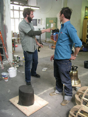
Thomas had this bell fabricated in Poland, where there is a good foundry there. The foundary didn't make bells before, so Thomas had to research the proper cross section for it. From drawings, the Poles crafted a positve form from clay, then they fashioned a mold from clay and poured the brass/bronze.
The inscription: "spirit without body".
We thought it might be a good idea to hang it up and ring away...
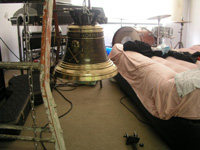
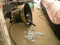
The bell was too heavy. It busted a link in the fall, a close call.
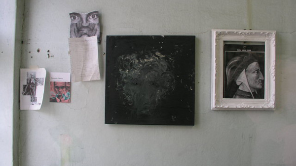
Then, I was looking at the work and the life of this artist, and the thought of mapmaking came to mind. I said to Thomas: "You're a cartographer!". Joel and Thomas both shifted uncomfortably in place, shrugging.
Joel is all into figural expressionism. When he paints, that's the stuff he does. Most of the paintings he champions is of that sort. And Thomas seems to be committed to some kind of directed force. The overtones of Levis, leather, Harley steel, flaming skulls... all indicate energy, male energy. A cartographer seemed to strike them as a nebbish sort perhaps. Maybe I was harshing their wild high. But I respect their vision, make no mistake... and I find it inspiring and energizing.
So I pointed to the evidence: the lines, the landscapes, the skeletons (which are armatures for the body, calcium lines* if you will), and the bells (a navigator with charts and compasses and sextants and bells)...
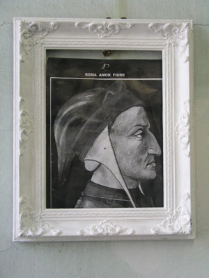
And there is Dante on the wall! Dante, who mapped hell in the Inferno. Another historical personage he paints portraits of is Tycho Brahe, who mapped the heavens (selected over Gallileo probably because he proposed an alternative cosmography).
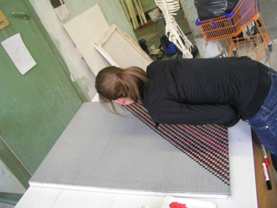
And here the assistant is hunched over a painting in the same way I used to work when I was the chart petty officer back in the navy days. Markers, grids.
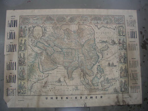
And look! Here, a ye olde map on the wall!
Then Thomas said: "It was there when I got the studio."
Oh.
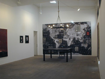
Later, googling to Dan Hug's website, I find this installation shot.
A new kind of cartographer with a beer choked at the neck and a glock in the waistband.
I rest my case.
* This makes me think of the body as painting. In the former as in the latter, drawings (lines as skeletons) and paint (fluidity as flesh)... the coordinates match perfectly. This, painting as the interaction and dance between lines that cut distinctions and paint that oozes and flows across all boundaries.
Posted by Dennis at May 2, 2005 10:36 AM
Hi Dennis,
Enjoying the visit to Berlin through your pictures and writing. Had to reply when I read this post because of a couple of things you mention: "painting into installation," and "the thought of mapmaking came to mind." I've just posted some writing about SF Bay Area artist Kathryn Van Dyke in which I refer to the idea of painting as installation and the use of a web of lines (a skewed grid) as a way of mapping the surface. Not mapmaking, as your refer to, and I think your sense of installation is a bit different, but anyway, a bit of a coincidence. Excerpt:
"Is painting dead or isn't it? Nah, of course not. But if modernist painting is dead in any sense it may be dead in that painting seems to have returned to installation. A painting doesn't stand alone. Once upon a time painting was part of installation; think of fresco, of altar pieces- these are installations. No painting is just its surface. And like it or not, for a painting to be seen it must exist in a place. A gallery exhibit is an event in a specific place. And that specific existence is an installation. Gone is the painting as a disembodied plane hovering before a wall. The gallery frames everything it contains as a single entity and heightens all elements."
http://www.chrisashley.net/weblog/archives/week_2005_05_01.html#000772
Hey Chris:
I guess the schema can run on either track.
On the plane of ideas, the categories of dimensions one, two, three and four can correspond to concept, painting, sculpture and installation/architecture (music is five?), this arrangement has it's appeal. Painting finds a maximum condition with the viewer in a perpendicular relation and the plane has no depth.
That's the funny thing about mathematics, how it rests on a set of incredible assumptions: the dimensionless point, the infinite thickness of a line and plane. From these initial leaps of faith, we build empires.
On the fleshy plane, paint sits on a surface cut by lines and oozed by flows. Taken to the practical level of this earthly plane, the pragmatics of handling and stability ramp up with the volume of material as the troubles of handling have to be negotiated: white gloved preparators screwing it into the walls of a truck for transport, or building crates for heavy supports versus FedEx-ing rolling tubes of canvas peeled from a stapled wall...
I'm sure you get what I mean. The thinner the dimension from canvas to a projected image, the easier it is to mount a show into architectural space... or conversely, less architectural structural preparation is needed for the turn away from the wall into the space to the gallery.
I guess it runs either way. It does light up the distinction between, say science and engineering or idealist philosophy and practical common sense.
Thanks for the second thoughts.
PS Chris, nice essay you did for KVD, built with oak.
Hi Dennis- I did read your reply the other day but there was something my head at that moment that as I read I though, "Man, this is dense." Tired, I guess; I read the words and couldn't break it down.
Now here I am returning three days later to read again and there are nice little nuggets that not I like but are very usable:
" the categories of dimensions one, two..."
"Painting finds a maximum condition with the viewer in a perpendicular relation and the plane has no depth...."
"the pragmatics of handling and stability ramp up with the volume of material as the troubles of handling have to be negotiated..."
And so on.
I still think that no matter how tight, and flat, and resolved a painting, and no matter how much the image or narrative on that surface is a whole, I'm always going to get information by walking up to the wall and seeing what this thing is painted on, how it's attached to the wall, what kind of surface is being worked on here- is it soft, flexible, resistant, etc. You know that sound a large canvas leaning against a wall makes when you're vigorously brushing the front- there's acoustics there. Wood or aluminum makes for, if needed, faster movement. And so on.
All this was part of my thinking about something that goes beyond the painted surface to the installation, and that installation is also the relationship or conversation or even dysfunction between things hanging in the same room.
Any flatter and you're painting on the wall... oh yeah, that would be installation, too.