December 12, 2005
Shakedown Crit
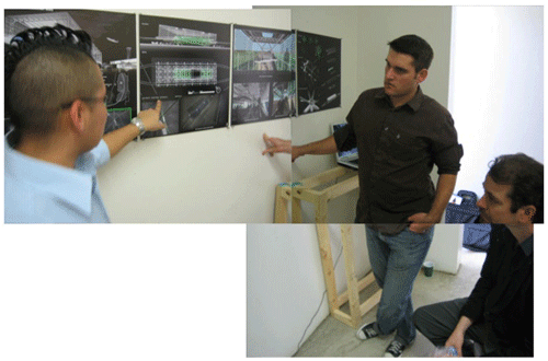
A quick note regarding the recent Woodbury critique:
A caveat for the faint hearted:
-Pics of students here are not specific to the critique that follows. I didn't take fotos systematically for this blogpost, so there is no correlation of the students in the pics with the critique in this post. The images here are meant to give the reader a general feel for how the projects looked.
-This post might read like a tough review -it's really par for the course... Silence is the worst critique and the fact that one exists is a positive thing. A critic/studio instructor has a responsibility to be honest. These kids (young adults, really) are on average, sharp and occassionally brilliant. They are on a journey and such adventures might require a switchback and reorientation from time to time. Tough love is still love after all.
The project was in the middle of its schedule with the final crit scheduled for the Spring. So, the kids needed a shakedown review so they can have a chance to rethink their approaches. I should have anticipated this, but instead of the intense chiropractic adjustments that a project of this nature would need, most of the kids punted.
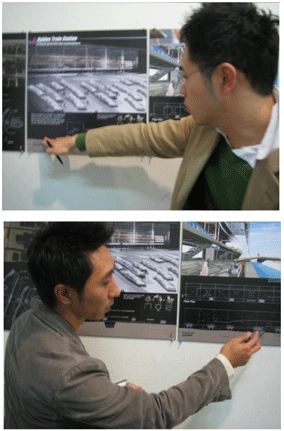
Here's a few of those adjustments:
-Dealing with the troubled history of the Levant, a heavy load, even or especially for senior level university students...
-The hazardous assumptions regarding the nature of their client population (the moral infrastructure I had mentioned earlier),
-Maintaining a critical yet not (knee jerk) skeptical position regarding the RAND study that prefigures their project. Why is the singular swath necessary? Should we just drop a 21st century transportation system into a culture that is struggling to grow into modernity? What and where is the Palestinian voice in this project?
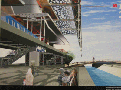
One factor that I had missed in the last blogpost was that the prime pedagogical instrument was an annual steel competition, another spinning plate in this circus. Students are expected to compete to win the prize for the best expression in steel design. This entails a peacock strut of architecture design and drawing within a rigid format of four boards in silent presentation. So, there are at least three major layers that the students have to thread as they wrangle this beast of a project, not to mention mastering the cumulative learning modules entailed in architectural education: research, parti, structures, resolution to design detail, relation to urban design issues, stuff like that.
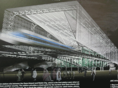
The big picture: the kids are simultaneously in over their heads and too sophisticated at the same time. Predictably, they glossed over the heavy lifting involved in this project (the chiropractic adjustments noted above). And (sadly) predictably, they are all sporting glossy, splashy, professional looking -yet ultimately vacuous designs that do not (yet) do justice to either their virtual clients or to the totality of the curriculum at Woodbury University. Ouch.
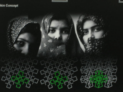
For example, the use of the hijab for design inspiration. What is the history of the hijab? Is this best expression (significantly iconic) of the Palestinian people? What does modesty mean for them and how does this vary in the many kinds of Muslim communities around the world? If the hijab corresponds to the skin of the rail stations, as many of the projects have employed, what does this mean for the interior reality, the implied function of chasitity in the building program? If this is to make a distinction between public/private realities, are there then further public/private distinctions in the civic realm? I am soooooo dissapointed when students take deep subjects and treat them shallowly.
But this is the mid review, after all.
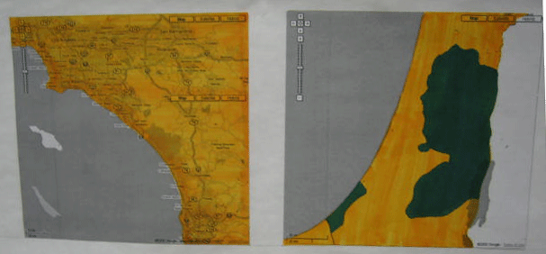
Quick notes (if the students are reading this):
Become chiropractors, people! Critically assess the assumptions that configure your assignment. Don't be sheep! I know that the history of the region requires deep research and too much time to absorb the intricate historical context of the region... sadly, our schools do little to prepare students for what should be university level work in this regard. It is all overwhelming to be sure... but all design contexts are intense and intricate (even though this one goes over the top) and the task is to be able to wade through the thicket and chart your way through it all. That's the job as an architect (this is what makes architecture uniquely suited for the 21st century info age, to immerse oneself into the phantasmagoria and emerge well oriented)... and increasingly, this condition will be our lives collectively as we free fall into an accelerating future (modernity itself).
There were too many representations of souqs that were simplistic tents in barren and underdefined plazas. Check out the wikipedia link and you will see that the foto of a souq in Marrakech, Morocco is anything but simplistic and peasant-like.
Too many times, students have swallowed the RAND study lock stock and barrel: a singular rail line in a necklace of cities. Are there no alternatives? Too often, simplistic parti's are expanded without elaboration (when instead, the parti should be derived after an analysis of multiple design factors and a design solution is configured... not the mindless inflation of a knee jerk cartoon of "train station".
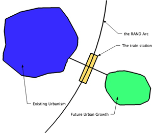
Kind of like this.
The result is that too many projects looked like gigantic parti's, thin and abstract, rudely reified notions lacking substantial humanity. The students are generally going through the motions, delivering what looks like a design... but with (not much of) a deeper look. It falls apart. Kind of like a ghost, the projects wisp away when you try to grasp them.
Fantasmas.
The fix: explore the nature of the cities in which you are siting your stations. What is Jenin like? What will/can it be be like, how should it grow in the future and how can the siting of a rail station serve it? Transportation systems should be fugal, possessing several scales of public transport from the largest (this regional RAND plan) to the smallest: air/seaports to regional rail (passenger and cargo) to inter-urban (between cities) to intra-urban to buses to autos to trollies to taxis to jeepneys (my favorite pet project) to bicycles, to scooters (go scooters!), to pedestrian scaled urbanism and the transducing function of parking that makes it all happen.... lots of issues that will ultimately enrich the design.
The saving grace is that this is par for the course, they have a big chance to catch themselves... and Gerry is a damn fine teacher and architect. Five months until their final presentation in the Spring can be a long time.
Sometimes.
Posted by Dennis at December 12, 2005 9:03 PM
Leave a comment