April 17, 2007
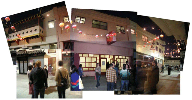
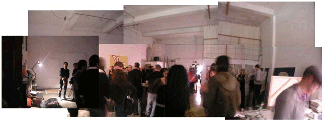
BART EXPOSITO, "DESIGNOMITE" Black Dragon Opening Night

"Figure Looks a Lot Like Me in Paint"
The interesting thing for me about Bart's show is that he references the design world several times over while avoiding formal superficiality by internalizing important aspects held in restraint. Some examples: 1) the centrality of drawing that slides into painting through exhaustive revision, 2) an emphasis on site specific installation that focuses on the spatial relations between paintings while ultimately disregarding the actual site of the exhibition, 3) the "project" orientation of his work which is ultimately disposable in service of a larger oeuvre of painting.
What-you-say? Let me expand a bit.
(BLOGPOST IN PROGRESS)
1) Bart draws studies of his work prior to attacking the canvas. What's unusual about that? Most artists do it this way, but Bart really works this aspect over pretty well. He has a nice parallel body of work in drawings, and someday that might make an interesting show somewhere. Bart could easily take mechanical means to delineate his forms and yet he insists on small incremental adjustments done by hand to bring each painting to completion. By approaching a standard of perfection that he never arrives at, his paintings have a kind of wobble that for me is full of humanity. More to my point, this is a striving type of humanity, something about aspiration and if I may say a word not common to today's art discourse: nobility.
2) Bart is always talking about site specificity and when he does, I constantly think about how the site of a gallery installation is so furtive, so temporary. How can an artist be so focused on such a thing when that thing disappears after the show? A show lasts a month and then the space devolves as all architecture does, entropy brings the mother of the arts (architecture's conceit) to dust faster than the rate of our own mortality as human beings. Collectors collect and thus dismember the show, eras change, our memory fade, the building crumbles. I've come to think of Bart's site specificity as an abstracted relational configuration. It is instead the physical schema that he is shooting for and not the literality of place.
3) He tends to group his work into strategic arenas, this show being one where he had washed out color a bit, the astringence evoking a harder edge. He also ramped up the project into stages of scale, from notebook size paper to large study paper to a 11' tall painting. The conclusive masterwork aspect was grounded by the long tail of prepratory stages, the whole enterprise was very much a project in the fullness of that term. And while he might make a couple of subsequent paintings, this project has come to fruition. New work will most likely be configured in the frame of another subsequent project.


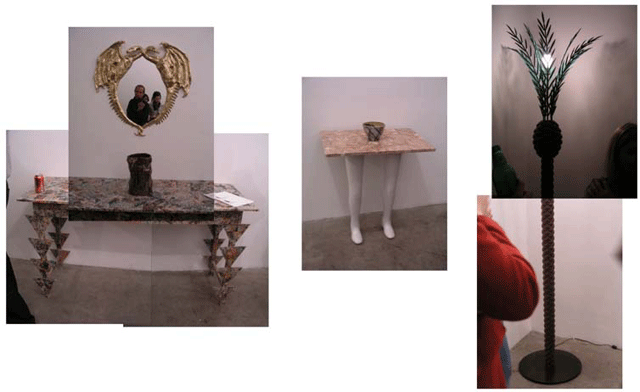
Pentti Monkkonen's "DESIGNOMITE": Artists: Chris Beas, Liz Craft, Evan Holloway, Piero Golia, Jason Meadows, Pentti Monkkonen, Ruby Neri, Colin Roberts, Josh Stone, Eric Wesley...


(BLOGPOST IN PROGRESS)
Posted by Dennis at April 17, 2007 12:22 PM
Leave a comment