May 15, 2007
Reap The Whirlwind
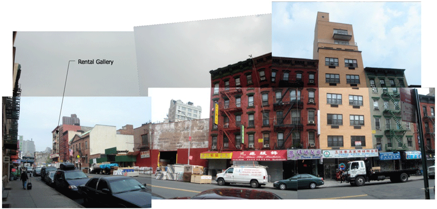
New York in 72 hours.
My old friend Aaron Parazette asked if I would be interested in visiting the city with him, we could split a hotel and spend the whole time talking about art. My show was done and shipped, I had a small window of time that coincided with Aaron's need to conduct business in the big city. We could attend the Inaugural show of Joel Mesler's Rental Gallery.
Hell yea.
The intensity of New York comes from the sheer density of people of course. After the bump and push through the throng, one notices the erosion of the built environment: details broken, chipped, abraded, pulverization in slow motion. Human oil and grime that inevitably clings to it is everywhere and slowly I came to a realization that living above or below the line in this city boils down to the capacity to live with or without clean architectural detailing. A density of people means a density of information. Social intercourse is fast and furious, the data often a potential determinant of success or failure. Very little of what one encounters can easily be discounted without negative ramifications. Life there must be different for residents compared to visitors, habits of living can be streamlined and the noise can be edited, but the mind and body for the visitor is pushed to the limit.
It felt wonderful.
How can I relate this to you all? Let's try a diaristic approach... this is a blog, afterall.

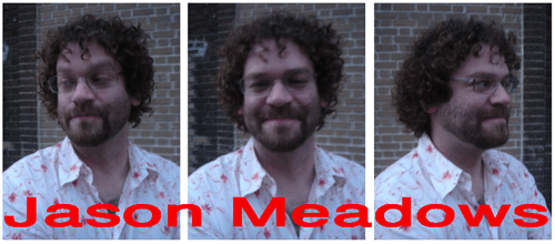
What a great countenance Jason has.

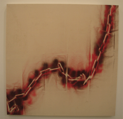
He opened at Tanya Bonakdar Gallery. The show's title: "Frame Narrative" probably reflects the fact that Jason teaches theory at ArtCenter but I like the monstrous aspect of his work, how the things he makes reflects a bigness, a bearishness. Jason himself is a kind of monster in the most amiable way. The terminology of art theory makes sense to me in that it is a language that seeks to make sense of a world made chaotic by the processes of modernity... that Mary Shelly's Frankenstein is a metaphor of this modern world, of things broken and stiched together, scary and big and uncomfortable.

Then finally, there remains --for me-- the fact of Jason's generous spirit, encased in a mountain of hair and flesh and finally a big grin rimmed with huge gapped teeth and eyes that shine in a most fraternal way. I believe that all talk of philosophy and monsters in this work must finally reconcile itself with Jason's smile.

Aaron and I grabbed a beer at the front desk and joined the crowd out on the sidewalk. Joel Mesler was there, pensive about the inaugural show that was set to open in a couple of days; Phil Wagner flew in too, Sarah Lehrer-Graiwer appeared, Parker Jones and Ry Rocklin were on my flight. Everybody was getting oriented to the weekend opening to come. The agenda? Food, drink and a visit to the new Rental Gallery. Around the corner, we hailed a taxi bound for the Lower East Side.
I forget the name of the bar near the gallery, it had no sign and the design was minimal. Good food, tall beers and noise. The gallery was around the corner. Chinese barrio style, Joel's place was up six floors overlooking the corner of Allen and East Broadway.
Joel's whole enterprise had become quite a topic back at LA's ChinaTown for the past nine months. People took the full range of emotions and positions about whether Joel would succeed. Mostly, I think the pain stemmed from the loss of a vital force in Los Angeles, particularly ChinaTown. There was also the all-too-human capacity to become confused when someone changes within a social context. Joel had to grow and New York was the only place to grow into. Not everyone was comfortable with that.
Joel is fulfilling the mandate of our time: manifold, genre crossing, multi-media, many faceted and all that jazz. Joel grew up from a knucklehead artist raising hell after art school to a dealer and a gallerist and a publisher and a painter and an artist who uses business itself as a fine art medium. It's a fine artworld popular wisdom conceit --but ultimately, it's not for everybody and few people can do it well. The question of whether Joel could do it was still an open one for some back on the West Coast.
An echo of that question hung in the air as Thursday turned to Friday as we toured the sixth floor of the future Rental Gallery amid the boxes and shredded shipping materials, artwork scattered everywhere.

Aaron had business to conduct and I promised Joel to help install the show with Phil. During the day, other artists in the show and friends began to show up: Robbie Kinberg, Andrew Hahn. Everyone pitched in and as the first piece got hung, the show started to look like it had a possibility after all.
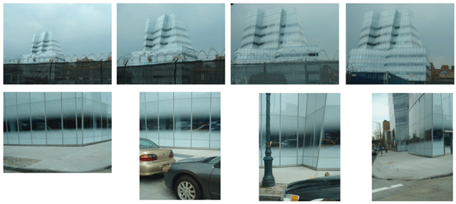
I cut loose from Joel's Rental Gallery in the early afternoon to visit my gallery (Nicole Klagsbrun) and say hello. I took a taxi since time was tight and on the way I caught a glimpse of the new IAC project by Frank Gehry. Looking like Superman's Fortress of Solitude, somehow the concertina wire in an adjeacent lot seemed appropriate. I admire Gehry's work of course, I cut my architectural teeth on his ouevre when I was young, but as always it is his detailing that consistently lets me down. Look at how the building meets the ground. I remember my first visit to LA's aerospace museum where the building was eroded, crumbling from human touch. Again, here is that idea of human corrosion, entropy. Buildings used to be fortified all over, then fortified at the parts that people reach --I think of my understanding of Louis Sullivan's distribution of ornament, within human range-- and now there is this guy from LA who's making buildings as fragile as paper, you just look at them and they age. Architecture as origami. Nice in theory but we don't live in theory, we live in fact. (Spoil sport.) Why wouldn't this kind of building be fortified at every point of human contact? And why would this particular place -where the sidewalk meets the building- not reflect and break down the spirit of the overall design into other harmonic levels of design techtonics? The building was built for the first photographs at the end of construction, it was made for a media existence. No other dimensions are neccessary, fugues are old hat. Dusty, antique Bach was meant only for the days of perfumed hankerchiefs and clockwork universes, not for our time of FTP downloads and 500 channel satellite TV.
But then again, Nicolai Ouroussoff might disagree:
But it is when you step onto the sixth-floor corporate terrace that you glean what?s missing from the design. Leaning back against the rail, you get your first close look at the glass cladding on the upper floors, at a point where the building narrows. The faceted geometry here is more extreme, the connections between the glass panels more awkward.(Emphasis Mine)Joints don?t line up perfectly; corners look hurriedly patched together. At certain points the unusual curvature of a window, created by the building?s odd geometry, makes it impossible to span the opening with a single piece of glass, and the additional mullion creates an odd, patchwork pattern.
The effect bristles with energy, as if the building were beginning to crack at the seams. It brings to mind early Gehry projects like the 1972 Ron Davis Studio in Malibu or the 1989 Vitra Design Museum in Weil am Reim, Germany. Neither work is perfect, but their imperfections are important. What you feel is someone struggling to make sense of something he has yet to fully grasp ? the incompleteness of the creative struggle.
It is a reminder that Mr. Gehry?s courage as an architect has stemmed in part from his distaste for perfection, for architectural purity ? which in his mind comes perilously close to oppression. His aim has been to redeem the corners of the world that we often dismiss as crude, cheap and ugly. He intuitively understood that what seems ugly now may be only unfamiliar. If the ideas underlying a design are strong enough, its beauty would eventually reveal itself.
The IAC building is elegant architecture. But it doesn?t make us rethink who we are.
So, bad detailing is actually ennervating, we get to rethink who we are.
It's like that line in Platoon: "Sheeit, gotta be rich in the first place to think like dat.".
*2
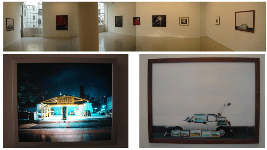
Young artist Barney Kulok had a show of photographs up at my gallery, Nicole Klagsbrun. To my eye, he exemplifies all that is good in a young artist today: preternatural, precocious, a traveller, open, introspective and gregarious. Video, photographs, different framing strategies, different approaches and different genres... I have often called for suppleness in the way we think about art and now that I think I detect a generation who are naturally supple in the way they manifest art. We may therefore be able to see a corresponding suppleness in the way we philosophize about it too.
The crew at the gallery were going to meet up at Beth Campbell's installation at 125 Maiden Lane in Downtown Wall Street later that night. With the rendezvous info in hand, Aaron and I met up to cruise the galleries for what was left of the afternoon.
Here is some of what we saw:
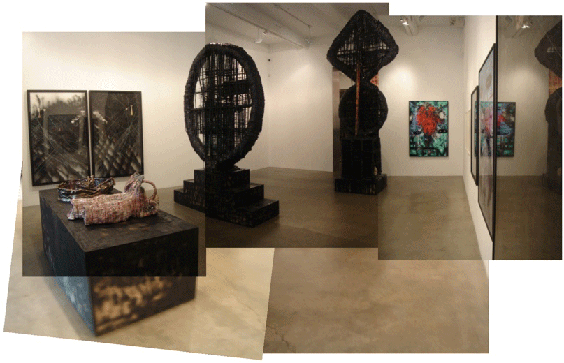
Metro Pictures, Sterling Ruby: "Killing the Recondite".
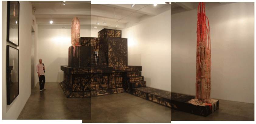
Aaron and I begin to talk about the need for the artist to awe an audience in an exhibition. The big question was, in this case, whether Sterling Ruby was doing this in a way that is an old way, something mannered, the shock and awe of a previous era; specifically, the language of a late 1980's avant garde?
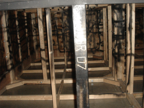
Behind the ziggurat was a portal to hidden depths. Was Sterling Ruby hiding his hidden depths? Does he have to?
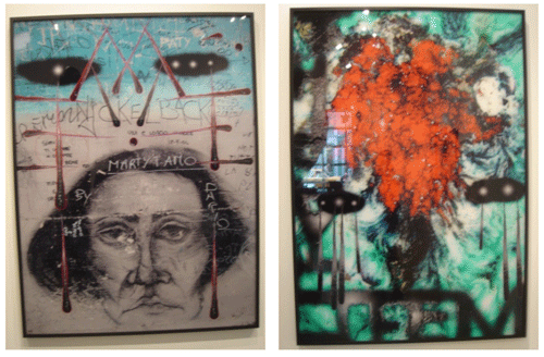

I salute what I see: manifold, genre crossing, multi-media, many faceted and all that jazz. But what I track is the way the artist's hand is constant throughout all genres that he is crossing.
And talk about an artist's hand....
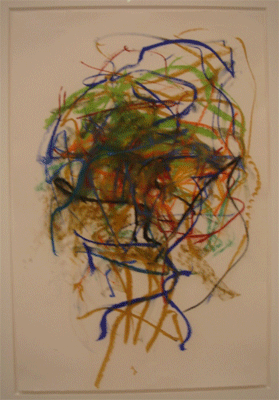
(Time is not on our side.)
We dropped into Cheim and Reed to see Joan Mitchell's show. August. Remarkable. Elegaic. A fortune in painterly details, scumbled passages coiled onto scumbled passages. A mind and body shown in turns of the wrist and rotational sweeps of knuckles, a legacy in a push from the heel of the palm.
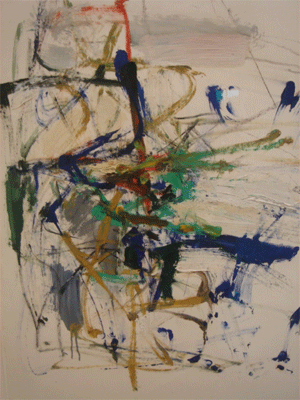
I estimate that we spent maybe ten minutes in the gallery.
We had to bug out, there was simply too much ahead of us to linger any longer.
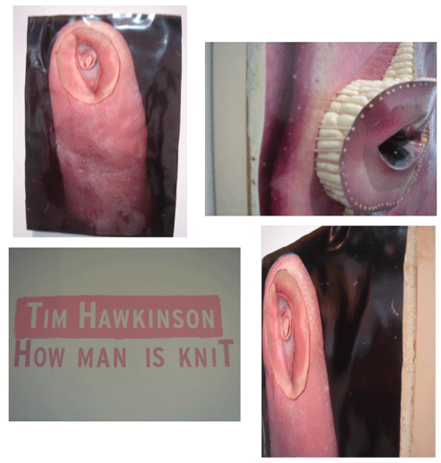
PaceWildenstein's TimHawkinson show. How can you not respect the way Hawkinson gets into his materials, a frenzied McGyver, the crazed bastard grandson of Louis Kahn's "ask the brick what it wants to be"* nature-of-materials ethos? Look at the way he dealt with these photographs, cutting and pasting, folding and bending into three dimensions. I imagine Tim and his crew in the stuido trying to figure out how to respect the mutilated surface of the crumpled emulsified paper. Ah so! Spray insulating foam to marry the irregular topology of the paper to regular surface of the wood panel below.
Brilliant.
The strange television show How it's Made came to mind. Tim and artists like him must get a charge from revelations of modern industry, I imagine.
Fabrication porn.
I thought about how Hawkinson dwelt on the technology of a prior age: the mechanistic engineering of a clockwork universe. Was this a deliberate strategy? Is he a Luddite of another stripe? Gears, wheels, pegs, compression, rotation, shear. Or did he simply require a newtonian techtonics for his vision, squatting stubbornly in a universe of Roman engineering and squeezing a few more ounces of silliness (a folly in the positive sense) from the husk of an earlier epoch?
Aaron and I began to talk about the production values of these shows, of how many people that were needed to produce the awe the art world demmands.
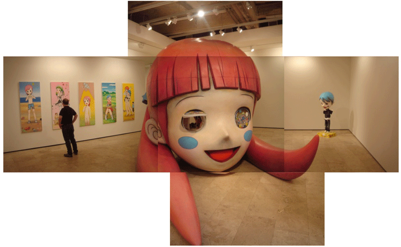
We ducked into Lehmann Maupin to see Mr's new show. An offshoot of Takashi Murakami's Kaikai Kiki's extended atelier, here was the power of high end industrial strength production values. Talk about multiple studio assisted power! (Back end of the head here.)
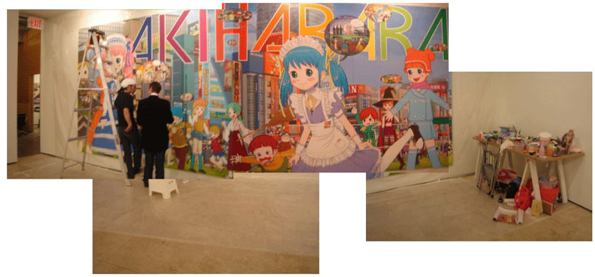
In the back gallery, it was Mr. himself who was applying the finishing touches on his work.

If this was the product of a large staff, then what was the artist doing here applying his humble hand to the huge painting? Where is the low paid and grateful staff to scrub in a rendered background? This is an offshoot of Murakami's factory, afterall. Is this theatre? Is this the final bravura stroke that completes the artwork as it is performed for the audience as in a performance piece?
And then there is the problem of questionable subject matter, specifically, child sexuality. Examples here and inferred here. (NSFW, Not Safe For you Kids, either, so stay away.) Why was this neccessary? Does the cuteness factor require such a balance? Where are the coordinates of the morality of this kind of turn? Maybe this addressed to the category of "art for adults"? The press release echoed Nicolai Ouroussoff: "The cheerful boys with their pants down and girls in short skirts appear sexually provocative, asking the viewer to question whether the work is a comment on Otaku culture or an exploration of Mr.?s fantasy world.". Ah yes, questionable morality is "ennervating", we get to "question who we are"... again.
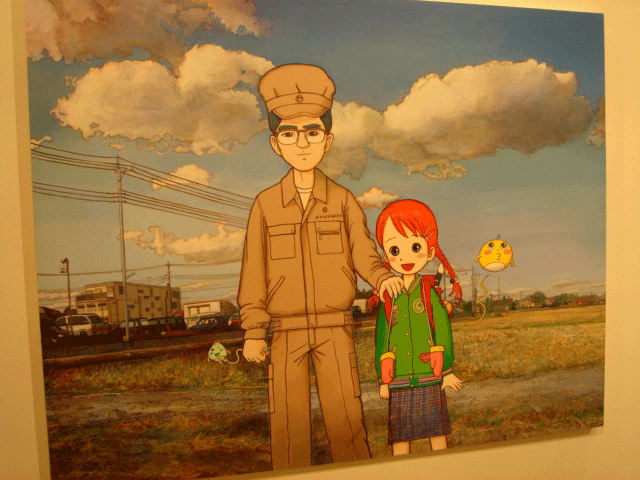
Aaron wondered aloud about the juxtaposition of prosaic rendering (light and shade, more realistic representation of reality) to cartoon Otaku forms, spotting the artificial shading applied to the fabricated sculptures like so much absurd make-up.

And what luck! Dana Schutz' show was up at Zach Feuer Gallery, in we went. Dana Schutz, the artist who has inspired such debate in art bars all over the world! I loved the show, she's brilliant.
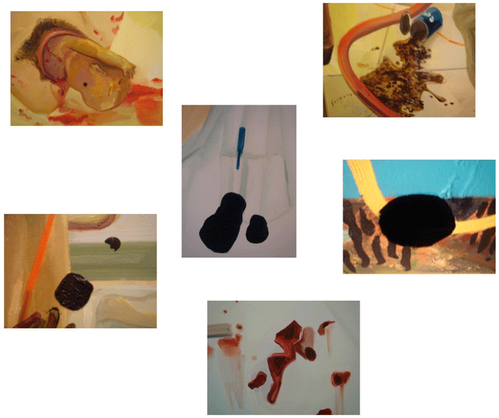
Some people would pick it apart, but I see a theme threading literally through the whole show. There is a sclerosis in all of the paintings, a dystopia in every aspect of her work. A dark vision. Lesions. Rust and corrosion. Spillage, stain, drool, blood, pus and evacutated bowels. Entropy. Sadness. Loss.
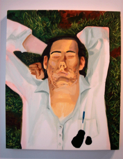
The show starts with a leaky ink pen in the front pocket.
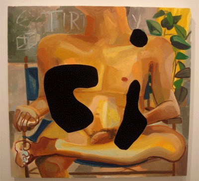
And ends with brutal knife thrusts that turn into the curves of Purism.

Then there is the now-famous "How We Give Birth". Wow. With the head turned away from us, the baby, the pain, reality... and facing deliberately the other world of painting, gazing into landscape-as-"Origin of the World", a battle cry for an escape into realism. Is mankind born of pain? Is the lesion itself (sorry, mom) the source of mankind? Is Dana Schutz... Job?
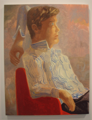
All that rough stuff, and then a piece like this.
A mash note for David Hockney.
The happy-go-lucky aspect of Purism keeps bobbing up like a reverse image of Ishmael's coffin.
*
*
*
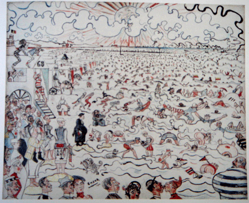
On the way to Beth Campbell's installation, we hustled over to Peter Freeman Gallery to see the the James Ensor show. I cataloged the small perversions and I wondered how or if Mister's pervsions are similarly positioned.
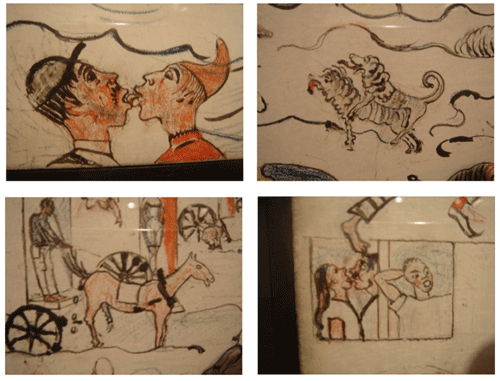
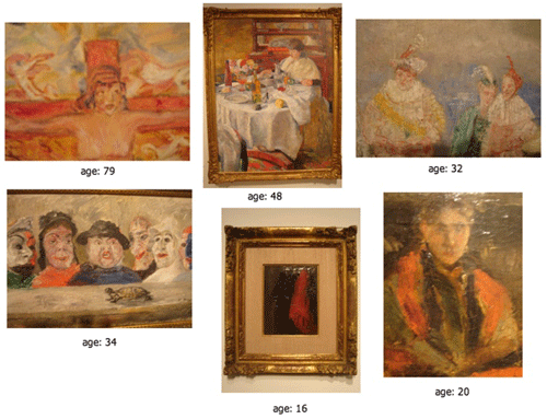
Then came the game called: chart the retrograde interval in the artist's life. Somewhere in the middle, he retreated to conventional representation after an early precocious and a later cantankerously felicitous imagery.
Alright. Cool.
Time to jet.
*
*
*

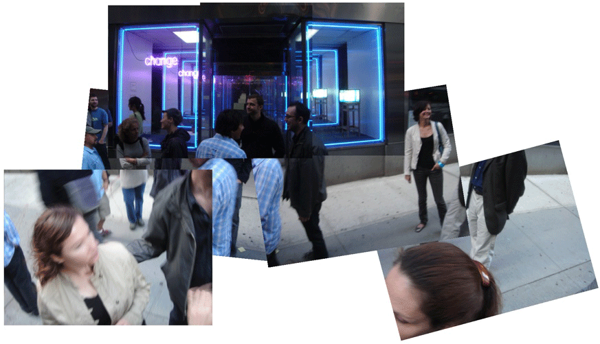
As the sun set, we found the site of Beth Campbell's public art installation.
Beth simulated an infinity mirror in an empty storefront, suggesting a travel agency from the Twilight Zone peppered with self help maxims and the allure of vacation get aways. The fabrication of the additional storefronts were excellent and yet hand made. After a while, the experience of the work becomes a search for anomalies. The jade palnt has different leaves, the ceiling tiles are not mirrored, the stainless steel of the door casing ripples the way foil does.

As Beth talked, I flipped open my camera hoping to capture her description of her own work. But two beats into the filming, she took a sidelong glance and demmanded that I stop then and there.
OK. No problem.
But why would an artist not want the dissemination of their thoughts/works?

After the after-party at a local bar, on our way to rendezvous with Joanne Greenbaum and significant other Bobby in TriBeCa for sushi, Aaron and I stopped by Beth's work to see the neon in full glory.
Walking the streets, a Spring night in New York.
On the way back to the hotel, we rendezvoused with Doug Henders. More beers and then the cigarettes at another cool bar on the street. We talked about his recent trip to Germany, of the scene in K?ln and Berlin, of art fairs in Dubai and where all this was going.

Two studio visits across the river this day.
Gilad Efrat had recently matriculated through Houston's Core Program as Aaron did back in the day. An Israeli who turned away from academia to recommit himself to art studio practice, he moved to Greenpoint (across the river north of Brooklyn, I think) to set up a studio and get all fruitful about it.
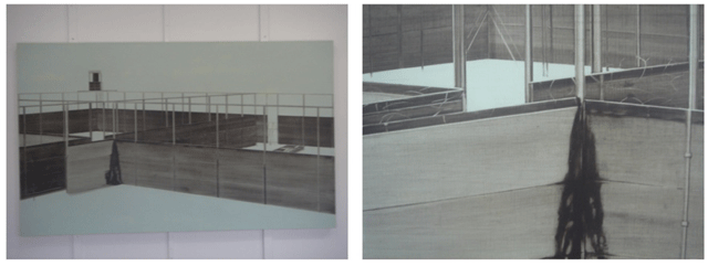
Gilad said he lays paint down in two shades and removes it with rags to render from dark to light. But how did he get such straight edges in this painting?
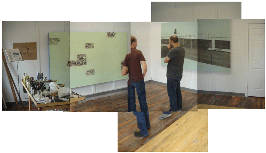

The themes that we chatted about sounded familiar. Gilad chooses imagery that is dark, that dwells on devastation and distress. We talked about how such conversations in Europe tend to content exclusive of technique and how it is al reverse here in the states. I asked about what Gilad thought about Mark Tansey and how his (Gilad's) technique intersected/informed the content that I perceived earlier. Is there a critique of humanity here? I asked him what is probably the most irritating question one can ask in the studio: what about that detrius that you are about to throw away, would you consider that art, a parallel project (I love the notations, the dwelling within of his prepratory sketches/gridded fotos)? Gilad was a gentleman as he answered with a generous positve.
Aaron asked about the time to produce each work, and did Gilad ever get the counsel in art school to be able to scale up and employ legions to produce work in size and quantity in order to shock and awe the artworld marketplace. Yes of course, Gilad said and he was wary about his apparent willingness to flout the unwritten mandate to operate a factory in the corporate executive manner. He couldn't imagine passing off the multitude of small creative leaps that occur between the gridded photocopies and the painting. For Aaron and I, the subject had become a worry stone that was passed hand to hand for 72 hours.
Quality time compressed in pulsed bursts. We called up Jim Butler and he was kind enough to pick us up to drive us to Ridgewood to see his new studio.

Jim shows with me at our gallery in Berlin, Andr? Buchmann Gallery near Checkpoint Charlie. Jim's practice centers on the creation of maquettes which he photographs and then paints that image in a loose yet realistic bravura manner. Recently, he has been hyper developing his maquettes, getting into glass and other exotic fabrication techniques at various glass studios on both coasts. He's become a Tim Hawkinson unbound, a world of material fabrication has opened up under him and I can't wait to see how his paintings reflect the intricate intensity of the discoveries he is reveling in lately.

Here, Jim describes how he makes the stands which prop up his maquettes.
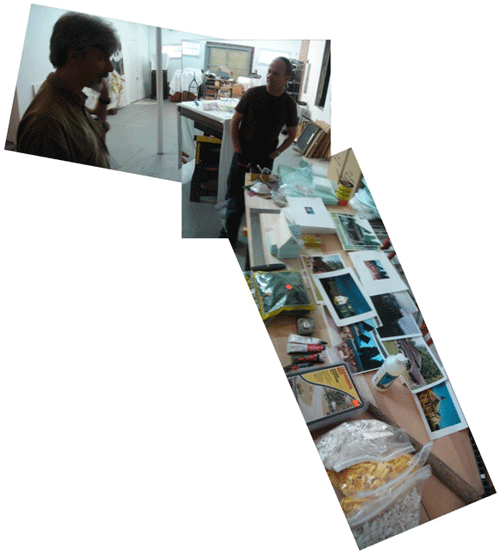
Look at his table tops. Jim arrays everything he has found so he can see them at once. Leggo parts that are made of a lost plastic fabrication, and he has more on special order from an obscure source. A model supply shop is in his neighborhood and he has kits to make waterfalls and model asphalt paved roads. He thought about modelling a conventional house, so he took his megapixel camera to shoot several prints of representative images. He spoke of hiring assistants to apply naive hands in order to reinterpret his research.
Talk about the atelier as factory! Jim has his personnel too, but they are all outsourced as vendors and suppliers or day labor with MFA's.
The density of information Jim delivered in that video is a snip of three hours that ranged from new material fabrication techniques to how the Brooklyn Queens area is gentrifying to the characters he meets who are in sole possession of lost knowledge.
My brain was beginning to jelly.

Afterwards, we hustled over to see Henry Taylor's show at the Studio Museum in Harlem.
(Sorry Henry, they wouldn't let me take pictures.)

On the way to Harlem, we stopped by Gagosian uptown to check out the Nate Lowman and Adam McEwen curated show "Beneath the Underdog". A perfect place to mount a historical survey of abject art, the corporate architecture of the Gagosian galleries was a suitable foil for a show such as this.
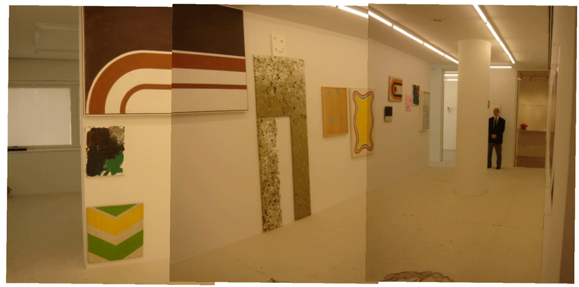
Aaron was interested in seeing the early work of Jeff Elrod, an old friend of his from the days back in the Core Program in Houston. Elrod's nascent artwork involved appropriating supergraphic paintings discarded in the trash back in the days that prefigured the contemporary preoccupation with fashion and hip edge.
I walked the galleries thinking about the Rosmund Felson show "Just Pathetic" curated by Ralph Rugoff back in 1990 just before "Helter Skelter"(A good short survey of abject art here). Abjection or Patheticism is no longer novel, its' history is long and pedigreed. The statement I read at the gallery desk was different from the press release you can download here at the Gagosian website. In the one I read, there was more of an exposition about the vertical (spiritual) and the horizontal (secular) and I thought about how historical the subject of abjection was becoming (can we all just move on now?); about how architecture was incapable of manifesting abjection, which illustrates a serious limitation (and ultimate nobility) of the kind of hippocratic oath architects labor under and how the general idea of the vertical/horizontal is also the armature of the political/cultural critique of the Left from the Right (examples here, here and here... not for the politically faint of heart, by the way.)

Most notable was the floor installation: a thick layer of sheet foam under a veneer of drywall. I don't know who the artist is, but I think it pushed the show over the edge into something remarkable. Try that, Frank Gehry!
No, wait... after five or ten years, the IAC Center will look just like this.


After all this, we rolled in to the Rental Gallery show late, and Joel Mesler's significant other, Allison Chernick promptly reminded us of our infraction with a sweet smile as we walked through the door. I think I'll let the video tell the story:
Later, Professor Winkler gave a speech to christen the event:

The inaugural show was a success after all; after all the doubts and backbiting by people who wouldn't let Joel evolve into another arena, another identity; after the self doubts and over analysis and too many minutes on the cell phone assessing whether it was crazy to take on New York; after all the talk in ChinaTown LA about whether Joel was making a smart move to the other coast, whether New York was over and incapable of providing a home for a young gallery; after the skepticism about the viability of Joel's iconoclastic business model that merges too closely with art practice itself. The question of whether Rental NYC would die in the cradle has been settled: the baby is alive and well, fingers and toes intact.
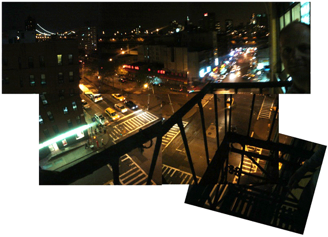
As we smoked the last cigarettes from my travel pack, a view of the city from the rusting balcony seemed to be an appropriate way to toast the ocassion. Thoughts of the many friends that I couldn't see or otherwise cram into the 72 hour schedule... a dull pain, and not in the arse it was.
And thoughts of how we would program the following day floated by. Oh, it'll be easy. Can we yet run into MOMA before we train back to JFK?
The after party: the bar we went to on the first night, this time packed twice as full of people, PS1 had their after party there too (what a distance!). More noise and shouting and great conversations. (Too much happened to relate here, the danger of slipping from journalism to gossip is an edge to be minded constantly. Time to move on....)

Aaron and I are perfectly matched as travel partners. He's too careful and I'm too careless. We ditched MOMA for breakfast with Joel and Phil around the corner of Rental Gallery, an echo of the morning coffee that we enjoyed in ChinaTown LA for so many years, keeping it real. Aaron was cutting the time down to the minute, and as we hustled back to JFK via the train, I was supremely relaxed, thinking that my flight took off after Aaron's. Aaron missed his flight by a mere minutes and lo, as I bellied up to the counter, I realized just how pathetic I am (Beneath the Underdog, indeed): I misread the flight information, mistaking the arrival time for the departure time. I totally missed my flight too!
We each returned home on later flights, by the way. The goof wasn't big enough to blow up the good vibe generated in the past 72 hours.
*(The answer to the Louie Kahn question: "...in compression...")
*2 (Postscript) I liked ending that section with the Oliver Stone line so much, that I'll add these second thoughts here:
Ouruosseff's reminder to Gehry suggests and assumes several things: that all you need is a strong idea and the details will take care of themselves, that Gehry's fine disregard for finish was intentional (probably so), that the appearance of elegance signals a dissapation of anarchic energy, that anarchic energy is synonymous with vitality, that the disregard he detected in the service stair shaft is different in degree with the rest of the building (much of the building is a folded curtain wall whose edges are gathered behind into his favorite service core like Balzac gripping his garment below his chin, his delight is the shabby way all the systems meet together). That's fine in a private realm, but as one approaches the public realm, there is such a thing as duty and service that binds service professionals, the very spot design and the fine arts diverge. Artists can live the dream, but architects (and doctors and lawers) cannot and should not confuse dreaming for living. It is the presence of that frame that helps keep the score ("Frame Narrative", indeed, Jason Meadows!).
I think the abject detailing arose as a virtue slavaged from the low price point advantage intrinsic to contemporary construction. I think it is the milk of human kindness to lift up your fellow man and spare them the gutter. I think artists and architects don't get along for this very reason. Artists have the license to sail over the edge, but if architects don't keep their feet planted in the ground, people might die... or live a degraded life. It's important to know when one is living and when one is dreaming --for to confuse the two, wretched insanity lies that way.
Contrairily, I remember a recent conversation with Mark McManus, a kind of architect who worked for Jorge Pardo and now for an old friend, architect Rick Corsini here in LA. Mark came from CalTech, an engineer and he jumped into architecture, designing buildings for Pardo's atelier. So Mark has a unique vantage point on the cats and dogs antipathy between artists and architects. Mark said that the problem with architects is that they fetishize their door details (a reference to the construction documents), that they have been derailed by the formalism of professional practice. Fair enough. The systems and processes of contemporary building do tend to acquire a life of their own, similar to Eisenhower's legendary warning about the military-industrial complex. Then again, it is our legal establishment which sorely lacks tort reform that has placed a critical stress on the importance of construction documents as a signal legal document that is instrumentally used to arbitrate disputes between owner and builder.
This is an age-old dispute, but I think much can still be done in bridging the parallel worlds of archtiecture and art.
Posted by Dennis at May 15, 2007 12:54 PM
Leave a comment