February 10, 2008
BCAM

I'm not sure exactly why Ed Ruscha wanted to burn the LA County Museum of Art. But I sense a kind of boggy mire that must come from the inevitable bureaucratic entropy inevitably associated with the grand and otherwise distinguished cultural institution that is Southern California's civic crown jewel. Try as they might, there is always something... less than magnificent about the art complex that is LACMA.
Well, as I like to say: Bureaucracy is the natural enemy of art. (I've just added Penny Aphorism #12.) This must be the ultimate source of the creep of mediocrity that keeps LACMA from shining as bright as it otherwise should. "Good enough for government work!" Even with the monumental efforts of building BCAM (Broad Contemporary Art Museum), even one of the worlds truly great architects was eventually sucked into the muck of mediocrity which for me sadly calls to mind John Fante's famous line: ?you pretty town I loved you so much, you sad flower in the sand, you pretty town ...?
No wonder Eli Broad reserved the bulk of his collection for his private foundation museum.
(Eli Broad delivers opening remarks at the unveiling of BCAM, LA County museum of Art .)
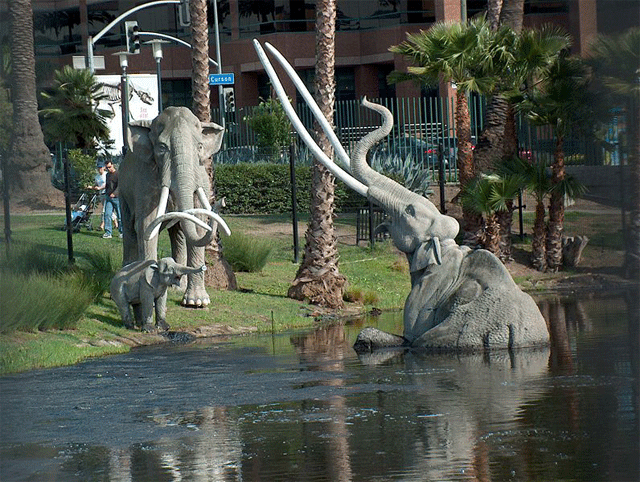
I don't mean to strike a corrosive downer note over the feat and deed that is the manifestation of the museum "campus" (their term) of seven buildings, a prehistoric bog, a park and twenty acres. The harsh aspect of this critique arises from the laurels of achievement that LACMA has justly earned thus far and the ambition by which it is tasked. LACMA is a good museum and it has a destiny to be a great one. This is why it must suffer a ruthless assessment. I think of exemplars such as the Smithsonian in Washington and the Metropolitan Museum in New York and and I would guess that it is the overwhelming force of a 230+ year democracy or the immense powerhouse that is New York City that helps these institutions achieve such an august stature and overcome the shabby curse of bureaucracy. So let this temper the harsh edge of this critique: Los Angeles is young. (I think LA is like a New York before the subway was built.) Despite the fact of California's high ranking in economic terms, there has not been an earnest reinvestment into infrastructure both practical and civic since the late sixties. In terms of diverse public/private partnerships that include British Petroleum, Target and Credit Suisse who participated in the creation of the LACMA campus, it bodes well as a example of what can and should be done in Southern California in the near future.
The particular contribution of the Eli and Edythe Broad collection is remarkable indeed. It is in fact a transformation of suburban wealth (Broad's Sun America and KB Home are both in the Fortune 500) into an extensive urban philanthropy. Indeed, the specific collection that Eli Broad is known for is so well done that the only critique that remains is that it appears all too complete, too much of a last word on the subject. Specifically, it is too complete in the telling of the story of the arc of the era known as postmodern art from Warhol/Ruscha to Koons/Hirst, the art of the 80's.
(Perspective alert: I see the development of art from the eve of the 60's to today as a forty year arc where art's mandate was to indicate everyday life through conceptual means. #2)
Therefore I find the various controversies over what Broad should or shouldn't have done with his property and his responsibility to Los Angeles or to the art world at large too tedious to track. The whole event is a great feat and a good deed, and everyone deserves an "attaboy" as far as I can see. But I did have high hopes for Renzo Piano's contribution and it was sad to behold the mire of the bog that for me has come to symbolize the whole evolution of the LACMA campus.
(Renzo Piano Opening Remarks BCAM LA County Museum of Art.)
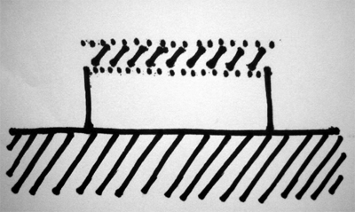
Initially, I fell under Piano's charms with the opening of the Twombly museum in Houston. Free of the partnership with Richard/Sue Rogers that created the remarkable yet garrulous Centre Pompidou, the Twombly museum seemed to me to reflect a kind of elegance of tech that was closer to aviation engineering. His expression of technological systems was tempered by Occam's Razor, nothing was designed that didn't serve the purpose of the building both functional and existential. The tech was hidden, even... the roof layer was a multitude, a bristling and vibrant machine whose presence was indicated only by the quality of light in the galleries and the occasional upskirt glimpse tastefully delivered. The rest of the structure seemed eternal. Overtones of Egypt. It appeared to be a promise of art history delivered in stone, concrete, proportion and stately procession.

(Click to pop up the parti.)
And Piano became famous for his parti: the eternal gallery and the tech frosting; the veritable sky, the kind of firmament that only pilots know, delivered in ambient presence within his architecture. So as I sat in the audience listening to the unremarkable opening remarks, I wondered about Piano's parti and how he would handle three stories of it stacked atop one another. I had hoped that the two floors weren't generic. But how could he have done it? How could one deliver one floor of galleries to the sky and deny that sky to the others below? There would not be any participation in this expression, no aire de Antoine de Saint-Exup?ry's, no Renzo magic below the top floor because the signature Twombly parti can only go so far... like a magnificent yet doomed jet in a high speed turn... before it disintegrates in mid air.
I was hoping to be surprised, another page in the Piano book.

(foto: Dan Hontz)
The first sign of trouble was the escalator to the third floor, the primary entrance to BCAM. Literally with the hum of people mover machinery, it was a solution chasing a problem that didn't exist in the first place. It was a massive poker tell of a bluff. Walking up into the entrance and down into the building, my fears were confirmed. The floors below were indeed anonymous architectural genera, the kind of architectonic blather one sees in office parks, shopping malls or somesuch building types. It was a copy and paste architecture, a formulaic draw from a pull down menu of anonymous solutions. Only the ceiling height and general proportions referred to a museum gallery. But to be fair, perhaps this is sufficient to the task. After all, these are the only qualities that artists tend to want in an exhibition space generated by architects.
Like the turn away from formal expression that architect Frederick Fisher made in the middle of his career --he said that he wanted to become a "merchant of light and space"-- this was a song sung to the hearts of artists all over the world. Artists and architects are famous for not liking one another, remember Robert Irwin's famous face eating scene with Richard Mier in the PBS special covering the creation of the Getty campus? Artists would prefer that architects get the hell out of the way, to not constantly steal the show, all the while stealing away a proper context for the presentation of art. Architects fundamentally don't understand why artists exist at all since it is architecture itself that is the mother of the arts... and mommy dearest isn't happy when the kids aren't quiet and behaving nicely. But Fred Fisher wasn't the architect of BCAM and Renzo Piano isn't a self effacing, ego erasing Buddhist. Piano can only get into trouble if he creates genera in architecture. Piano has a specific vision, and this vision suffers when it is not attended to.
And then there is the "spider".

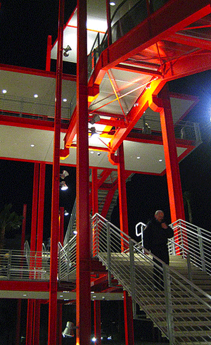
With the repeated flaccid references by Piano and various LACMA officers to the "spider" that is the circulation spine of the campus, there seemed to be an attempt to convey some kind of affection for the internal street that culminated in the escalator. It was as if they had to convince themselves and the public that the crawling walkway was the string that strung pearls. The creepy crawly name itself, the "spider", betrayed a lack of trust in the expression of the solution. Spiders spin webs and spiders eat what gets caught in them. All the red paint with which the "spider" was painted seems to be another solution chasing a problem that didn't have to exist in the first place. Perhaps the expenditure of 60 million strained the budget. Of course it did. Perhaps the circulation should have had a more robust presence. Yes. Perhaps the spindly sticks of I-section steel actually reflect the literalness of the characteristic line hatches of Piano's drawing style. Hell, yea. It was as if he had handed off airline cocktail napkin sketches to his lead designers as he zoomed off to the next fabulous client meeting (I recall I.M.Pei's famous generation of the solution to the National Gallery in Washington while flying coast to coast). It might have been better to evoke an urban street using paving stone, lighting standards, occasional seating, trees, vistas, crossings, water features (...since I am continuing this blogpost after a visit to Madrid, the Paseo de Prado/Recolctos/Castellana is what I am thinking of). But then again, what would all this have to do with the tech frosting that delivers the aire de Antoine de Saint-Exup?ry's?
Thinking of how to express other architectural features outside of the classic Piano parti prompts me to wonder how Renzo Piano could possibly extend his language beyond the tech roof systems that he is so justly famous for. Architects see buildings in terms of systems much like doctors do, in terms of nervous, digestive, circulation, and endocrine systems. Unlike his contemporaries such as Foster Associates who emphasize the extreme expression of engineering systems such as mechanical, structural and electrical, Renzo Piano focuses on broad systemic categories such as roof, wall, floor as the principal aspects of architectural expression which would normally contain the three engineering systems. Specifically, he has dwelt on the roof as an empire in itself, one bristling with the various subsystems meant to deliver the lens of light in the sky into the interior volume of the architectural experience.
My question to Mr. Piano: why not look into the other broad aspects of wall and floor systems for a capacity to do something similar to what you have done with the a tech thickened roof? Wall systems could become a lens which focuses and delivers the civic community. Floor systems could become a lens which focuses and delivers the earth and ecological context. Perhaps it is his genius that restricts his expression to the sky. Perhaps it is the central distinguishing aspect that separates him from his former collaboration in the Centre Pompidou, a move that broke him away from general techno-lust that obscures thousands of other architects.
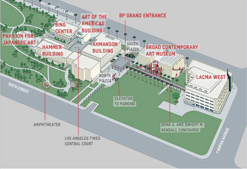
Therefore, in commissions such as the BCAM, it is important to negotiate the two forces that prompted him to stack his important parti atop two floors of genera: the need to enfront Wilshire Boulevard with an elevation that linked LACMA West with the rest of the Campus, and to clear the decks for the provision for underground parking and open green space that is the tattered remnant of the La Brea tar pits.

(Click and imagine spreading BCAM across the site like a hot butter knife.)
It's time to do our own design a la cocktail napkin. Let's imagine a Ranzo Piano solution that ties all these aspects together: A tall and narrow space that forms a facade on Wilshire, top that with a Piano tech frosting, flow the frosting in an angle to the north down toward the park and let that cover the rest of the program that is spread out over the former open space across the circulation spine, then tuck the parking under the whole program and then take the green space and feather that into the tech frosting in a way that merges people on foot into the Antoine de Saint-Exup?ry's firmament. Would it be possible to achieve a feeling of flying or floating as you approached the building from the park?
One can only wonder.
Posted by Dennis at February 10, 2008 6:02 PM
Leave a comment