September 27, 2010
Simmons & Burke at Michael Kohn Gallery

The artistic team known as Simmons & Burke just opened their show at Michael Kohn Gallery last week. We are all represented by Michael in Los Angeles, and I am happy -to say the least- to be in proximity with talented folks with something to say. I wanted to lay out a few thoughts that I had about their new work and the installation of their show, the design of which deserves mention, even in this information-aged environment of ours.
This note is just a diaristic scribble, not the normative critical presentation of their work, a proper art review, a premonition of which you can witness in this Wired.com article (fotos of the artists themselves at the link, by the way). To ease the descriptive task a bit, here are the first three paragraphs:
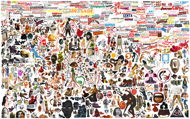
To produce the dense, hypersaturated art pieces seen in their new exhibition, two artists googled the web, scoured fan forums and browsed Flickr accounts to round up 5,000 images for a single collage.Later on in the article, Wired clarifies that what they are culling are both images and audio samples, a point that cannot be sharpened too finely. The intensity of image and audio beg some kind of mapping of one to the other, a task too difficult for my abilities here. But I wonder... is their a synesthesia or somesuch going on? The only way to find out is to hang out for a day or week with the headphones on, eyes agog. Should we expect something like this or bigger from these two artists in the future?The duo, who work under the moniker Simmons & Burke, then assembled their visual plunder into the eye-popping print, pictured above. ?We like the idea of making a Frankensteinian world that is both overwhelming and quieting,? Case Simmons and Andrew Burke told Wired.com in an e-mail interview.
For their new exhibition If Not Winter, which goes on display Thursday at Michael Kohn Gallery in Los Angeles, the pair appropriated about 15,000 images from a vast trove of sources. ?We use all sorts of sites and forums to discover images and samples on the internet,? they said.
All positive adjectival attributions are well deserved of course, but what I want to focus on in this blogpost is the design of their show. The image above is titled "B-Movie Palette", a work that I thought would be best to lead this blogpost. The piece is mounted on the left as you enter the first room of the gallery, and I think it is a sort of skeleton key to their current state of evolution of their collaborative project.

The work occluded above is is titled "If Not, Summer". That two people are silhouetted in the foto above is a happy accident for this blogpost because the first image arranged in the show is of an image of a human figure cut out, revealing a red-orange background, making strange a foreground resembling mud or clay. It is positioned immediately to the right as you enter the gallery. This piece is small, modest, tucked away... but yet a prime signal of the artists intentions. It is a primeval act of collage in arrest after the first cut. It is a pirate flag. Is it also the bite of the apple before the fall? It must be the redness of the show that curries this association for me.

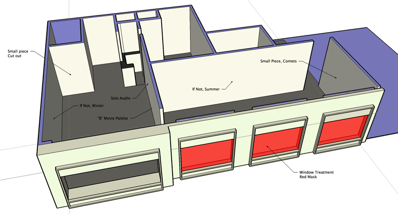
The panorama above tells the story... and if it doesn't, the image of the gallery model below should lay it all out nicely. What we have here are two rooms, the central one is crowned with "If Not Summer" in three parts, something like a triptych splayed apart. Diptychs and triptychs bring my mind to historical European painting, specificallythe Hieronymus Bosch room at the Museo del Prado in Madrid.

In terms of the design of the show, the position of "B-Movie Pallette" and the small figure cut out (I don't have the title on hand as of this writing) tells us that Case and Andrew are widening their public offerings to include aspects of their medium that normally swept away as they mount their "A-Movie" project. Isolating the figure renders shards, heaps of them. Art is about paying attention, and I can identify with their ambition because I too often notice that sometimes the best things in painting are what's left behind on the palette... and the task is to capture them on the stage in which I would want to present as art: the painting proper. In their practice, they normally use an image file that they call a palette in order to corral the images that they cull from the internet. I can imagine that one day as they were combing through their palettes, they must have stopped and said to themselves: "Damn, that's nice."
If you can indulge me dear reader, I'd like to recall an earlier blogpost describing a similar idea discussed in the context of visiting Copenhagen artist Javier Tapia earlier this year (you should check out his site, he has images of his cave installation completed last spring):
Javier took me to visit his studio at the Royal Academy. Several floors of studio spaces were secured by guards and accessed by key punch locks. The warren of working spaces looked like any art school, the good ones. I was dazzled by the breadth of Javier's investigations, by his willful spread into multiple simultaneous media. He had been painting, to be sure, works of facture delivered with a fond disregard. I could identify with the wellsprings of his inspiration in painting: there is a moment when you realize that the best mark is not the one on the canvas but instead left behind on the tool or palette. The trick was to get that particular mark -or anti mark- onto the surface of presentation. What is different between his painting practice and mine was that I tended to domesticate the wild mark, or to find a negotiated position between each, to try to counter-balance both ("through contrast, one becomes conscious")... Javier, by contradistinction, wanted only wildness on his canvases. An interesting proposition!Well, there you go. Three points make a plot.
Redness. This color is a lead actor in their passion play. It brackets the central piece, "If Not, Summer". The windows of the gallery are given a red treatment of adhesive plastic film. Hollywood calls these kind of things, "gels". In the afternoon, the light in the central gallery is flooded with rose colored light. To the left as you enter and before "B-Movie" is a set of headphones and an unspoken invitation to enter aural space. I will have to return to plumb its depths, I cannot describe what that world is like. But this is what is plain to me: the first room and the design of the show in general, the artists' project is splayed, an anatomy lesson, a crucifixion, Rembrandt's flayed cow, Soutine's rotting chicken nailed to a board, blood let and running out. Redness.

On the right as you enter the first room are several pieces co-joined even though they were conceived separably. They are titled "If Not, Winter". They each are -as I understand it- a different kind of collage, or maybe not one at all, a super-superposition of images laid one atop the other. How they are done and what decisions that govern what is hidden and what is permitted to prevail, no one can tell... or then again one can plainly see But what I see with these pieces is an ambition to take collage to someplace strange. This, they have already done with the work that we have come to know. What is impressive is that they are actively seeking other dimensions of it, an art practice called collage brought to a boil, a wringing of something more than information from our own vaunted, notorious age.
Leave a comment