April 22, 2014
Museums of Art
There has been some debate about museum design recently. The discussion ranges from MOMA's impending sacrifice of the lamb, to the anticipation of the New Whitney Museum and if they might have learned something about the needs of exhibition spaces after the era of Marcel Breuer, to Paul McCarthy and Mike Bouchet's Oh-so-delicious LOL ROFL send up of Frank Ghery's Bilbao Museum.
It all boils down to this: artists think that architects are assholes, preoccupied with an urban scaled formalism and that they give the artists the hindmost when it comes to the design of the exhibition spaces... architects think artists are over sensitive prima donnas, that architecture is the mother of the arts (therefore, what much can mama learn from the children?), that artists will adapt to what they are given anyway, and there is ultimately no way to please them.
Both are right to degrees, but when you clear away the egos, it is true that museums have adapted to a wide array of previous uses. The Reina Sophia in Madrid used to be a hospital, the Geffin (they sold their previous name cheap, the Temporary Contemporary) used to be a warehouse, the Tate a power station... So, what about the design of a museum qua museum? Louis Kahn drew a singular section of an art experience and extruded it. Renzo Piano did well with the Menil and the Twombly museums, compressing his Centre Pompidou experience into the roof plane, a thin sandwich of technology controlling light and weather over walls that instead recalled an architecture of eternity, in his Twombly Museum certainly, walls and detailing suggestive of antiquity.
And then I saw his Broad Museum(LACMA)in LA, and was disappointed especially in the multistory half, where the technology spilled out over the pathways willy-nilly and the poetry of the thin tech roof was bloated and slapped on top of a layer cake of floors, rendering the floors below unable to share in the glory of a mediated sky ceiling, made even more evident by the struggle of many escalators to get the visitors to the top floor, the only floor that benefits from the technological light controlling lid.
I'm eager to see the new Meat Packing Whitney Museum next year, I hope that Renzo Piano will pull it off, but from this distance, I'll bet that he has already lost the plot. It seems other people agree, but for different reasons. Aaron Betsky called the new Whitney boring while its still under construction:
The building turns its heavy haunches to the small, mainly brick structures of what used to be the Meatpacking District. The area has become gentrified at a speed and with a lack of inventiveness that is extraordinary, but it still has a scale and texture that offers a welcome respite from most of Manhattan's increasingly rigid and large blocks. The new Whitney, which may be completed sometime next year, will have nothing to do with that. It offers a small set of doors--cowering under a cantilever--to the city, turning its large glass instead towards the ticket-paying patrons' enjoyment of the Hudson River and New Jersey. The architect, Renzo Piano, Hon. FAIA, claims that the lobby's slope will let you see the river from the High Line. If you crouch down and squint, that might be true. The rest of the building is a block with a few nicks and tucks, clad with grayish brown metal panels. I am hard pressed to say anything about it other than that it is big, badly proportioned, unrevealing of anything on the inside, and dull in its appearance.
See the concerns of the architect? From his account, the building didn't further define the remaining graces of the Meatpacking District, the scale of the buildings and the texture of the streets. It almost ignores the welcome mat for the neighborhood, the privelaging of the view corridor of the river through the site and mass of the program is strained without enough effect. It's form is insipid and overly deferential, not even a Breuer's crystallization unbound, much less deconstructed.
So what about the POV from the art world? Jerry Saltz had something to say about the Queens Museum and museum design in general:
Davidson: So you think people will be attracted just because it's new? What happens when it's not new anymore?
Saltz: You know, things have gotten so bad with contemporary museum architecture that I almost don't care anymore what the outside looks like. The single most important thing is how the interior space of a museum works or doesn't work for art. Can you tell me why architects love huge, open, useless vanilla spaces? Instead of this soaring, double-height atrium, the entire second story could have been used for art or cultural artifacts or whatever the hell this museum might want to install. Why do architects give us such terrible space for art?Davidson: I don't always agree with you on this issue, but I do here. The architects at Grimshaw have tied themselves in knots to express the idea of openness. That means lots of glass, high ceilings, few walls, and plenty of space unencumbered by, you know, art. It's the loft principle extended to institutions, and I find that incredibly literal. The Metropolitan Museum is none of those things, yet it's plainly welcoming to everyone. MoMA follows all those rules, and it feels forbidding. What makes a museum open is when admission is cheap or free. Other than that, I think you can go to town putting up walls, and people still aren't going to feel like they're in jail. If what you want is a place for kids to come in and start drawing or making things, then do you really want a huge atrium with polished concrete floors, so that yells of glee go ricocheting around like trapped birds?
Saltz: And what's with that idiotic space-eating twisty staircase? And the obligatory glass-skywalk thing?
I started wondering, just what is the ideal museum layout?
For artists?
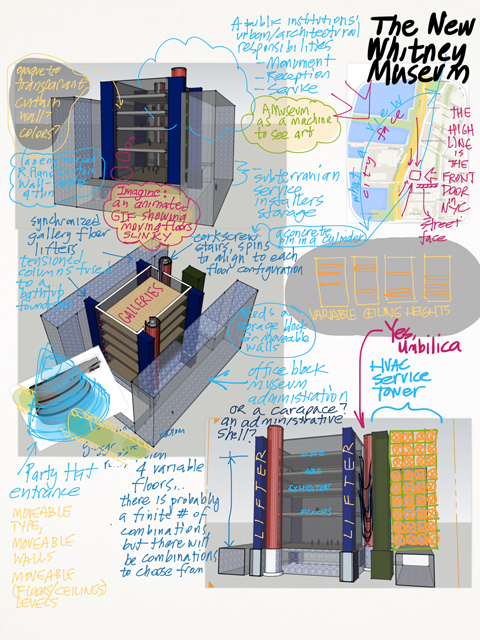
The vicissitudes of artists' adaptation aside, why not a museum that adapts to artists, instead? Why not an architecture of vicissitude itself? It would be, shades of Le Corbusier, a machine for art exhibition. It would be stage, backstage, flys, wings, pits and dressing rooms. It would configure and reconfigure itself for every season. It would be a mechanical device that envelops it's function, an oven or microwave that cooks and predigests our dinner, a Mechanno Museum.
Of course, the ultimate Mechano Museum would be a containing volume and a quantity of Utility Fog. Utility Fog, a cloud of atomic-tiny robots that hold hands and configure the interior space at will. Until that day comes, we will have to satisfy ourselves with Gundam Robot Architecture. At every corner of the volume, there should be a spinning drum of stairs, so as to meet landings to the new levels. The exterior faces of the volume could be a kind of curtain wall skin that can be dialed opaque, transparent or in between, with images either projected or LCD'd like Blade Runner. Also at each corner, two crab-like hydraulic arms that hold a basket so that artists can reach the out side surface of the volume. Inside the volume, three or more floors move into different level configurations, moving up and down in concert. Temporary partitions could built as needed either for each show, certain standard dimension walls could be warehoused in the design.
I was wondering how Renzo Piano could have developed the wafer-ization of technology, he put it into a roof plane, what about the walls, the floors? How thin can it get? Louis Kahn mechanized the floors of the Salk Institute, every science floor was a thick service deck. What about thin service decks? How about curtain walls with not only with chameleon skins, but with transparent HVAC ductwork that branches arboreal throughout the view? And while we are building a fine castle in the clouds, how about crystalline pores a la Jean Nouvel's Institut du Monde Arabe, but small, like the pores in our own skin.
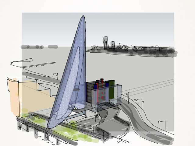
As I was fiddling with the drawing in SketchUp, I tried to fashion an entrance in the pattern of an upside down Guggenheim bowl or a DEVO hat. SketchUp is as simple and plain as you can get in CAD programs, but I became an architect in the years of pencil and paper, so that even using a SketchUp tool as simple as "Follow Me" has its challenges for me. In a flash of a trackpad, my attempt to create a cone fell short and this crazy Calatrava-like form resulted in the drawing below. Well, alright then. I made a mistake and called it kismet. Jerry, here is your obligatory glass-skywalk thing. I'll work in the idiotic space-eating twisty staircase part later.
Fascinating discussion. The philosophy of architecture goes far deeper than superficial art talk. But of course art and architecture are always together- except in land art.