May 30, 2015
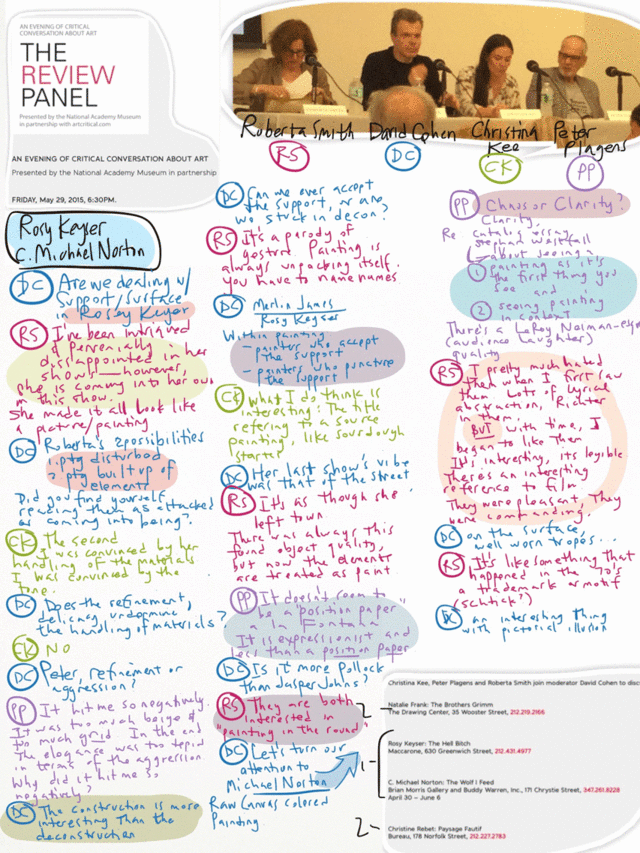
Review Panel 5/29/15

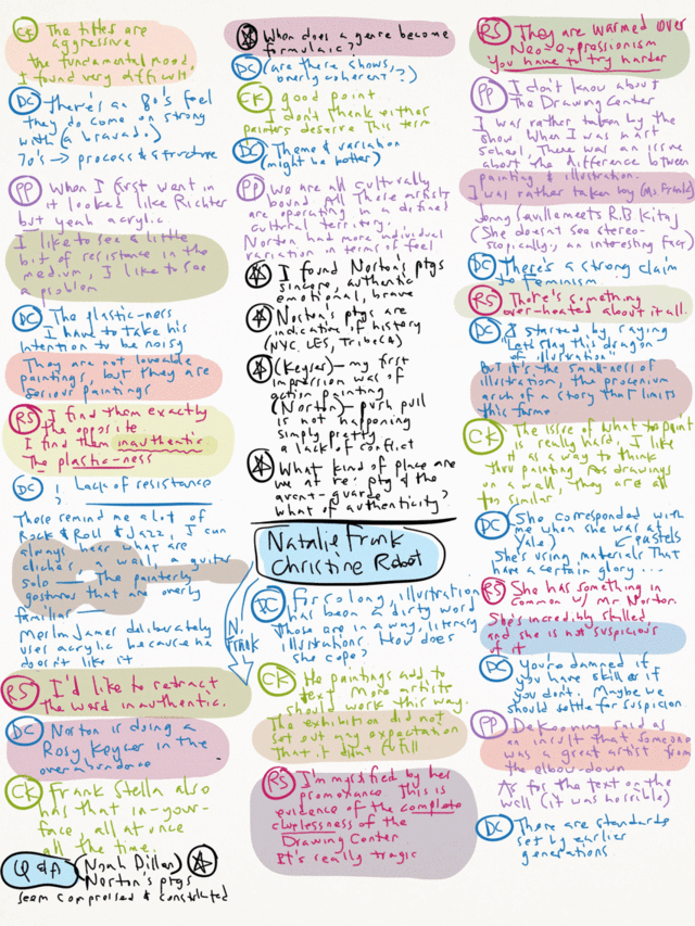
David Cohen's Review Panel just had their final event for the season last night at their host, the National Academy Museum adjacent to the Guggenheim and Central Park. Review Panel announces beforehand a group of shows that will be discussed, three critics other than Cohen expound on their impressions of the exhibitions in front of a live audience, who have had the opportunity to see the shows for themselves. I really appreciate the Review Panel, it's one of a kind, a special opportunity to hear a whole range of art critics as they expound their views live in person, both demystifying and humanizing them. While David encourages debate and any heat would be appreciated, conflicting views clash civilly and usually with humor, all of which imbues the event with an over riding concern for penetrating the intellectual heart of the matter, free of any egoistic grandstanding or academic point scoring.
(Here's the link to their YouTube page for the archive.)
I took three pages of notes this time, a record so far, they follow below the break. Here are my own thoughts about the exhibitions discussed last night, interspersed with the notes:
Rosy Keyser: The Hell Bitch
Maccarone, 630 Greenwich Street,NYC.
There has been a revivification of painting-as-art-material-to-the-bone in the past ten or fifteen years. Every art season and art fair have a few artists who shred and apply the plasticity of paint down to the wood and fabric of the support. Every time I had seen the stretcher bars and cut canvas, I thought of Robert Ryman, who extended art material status from the paint to the canvas, stretchers, staples and even the mounts to the wall. Locally to NYC, the Supports and Surfaces show has the privilege of owning the flag planted on the hill of painting unbound. In the Keyser show, I saw a possible Fabian Marcaccio alternative future where he had come down to earth. And of course, there is the Ur-deconstructor, Fontana, which every artist in this tradition must show deference. What Keyser has to contribute in this show are the dregs of diminishing options for painting in this tradition, so she is turning up the volume. But is the volume control knob turned up high enough? Are there enough click positions past ten? The press release is full of sound and fury, and like smack talk, you had better be ready to back that shit up. But standard commercial art supplies are insufficient to the task, they are meant to literally support, to let another take the stage. Freed of this, what dimensions could a stretcher be? Fabricated from 2x12 lumber? Should the canvas as wide as buildings, should they be made of sails? What tool could be used to shred the material? An industrial wood chipper? All of these suggestions might be absurd, but the verbiage ("Hell Bitch", remember?) in the press release seems to promise such extents, and when it falls short, the little Stonehenge from Spinal Tap looms like a condemning ghost in a fevered dream.

C. Michael Norton: The Wolf I Feed
Brian Morris Gallery and Buddy Warren, Inc., 171 Chrystie Street,
I shuddered as I saw aspects of my own work in this show. The masking and concomitant attention to edge, the bravado application of paint, the primary colors, the embarrassment of unreflective manly virtues, the in-your-face assertion of the glory of paint. No, I'm not like that. I hope that I am not like that. No, I am not like that. What is not there in Norton's work is a delicacy in counterpoint to the boldness, an implication of drawing in the masking -a kind of drawing that lightly plucks the strings of visual language, of primary colors that are pushed via the entropy of mixing toward dissolute mud and arrested in mid-flight, of self doubt balancing confidence, and finally, an existential condition of paint in a state of glorious fragility. I was turned off by the untempered brashness in all directions. I found it hard to linger in the exhibition. I was eager to leave.Natalie Frank: The Brothers Grimm
The Drawing Center, 35 Wooster Street, NYC.
Gouache underpainting, pastel rendering, ink or black gouache detailing. A book of illustrated fairytales is made available, and one can see how the camera amplifies the aura of the illustration by collapsing technique ever so slightly. I immediately thought of great artists as I looked at Frank's works on paper. Names such as Ensor (sparked by her rendition of faces, skulls, eyes), Goya (sparked by the dreamlike nature of her subject, bringing the Caprichos to my mind), Daumier (overtones of social commentary), Beckmann (the claustrophobic compositions)... but each and every time, after a very short time, her work withered with each association, damned by the conjured spirits. Could it be the problem of illustration and it's long lived inferior status? Jacob Lawrence Migrant series could be called illustration, ditto Goya's Caprichos and Daumier's political cartoons... but mostly, each are also the author of the content that they render. This could be a key distinction.

Christine Rebet: Paysage Fautif
Bureau, 178 Norfolk Street,
Bureau always struck me as if it were a university gallery, this show complied with this characterization. The obligatory genuflection to Saint Duchamp was signaled in the press release, I was interested however in the suggestion that she was running Marcel's project in reverse (a pet idea of mine, running artist's programs backwards), something about machines generating secretions / secretions generating machines. Perhaps I should have lingered to study the work more, but I saw little of this in the show. I've seen a few painterly expressions in film recently (it's hard to cite them all at the moment, but trust me on this), where artists treat emulsion and film like fluid paint on canvas. It's hard to know if this is a precursor or if the artist is following what might be a trend. I came away with trivial thoughts about how to rearrange the show for a larger impact: to mount the film presentation as a proper theater in the back room and gather all the works on paper (were they generative or were they products for sale to support the making of a hard to market film?) in the front gallery. I left the gallery with a vague impulse of getting to the student union for a bite to eat before philosophy class started.Posted by Dennis at May 30, 2015 6:39 AM
Leave a comment