June 13, 2020
ReZumthoring LACMA
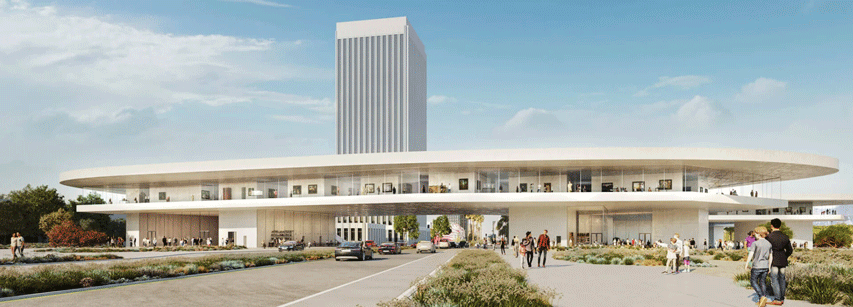
During the pandemic lockdown, news began to filter about a quiet demolition of historic elements of the LACMA campus:
In April, while all but the most essential workers were home under shelter-in-place orders, demolition crews began tearing down the three structures by LA modernist architect William Pereira that were part of the original 1965 scheme, as well as the never-loved 1986 addition by Hardy Holzman Pfeiffer Associates. As of last week, the museum's Bing Theater reduced to a pile of debris.Now, these aren't such stellar historic structures, iconic civic jewels such as the Tower Records building or Union Station or the Hollywood sign, even. It's inevitable to wonder if there wasn't a softer option for its director Michael Govan. Charting the way forward for one of Los Angeles' premier art museums is tricky business. Consider the numbers and general situation. The Pereira building needed asbestos abatement, which is a monumental exercise. It's of a scale that itself would provoke a complete demolition and redesign to follow in suit, instead of renovating the shell of a building that remains after that process. A classic good money after bad.
Even before the construction crews enter the campus, LACMA was already staggering $443 million in total debt. Imagine if you were the director facing this situation and charged with charting a path forward. Apparently, Govan's solution is to build an epic design of a replacement building, of such star power that could attract enough contributions in fund raising to overpower the liabilities and cost of construction. Easy, right? Not so fast, architecture will take you to the limit, in patience, temper and budget, it always does. Preliminary cost estimates range between $650-750 million. The final numbers always dwarf the preliminaries, I'd say that planning on double the initial estimate is a rational frame of mind in almost any architectural project. We're in the well over a billion territory and counting.
[Jump cut to Howard Ratner in Uncut Gems. Most of the ruling class must be exactly like that character.]
So, the gamble is a billion and change in dollars. Maybe two. As the director, you have to find an architect to pull it off. Govan chose Peter Zumthor, not the most well known name at the time of the choosing. An exquisite sensibility. He is well respected in architectural circles for projects that were tiny in comparison to what is about to go down in Los Angeles' Miracle Mile, smack dab within the La Brea Tar Pits. What ominousness overtones! LA's boom and bust Day of the Locust and "It's Chinatown, Jake." Miracles, indeed. And pools of upwelling crude that have drowned struggling creatures for millennia. The whole prospect is as scary as it is enticing.
Cat nip for architects.
Cutting to the quick here, my critique is that Zumthor delivered a lazy cartoon. I think that LACMA is better off left as it is for the time being... for this generation at least. The asbestos is best left undisturbed until LACMA pays off existing debt and stores up enough energy to take on the ultimate obligation of rebuilding itself. But Govan pulled the Cortez option, there's no turning back now.
If you're going to revamp the exhibition program, then try to swing for the bandstands. If you're going to make an icon of the tar pits, don't extrude a doodle. From the g-d's eye view of an architect standing over a plan, Zumthor drew an outline of a pool of liquid and initially colored it black. Levitate the squiggle a couple of stories over the site to evade the problematic sticky ground plane, extrude and BOOM, you have a world class museum to pull off in LA what Gehry did in Bilbao.After the phenomenal success of Gehry's design for the Guggenheim Museum in Bilbao, Spain, critics began referring to the economic and cultural revitalization of cities through iconic, innovative architecture as the "Bilbao effect". In the first 12 months after the museum was opened, an estimated US$160 million were added to the Basque economy. Indeed, over $3.5 billion has been added to the Basque economy since the building opened. In subsequent years there have been many attempts to replicate this effect through large-scale eye-catching architectural commissions that have been both successful and unsuccessful.
A Bilbao Effect is a flash which is destined to fade as the world rushes to imitate in diminishing resonance. The Big Bang and Heat Death over and over again, turtles all the way down. Contextual circumstances are instructive. Bilbao was challenged with shifting from a declining shipping industry to another better horizon. Tourism in Spain garners between 12-25% of their GDP and the decision to choose a starchitect to reestablish Bilbao on a cultural tourism industry made a lot of sense. The sensibility, history, and European context of the Basque people and post-Franco Spain was a most unique context. It takes more than an architect superhero to pull off another Bilbao Effect.
A constellation of factors aside, let's examine LACMA's new design. Zumthor's elevated planar squiggle forced the program into a tightening lasso.
...announcements by Michael Govan, director of the Los Angeles County Museum of Art, were always reassuring: don't worry, the new structure replacing the four existing gallery buildings on the East Campus would equal their total square footage, though the gallery space might be a wee bit smaller.A single floor, the design relied on an undulating glassed perimeter which imposed huge limitations on the exhibition program. Art work must be arrested in time and entropy and even ambient indirect sunshine is a conservator's ulcer, limiting what can be shown on the walls, that are all facing a view that over-competes for the visitor's attention. Light controlled exhibition environments are the square footed remains of the plan minus the corridor belt, the "nucleus of the cell", as it were. Add to the list of constraints, the thickness of the plane itself, in compliance with the extruded puddle doodle, a uniform ceiling height regimenting all exhibition spaces.Then the bombshell exploded: the Final Environmental Impact Report (EIR) released in late March slapped Angelenos to attention when they learned they would be paying $650 million to get a building that would be 105,108 square feet smaller than the originals, with 53,000 square feet less gallery space.
All of these issues are not-so-insignificant irritants, but the biggest has to be fact that it will be a smaller building than the one it will replace. How to deal with this shortcoming? To increase the performance of a museum gallery, we can't use a turbo charging concept since super-compressing a volume of people is inhumane and a travesty to art. Instead, the idea is to overclock the exhibition schedule, speed up the rotation of exhibitions and flow more people through the turnstiles. This reminds me of what happened in fashion in the past thirty years where the yearly season cycle went from four to five to -fast forward- past twelve. The effect on the fashion industry? It's called "Just-in-Time" design and manufacturing, a hamster wheel from hell where creativity is shrunk to the limbic and the twitch response is amplified fearfully. Map what happened in fashion's design offices to what will happen to LACMA's curatorial offices, if you will.
This is becoming a tirade of a critique... but hey! I'm just getting started.
Both Peter Zumthor's LACMA and Richard Meier's Getty Museum share something in common. Both faced pressure form their clients to fundamentally subvert their designs. (I will leave the question as to whether their careers were subverted, like a loaded pistol on a tabletop.) Meier's entire oeuvre up until the Getty project was based on an architectural dictionary derived from Le Corbusier's Villa Savoye. In 1920, Corbusier published Toward an Architecture, unleashing his famous quote "Une maison est une machine-à-habiter" ("A house is a machine for living in"). Meier made an architectural canon from this, a catalog of machine components recombined into a career of projects which branded him quite effectively. When the day came that Meier's Getty clients insisted on a switch out from his typical white anodized modular metal exterior cladding, he should have smiled and said no. Yes, like Roark did... and not particularly for Randian reasons... but yeah, like that. The same goes for Zumthor, who was asked to switch out the initial bitumen black finish he first envisioned for... what I imagine he thought was something more SoCal: desert beige. (SoCal is a multitude of microclimates, actually.) You see, the only quality that could have possibly allowed his doodle to fly was an inky petrochemical blackness, which should have been everywhere, maybe even inside the galleries and parking garages, the sun and the world be damned. But no. This was not to be. The color change, doubly untethered to the subterranean tar pit site of inspiration, sent associations to other places... to the freeway overpasses, unfortunately.
So, what to do?
Well, I can imagine an alternate future. What if we could go back in time after the Govan meet up, when the roll of tracing paper first laid over the site plan? What if we ReZumthored LACMA?
Let's do it.
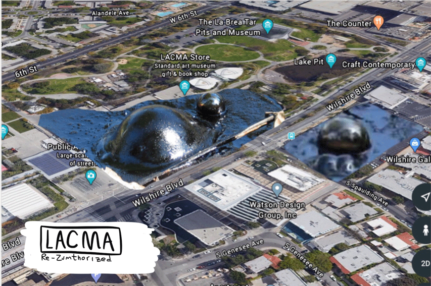
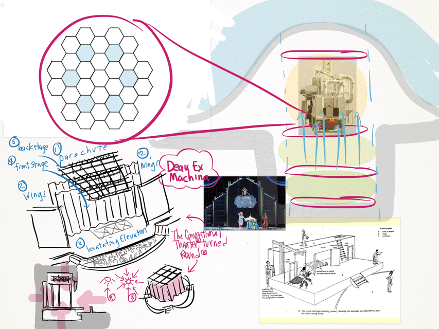
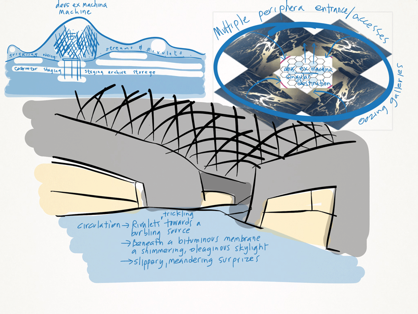
Ladies and gentlemen and everyone in between, I present an alternative LACMA design. The allure of the tar pits is too strong, sending us towards an allusion of the art world itself. Quicksand and sticky bitumen of oblivion, the pickled archive of mother nature as the ultimate conservator, the upwelling of memory, levitating gasses of curation, entropic time arrested, a nearly combustive atmosphere of curatorial swamp gas... There his no way to go in reference to this mother load of contextual associations but directly into eye of the hurricane of verisimilitude. Abstract any distance less and the result would be Just Pathetic.
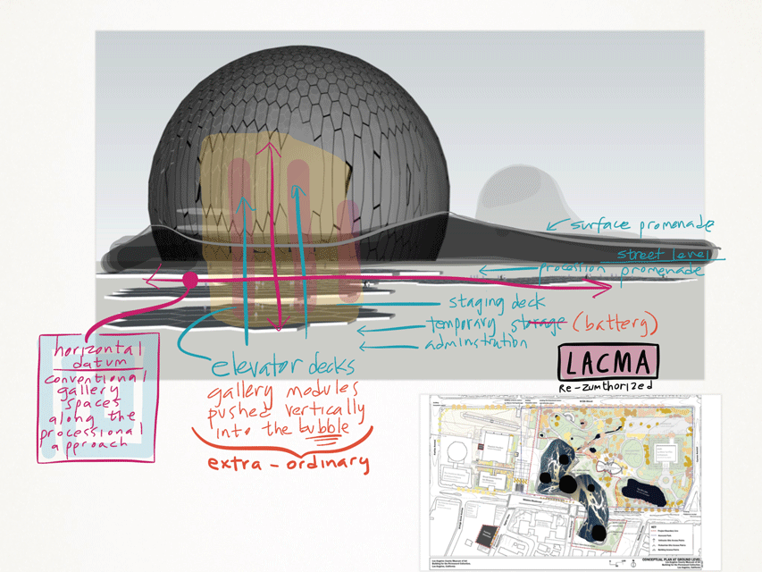
Let's use the Bilbao Effect. Let's employ the eye catching star of the show main exhibition space and express it as a machine for showing art in. Go for it, a
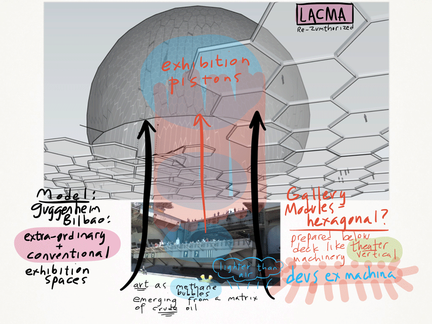
The parti for the ReZumthor is geometrically roughly similar, except that there are multiple nodes, one centrally large with smaller satellite exhibition spaces in the surround. Instead of a material accident, drainage. Rectilinear galleries framing double loaded irregular corridors all trickling towards the sinkhole where art erupts. The procession in circulation spaces are slippery meandering rivulets trickling towards a simultaneous burbling drain and upwelling source. All this beneath a bulbous bituminous integument. A shimmering oleaginous membrane, swollen with imaginative surprise.
Via Ben Davis:
In the 1966 essay on "The Historical Function of the Museum," the art critic John Berger recounted a scheme proposed by an unnamed "French curator" in a then-recent book. "[T]he museum of the future will be mechanized: the visitors will sit still in little viewing boxes and the canvases will appear before them on a kind of vertical escalator. 'In this way [the curator wrote], in one hour and a half, a thousand visitors will be able to see a thousand paintings without leaving their seats.'"Posted by Dennis at June 13, 2020 6:27 PM
Leave a comment