September 29, 2012
Meanwhile, in Spain
Here's the view from a Yanqui expat in Catalunya, a blog called Lost in San Cugat:
Catalan nationalism gets seriousI?ve been generally skeptical about the benefits of a sovereign state for Catalunya, but I think there is a good chance of something major happening in the next year.
What the economic downturn in Spain has proven is that the system of autonomous communities is not a real devolution of powers, as long as Madrid can dictate the budgets that the autonomous communities have to abide by. Supposedly Catalunya runs its own health care and education, but then what the fuck is Madrid doing telling the communities how big their classes are and whether they can treat illegal immigrants or not.
Combine this with the feeling of powerlessness by being rules by a political party that has essentially no support in Catalunya, which is also run by the political heirs of Franco (like who?s brilliant idea was it to put bullfights on public TV again?), I can see why people here wonder about the benefits of being part of Spain.
Since referendums on independence are essentially illegal, Artur Mas has turned the snap election itself into a referendum on nationalism, which is at this point is a no-lose proposition from him. It?s likely that he could even get an absolute majority, which would make his job significantly easier.
So how does this end? When people talk about what the army might do, it?s not entirely flippant, since Catalunya has its own police force, who is going to take Artur Mas to jail for ignoring the Spanish Supreme Court? These are all mutually-assured-destruction scenarios, so I?m assuming that where things would end up with is some kind of federation model (and it?s not like Europe doesn?t have any other weird half-nation states like Monaco, Andorra, etc). However, the likelihood of a Spain run by the PP giving up fiscal control of Catalunya seems vanishingly small as well.
My feeling is that this is going to get much worse before it gets better. Of course, none of this solves any of the real economic problems that Spain is suffering from, and is unlikely to help anyone, but Catalunya wants spend its energy declaring its part of the deck of the Titanic as sovereign territory (no touching our deck chairs!), who am I to complain?
September 24, 2012
SPURA LES

Ok, so here's the deal: From what history of the Seward Park Urban Renewal Area (SPURA) that I could glean from the internet (here, for example) there was a concerted effort in the early 60's involving NYC government, various union organizations and leadership characters such as Abraham Kazan and Robert Moses were responsible for the urban redevelopment of the Lower East Side (LES). And so what we have in the LES at this time is a melange of classes and cultures that endow this particular part of Manhattan with its unique character. SPURA was begun but not completed due to various interest group infighting, leaving behind the largest undeveloped site in Manhattan for fifty-something years now and counting. As you can imagine, the strategy of using the urbanism fashionable at that time, the tower in the park solution popularized first by Le Corbusier and his Ville Contemporaine, but over the years the tower in the park scheme (and Le Corbusier himself, by the way) has been discredited first by advocates of human scale in urbanism such as Jane Jacobs and later by critics of mass class aggregation in housing, the icon of which was Pruitt-Igoe.This year, NYC is moving ahead with the completion of SPURA, the development plan is being approved through the layers of city government and soon the mayer is expected to give it the green light.
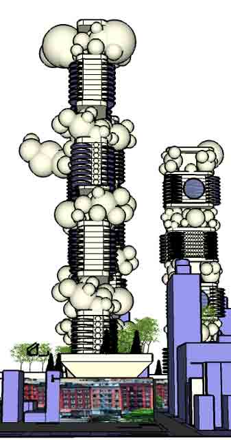
This introduction is as compact as I can shape it, but suffice it to say that the history and issues in urban planning, sociology and architecture inherent in SPURA are complex, controversial and deep. Into the depths, I couldn't resist splashing about with a few ideas in the form of a loose schematic design that is an attempt to sort and fit the various puzzle pieces together into a proposal for what to design for SPURA in the LES. What you will see here in this blogpost is the equivalent of a sketch on a napkin. I used SketchUp to hammer it out, the forms rendered here are meant to be read in the most general, hypothetical terms. For example, I lifted the Essex Street facade from Google, trimmed it, and pasted it on the substrate street blocks to convey the general intention in as few strokes as possible.
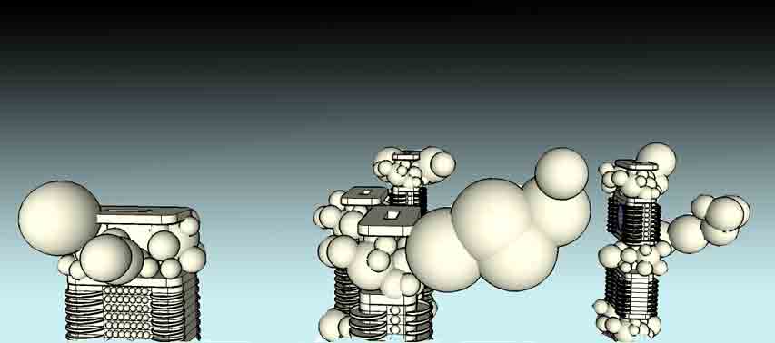
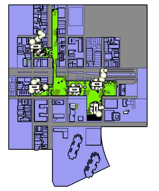
A few notes:
1. Mixed use, super mixed use. The idea of mixed use development is normative today, even though there is some resistance from some quarters in the LES, such as a low income project counterproposal floated recently. I'm suggesting a super charged idea of mixed use: mixed residential classes both in the towers and in the street level blocks, mixed use retail, office and light manufacturing, mixed use everything and everywhere.
2. The park in Seward Park: fuse it with the Lowline with a higher line. In the previous blogpost, I showed the fotos snapped of the Columbia Graduate School proposal for the renovation of the Delancey Street trolly yard into an underground park. They have linked it conceptually with the Highline in Chelsea, and what I am suggesting here is a literal fuse of a below ground park, an above ground park and to the existing Seward Park at street level. I think that the folds and linkages would be very exciting. It would be very interesting to extend their organic hexagonal pattern motif that they used for the skylights into the rest of this design, especially into the freeway overpass style plinths that form the (tower in the) park datum.

3. Parallel Cities was an ancient urban proposal of mine about the co-existence of the pedestrian city and the car city. I identified the essential problem of urbanism today as a conflict of two seemingly antithetical ideals. One, an ideal of a Jane Jacobs type of human scaled urbanism that is dependent on history (the evolution of a city over time) and geography that constrained urban form to the scale of people. This is fundamentally in conflict with the ideals of imagination that were increasingly being realized technologically with the influence of the automobile and other scale busting forms of technology. The critique is that we can only build a Jane Jacobs type pedestrian scaled urbanism anew as a kind of Disneyland, overly controlled and artificial. In my previous application of Parallel Cities for Los Angeles and for all similar modern city plans, I represented a solution of this schematically as pedestrian island zones within a sea of car-centric urbanism.

So how can we build within the urban fabric of Manhattan in a way that is in harmony with the existing urban fabric? Robert Moses and others tried to level the existing urban fabric and build the towers in a park scheme, as Le Corbusier once proposed for Paris. Crazy. So building within the level of density that is natural to the ideal of pedestrian urbanism is the way to go, obviously. But the basic dynamic of urban development is that to build you have to contend with the unavoidable reality of the cost of borrowing money, and what one can build today costs much more than what was built in any previous generation. With each generation, more mortgage-paying units will have to be structured into the plan in order to finance urban development, and over time we have achieved auch optimal levels of density as we enjoy in cities such as Manhattan, Toronto, London, Amsterdam, the list is long but finite. The increasing number of units and the square footage they represent (this summer, I recall news reports championing micro living units -a la Japanese Capsule hotels- by the mayor Bloomberg's office in NYC) inevitably engorge urban form with it's sheer mass, and the density level dynamic can overdrive into the nightmare scenario painted so well in movies such as Blade Runner. Like auto driven solutions to urban form, there is a tendency to succumb to scalar inflation that pulls us away from the vision of urbanistic bliss as that dreamt by Jane Jacobs. The design problem with projects such as SPURA is how to integrate a continuity of the urban fabric while simultaneously addressing the constant and increasing pressures of modernity in the form of transportation and finance. The strategy here is a bit more than a have your cake and eat it too kind of thing, it's a sell your part of your cake and eat the rest kind of thing. In this design, it would be the towers that would finance the margin that it would take to make the Jane Jacobs dream come true anew. If you look at the existing division of property in the historic blocks of the LES, they are more numerous and smaller than is possible today. Contemporary normative development strategy would claim larger parcels, bigger massing and lesser diversity of uses at street level, all of which is alien to the existing character of the LES.

So then, what to do, given all of this, with in the context of the Lower East Side's SPURA? Here is one approach: a superposition of legacy urban blocks of five to seven story buildings with the tower in a park scheme. An urban sandwich.
More Links:
City Planning Commission Approves SPURA Plan
SPURA: Seward Park Mixed Use Development Project
Seward Park Development Proposal
Forty Years of Growth, Except Where It Was Expected
September 23, 2012
The Lowline, LES
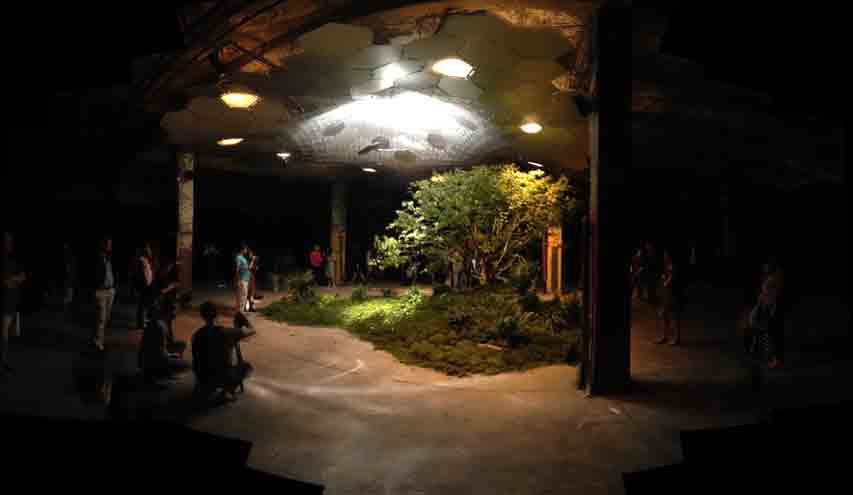
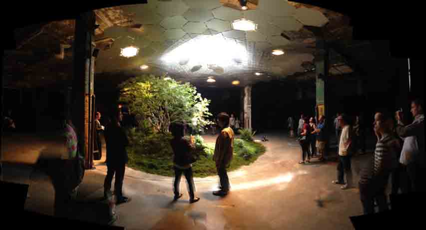
The Columbia Graduate School of Architecture, Planning and Preservation (GSAPP) mounted an exhibit called Experiments in Motion, in partnership with Audi in the Lower East Side, sited in a building at the corner of Delancey and Essex. They imagined a project that reclaimed the abandoned underground trolley yard below Delancey street where the Williamsburg Bridge makes landfall in Manhattan. As you can see above, they proposed an underground park, playing off the success of the Highline in Chelsea, an acclaimed, reclaimed elevated train track. Impressive.
September 18, 2012
"MONADS" at Cirrus Next Saturday
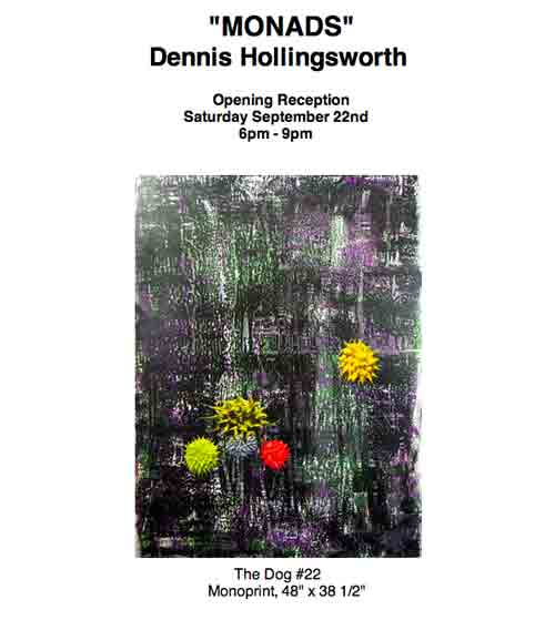
I will have a show this coming weekend at Cirrus Gallery, of my recent monoprints created at Cirrus Editions with the incomparable Jean Milant.
See more images from the edition here.
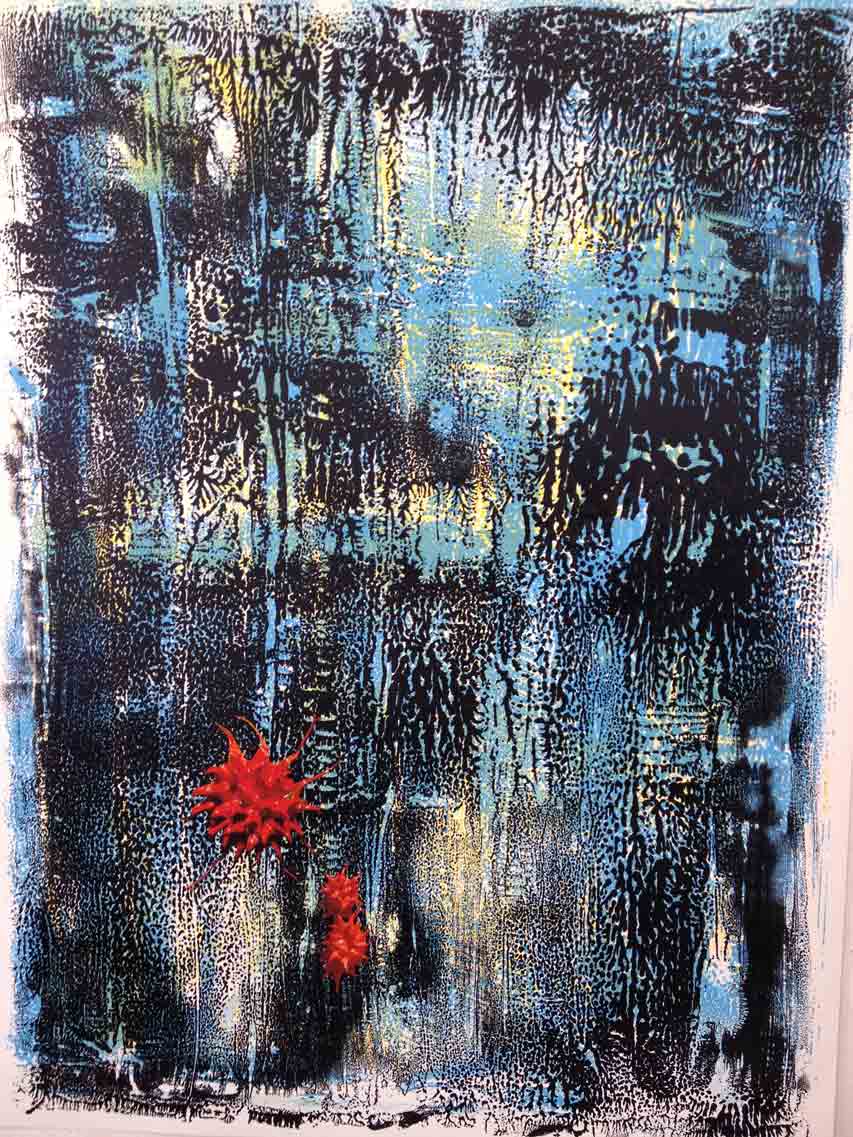
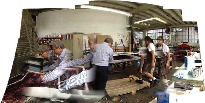
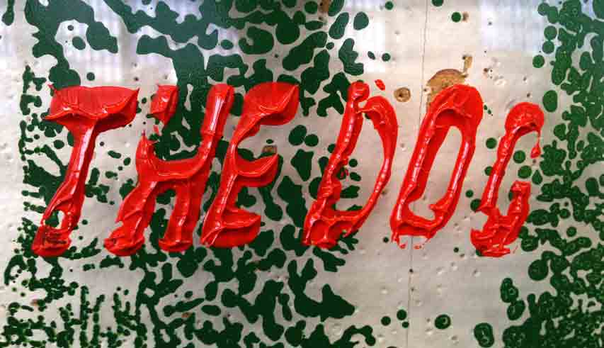
Jean and I edited the statement for this edition. Typically, my version was too turgid for a press release. But true to my turgid tendencies, here it is in its orotund glory:
Goya painted The Dog at the end of his life as he took refuge in a villa near Madrid. After initially painting the walls with conventionally inspiring images, he overpainted them with what we know today as his Black Paintings. Images of witches and colossus and fools and titans emerge from the shadows and finally Goya conjured a forlorn canine half hidden in the earth, gazing up a hill, in whose eyes one could almost detect a trace of hope.
I mark the beginning of my career in art with a visit to the Prado when I was fourteen: no longer a boy, not yet a man. I remember seeing his Caprichos, the prints were electrifying. I remember vividly that I had stood in front of Goya's Saturn Devouring His Children and time stopped, my eye and mind dilated, a universe of pigment took its place. Goya's work has been my touchstone ever since.With this third monoprint project at Cirrus, I settled on conjuring fields of patterns derived from the peeling of ink embedded between printing plates. Multiple plates floated color over color and soon, the atmosphere of The Dog began to bloom on the paper.
The corollary of the turbulence of Peninsular War of Goya's time to our own global problems today is made with caution and determination. As an artist, Goya was a landmark and transitional figure who first served his king and later served his own imagination. His story is also about the emergence of modernity driven by the ongoing bloom of individual freedom. Modernity can be characterized by cycles of relentless change that wrenches us from the past in an often remorseless manner, as we each in our own time can all attest. Change brings uncertainty and dread, and for this I drew the dark veil of Goya's Black Paintings down across the colorful lithographic inks with a dense black silkscreen.The Dog is as simple as a figure in a field. The creature is a figure of fragile hope. The figure that occupies the field in these monoprints are ink jet avatars culled from the language of facture which has become typical to my painting practice. These spiny hemispheres of paint resembling sea urchins have been an integral element in the formal vocabulary of my painting since I began painting wet into wet, otherwise known as a technique called alla prima, in 1996. The beauty of painting whilst the paint is buttery wet is more than the lick and luster of the materiality of paint. This beauty is also about becoming strung under the pressure to work within the drying time of the medium. The pressure of constraint makes vivid consciousness itself, and few forms in a painter's world crystalize the acuteness of feeling and thought more than a spatula drawing itself out from a jellied hemisphere of slick paint, the cowlick forming a tail in its wake, the wet medium spending itself out as it simultaneously resists and complies with gravity, this act repeated again and again until the corpuscule bristles alive with lyrical, natural form. I have a pet theory that the bristle of detail of each monad creates a limited aura of heightened visuality, a spotlight of vividness that can illuminate the painterly action or facture around it. Since the beginning, I have called them monads, a name inspired by the German philosopher Gottfried Leibniz, who wrote a treatise called Monadology which described the world as being composed of irreducible atomistic units of consciousness.
Monads are, for this project, my dogs.
September 17, 2012
Blasphemer Sandwich
Some of these productions of art will get you awards, some will get you in jail, some will get you killed. Here we are, at the dawn of the 21st century.
Here are some links to infidels of various stripes:
Pussy Riot article in the New Republic, Theo Van Gogh, Ayaan Hirsi Ali, Ayaan Hirsi Ali speech at U. of Wisconsin, Tony Shafrazi and Guernica, URIEL LANDEROS defacing a Picasso, Mohammed image archive, Book of Mormon (the musical), Ai Wei Wei...
September 13, 2012
Lincoln Again

Late one night last week, so late that the dawn was only a couple of hours away, I made my way home after hanging out with friends, the bonhomie so good even at the cost of the next day. Using the subways at such a late hour is not recommended since the train service is so infrequent as to be nearly unreliable.
But down into the subway station I went for the F train and I thought I was rather lucky since one arrived as I did and on I hopped. I screwed on my ear buds and played another Lincoln audiobook, the second after Michael Burlingame's epic Abrham Lincoln: A Life. I was listening past the halfway point in Harold Holzer's Lincoln at Cooper Union: The Speech That Made Abraham Lincoln President.
I was so immersed in the audiobook that I didn't realize that I wasn't on the F train but on the B train instead. I was at 81st street when I was supposed to get off at Lexington and 63rd. It wasn't until I got out that I sounded the depth of my error, that not only was I on the wrong train, I was on the west side of Central Park when I wanted to be on the east. I had some walking to do, and fast if I didn't want to see the sky brighten before I entered the doors of the building I lived in.
So I choked my disappointment and started walking south along the side of the great park. After I got my stride, still listening to Holzer's book, I savored New York streets on a warm summer's night, unusually clear of people since everyone else was astute enough to be in bed. As I counted off the numbered blocks, my head full of Lincoln's experience in New York, I approached a stately building that I came to know as the New-York Historical Society. And a statue stood in front of it, life sized. It was bronze. It was Lincoln! And with Holzer's and Lincoln's words ringing in my head, I felt that this night/morning wasn't so misbegotten after all.
I stopped to snap a few photos and forged onto the rest of the way with the tingle of kismet.
September 11, 2012
Phil Wagner Opening at Untitled
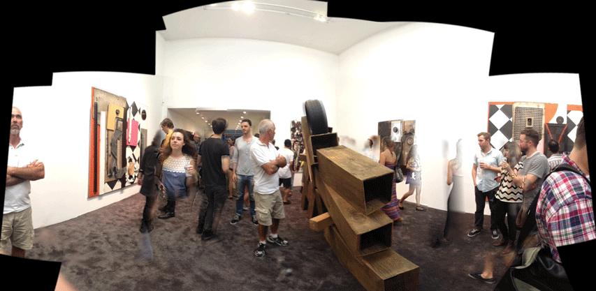
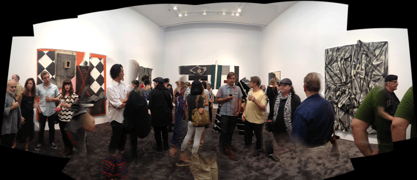
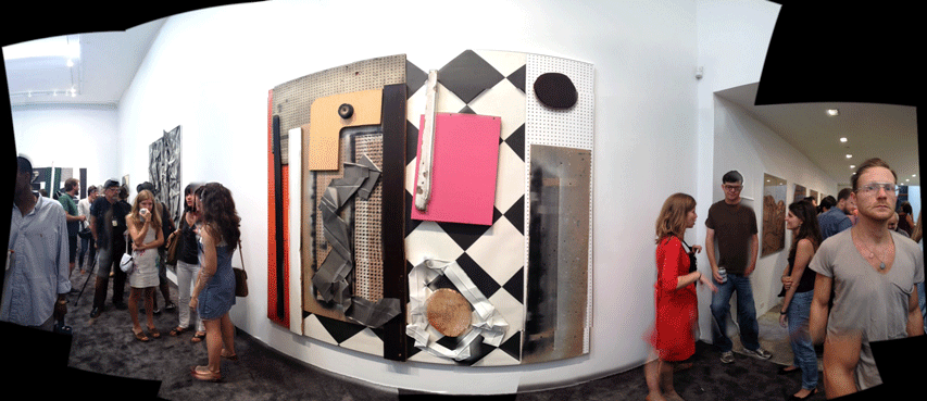
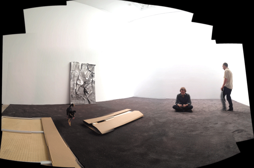
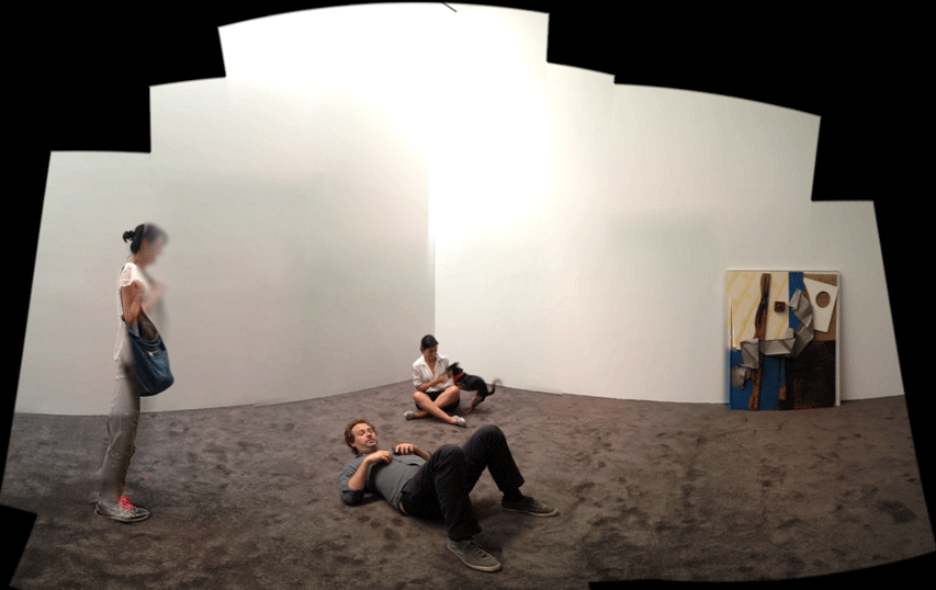
People lingered at Phil Wagner's opening at Untitled Gallery in the LES Sunday night. He dialed up the color this time, rolled out wall to wall carpet, came off the walls onto the floor with sculpture in the round, tagged his assemblages with paint (a turn of the gyre for him) rimmed the whole show with a subtle aluminum edged detail, and introduced a series of drawings for the first time. When I walked in and saw the five drawings mounted on the wall like a runway to the main floor, Beckmann immediately came to mind. Then, as I walked through the carpeted floor, reverb of Picasso's Harlequins, Schwitters, Rauschenberg, Duchamp.
September 9, 2012
Notes on Robert Moses
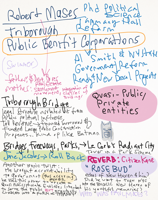
Having finished two huge audiobooks on Lincoln, the time is ripe for the other end of the spectrum: Robert Caro's The Power Broker, the reputed definitive biography of Robert Moses. After listening to the first vignette in the introduction, I was apprehensive that this ten volume beast was hagiographicly larded with honey. I was relieved that by the end of the intro, ironies abounded. Preferring to either find or make a map as I enter such a huge territory, a scribbled a few notes as I read the wikipedia article on the person that is compared to Paris' Baron Haussmann.
(Added: Just found this, it should be interesting.)
September 7, 2012
Openings September 6, 2012
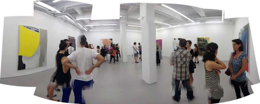
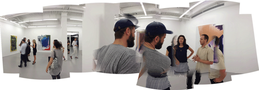
Monique van Genderen at D'Amelio
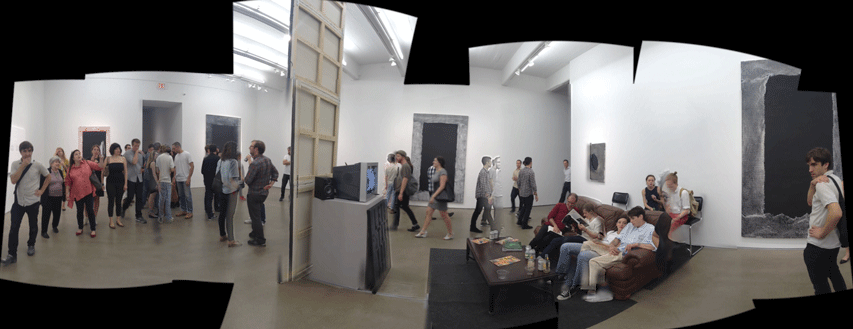
Mark Flood at Zach Feuer
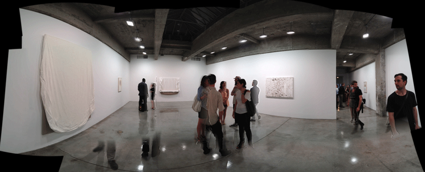
Analia Saban at Bonakdar
Baroque Suprematist
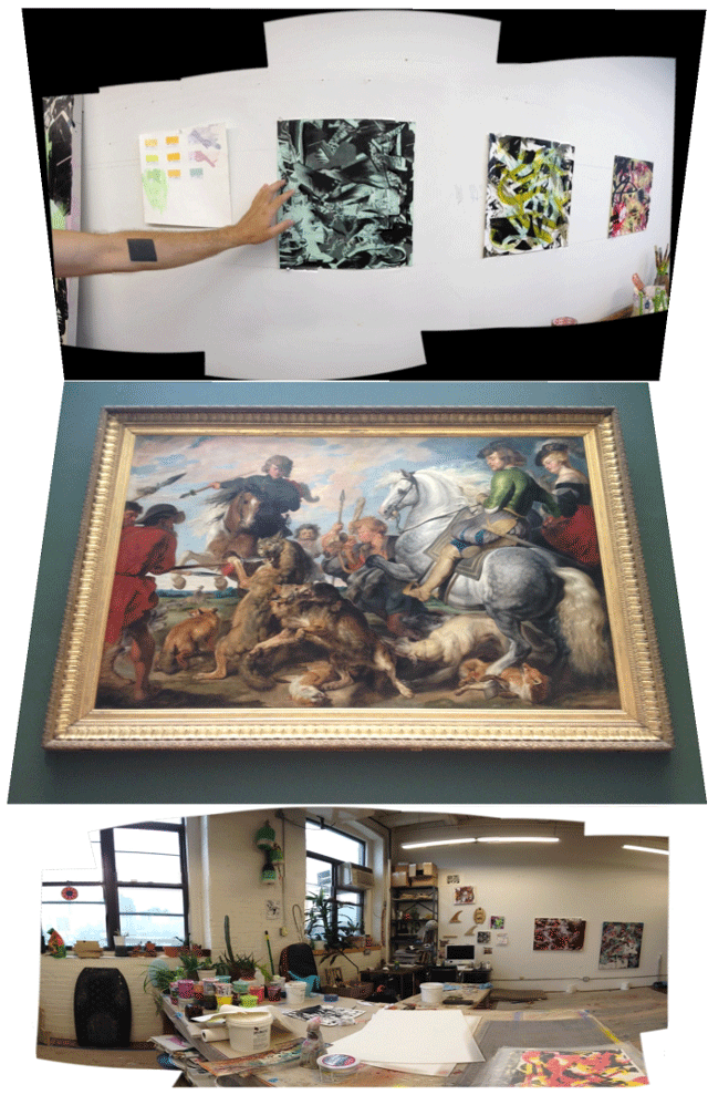
A few notes from a recent studio visit with Kris Chatterson:
Many of you might know of Kris' paintings. He's also a co-author of KCLOG, together with Vince Contarino, Carrie Chatterson, Amelia Ishmael, Julie Chae and others. We talked one rainy day in his studio about that Kasimir Malevich influenced tattoo on his arm, the influence of printmaking in his painting process and his appreciation of Rubens made apparent in the movement and energy in his abstract compositions. It was a fast studio visit, we didn't have a chance to get into the weeds with Kasimir. I have yet to ask him what he thought of Malevich's representational work, how he blended it with his abstractions to the point that he scrambled the dates of his paintings, that perhaps his "Art for art's sake" suprematism has ironic folds to it, and what does this mean for abstraction today? In terms of process, I found it interesting that he doesn't paint several canvases at once, developing compositions like the emergence of an image in photo emulsion. He keeps the work to the materiality of paint when it could easily disappear into the logic and feel of a computer screen. The delivery of print-like gestural images happens with copiers and transfers with acrylic mat medium and a watery rub off of the paper backing, resulting in a mulch of paper that he dries and collects in buckets, his intuition piqued but only just so as of this moment. He works on one painting at a time, a practice that I can relate to, but time doesn't constrain him as it does for me, we have chosen differently in this respect. He spins his paintings as he paints them, but only selectively. He paints in layers and all at once to the entire surface, reminding me of the layers function in Photoshop. And Rubens. He loves him some Rubens. I can see it in the movement, detail and energy. The eye tracking is the key to the composition. As we talked, I thought of Chris Burden, whose ultimate subject is power, and like Rubens, all of the apparent motifs seem to my eye dispensable to the underlying, elusive and enduring subject, abstract and general as it is. For Burden it is sheer power, for Chatterson, it is the power of movement.
