May 28, 2013
May 23, 2013
May 21, 2013
May 17, 2013
Frieze Keepsake
A week after the spring art fairs, one artist in particular sticks in my mind: Mary Reid Kelly.
Inspiring.
May 13, 2013
Brendan Fowler at Untitled
Brendan Fowler's show is up at UNTITLED, and its a kind of a going away party and a coming out party at the same time. As of the time of this blog post, you'll have a few more opportunities to view his performances: Friday 05/17/13 2:30PM, Saturday 05/18/13 5:30PM & Sunday 05/19/13 5:30PM; all at UNTITLED Gallery in NYC's Lower East Side.May 11, 2013
NADA + Papa Smurf

Two LoopCam animated GIFs for your perusal, one from the NADA art fair (note: that's Jean Milant's mug in passing) and another from Papa Smurf's opening (the knick name of affection for Paul McCarthy via my circle of pals) at Hauser & Wirth at 18th Street in Chelsea.

May 9, 2013
Tyler Matthew Oyer at Cirrus Gallery/ Cutlog

This is a LoopCam capture of a few seconds of Tyler Matthew Oyer's performance of "GONE FOR GOLD" at the Cutlog Art Fair NYC, represented by Jean Milant's Cirrus Gallery.
Share the Joy


Oh, Henry! Just got this photo from the Untitled booth at the Frieze Art Fair.
May 8, 2013
A Very Nice Lighting Strike
I'm reposting a blog entry from 2007 to celebrate a news item from PYS.ORG that helps fill out an abiding theme of mine that draws together aspects both great and small, here's the headline and first paragraph:
Russian researchers find more evidence to support notion that lightning is caused by cosmic rays
May 06, 2013 by Bob Yirka (Phys.org) --Russian physicists Alex Gurevich and Anatoly Karashtin claim, in a paper published in the journal Physical Review Letters, they have found more evidence to support their idea that lightning is caused by cosmic rays. The notion was first proposed by Gurevich back in 1992, and has been a source of debate ever since.
***
My gallery in Barcelona, Miguel Marcos, wants to put a show together with what I had painted over the summer and the last painting I recently sent, Kikuchiyo.
Miguel asked what I would name such a show, so I flipped through the blog archives and arrived at August 14th's Niight Dive Round Cap Tossa. My virtual divining rod pointed at the second video, time 03:11 A Very Nice Lightning Strike, it seemed to fit both the feel of that summer and the allusions to Toshirō Mifune's Kikuchiyo in Kurosawa's Seven Samurai, which for me resonates with that moment Kiko, Alberto and I shared out at sea in the middle of the night as lightning illuminated the sea bottom like the flash of a Japanese blade.
There it is, the title for the show at Galeria Miguel Marcos, 10 Jonqueras Barcelona Spain:
03:11 A Very Nice Lightning Strike
May 6, 2013
May 4, 2013
Rebuild Them
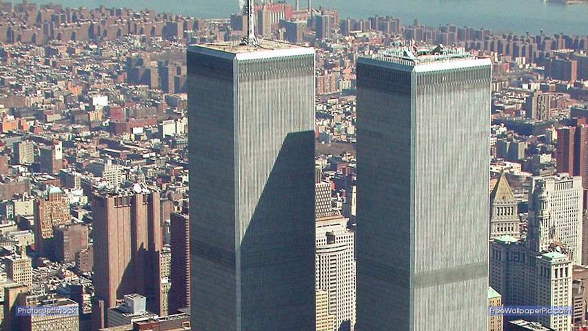
1776 feet?
Really??
It takes a Gawker to call out bullshit on a monumental architectural insult to intelligence. Here is their last paragraph:
But when you wed yourself to symbolism so glib and cloying as that--you have to follow through. If you're going to tell everyone that your new office building rises one foot for every year since the birth of Christ to the signing of the Declaration of Independence, so better to really celebrate Freedom, it better do so. The mythic height 1,776 feet isn't just a "close enough" figure. It's a feat of numerology, a totem clung to by the Lower Manhattan Development Corporation, the Port Authority, and Larry Silverstein through half a dozen designs, two architects, several public squabbles and countless delays.Truth to an indifferent power. Read the Wikipedia page, especially the design history section to learn just how thoroughly the design was mauled into disfiguration.
More history and another graf, from Scott Raab in Esquire, The Truth About the World Trade Center:
Forget the details for now and focus on a simple fact: The Port and the politicians who run it are pigs.(Emphasis mine.)The memorial means nothing to them beyond winning a fight for control of the museum's money and operations -- the same fight that every project on the site has inspired.
That has been the underlying and unyielding truth of Ground Zero since September 12, 2001.
This is truly the best reason for dumping the politicians: Ground Zero is not so much a place of remembrance and honor as it is a battlefield. Last year's ceremony featured readings by Obama, Bush, Christie, Cuomo, Rudy Giuliani, and the two sad-sack governors who held office in 2001, New York's George Pataki and Donald DiFrancesco of New Jersey. Pataki is the yutz responsible for nearly all that has gone wrong in rebuilding the site, but they couldn't not invite him. DiFrancesco's connection to Ground Zero was why he fled office: He took a large low-interest loan from a pal he helped put on the Board of Commissioners that presides over the Port Authority. DiFrancesco was not invited to last year's observance until Governor Christie threw one of his many tantrums and Mike Bloomberg agreed to stick DiFrancesco at the bottom of the batting order.
Poor George Pataki: Never the brightest bulb in the chandelier, he once had hoped that the rebuilding might lead him to the White House. So it was understandable that he might be feeling proud -- maybe even a little wistful -- at last year's ceremony. The dignitaries are assembled by the stage, waiting for Obama and Bush, when one of them overhears Pataki say to Cuomo, "Isn't this a great day? Just beautiful -- and look how this has all turned out."
And Andrew Cuomo says to Pataki, "This is the biggest waste of money anybody's ever seen. Who would have ever spent this money? If we'd known what this was going to be like, nobody would have ever done this."
Read on and try not to weep as you do so, and you will learn just how thoroughly debased the design of "Freedom Tower" really is.
I would prefer to dismantle it to the ground and rebuild Minoru Yamasaki's design, modified to incorporate a world of lessons learned since it was built fifty years ago... two of which are complimentary: the Port Authority insisted on too much office space (my un-researched impression is that there was a surplus of square footage, much more than the market could ever bear) and of course, the destruction of the towers themselves (the horrific loss of life is first and foremost of course). Put these two items together and you get an interior volume of a suitable size to incorporate into the form of the twin towers as a memorial. After that, channeling Yamasaki through a Norman Foster type filter (an unbelievably crazy, robust integrated systems approach) would probably render a renewed and refreshed design much in the manner of a Marvel Comics franchise reprocessed via Hollywood.
All humor (meant to be simultaneously snide and constructive) aside, think about what we are doing -and not doing- at One World Trade Center. Think about what we are saying to the world.
May 3, 2013
My SPURA, Collated
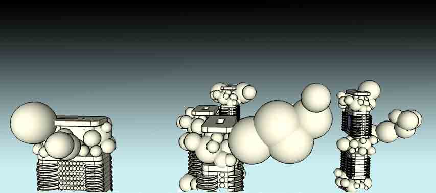
On the occasion of the SPURA (Seward Park Urban Renewal Area) project proposal submission deadline that is due this coming Monday, I am collating all of the blog posts that I have rendered since arriving in New York last fall.
SPURA LES
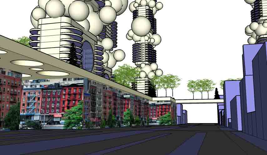
Ok, so here's the deal: From what history of the Seward Park Urban Renewal Area (SPURA) that I could glean from the internet (here, for example) there was a concerted effort in the early 60's involving NYC government, various union organizations and leadership characters such as Abraham Kazan and Robert Moses were responsible for the urban redevelopment of the Lower East Side (LES). And so what we have in the LES at this time is a melange of classes and cultures that endow this particular part of Manhattan with its unique character. SPURA was begun but not completed due to various interest group infighting, leaving behind the largest undeveloped site in Manhattan for fifty-something years now and counting. As you can imagine, the strategy of using the urbanism fashionable at that time, the tower in the park solution popularized first by Le Corbusier and his Ville Contemporaine, but over the years the tower in the park scheme (and Le Corbusier himself, by the way) has been discredited first by advocates of human scale in urbanism such as Jane Jacobs and later by critics of mass class aggregation in housing, the icon of which was Pruitt-Igoe.This year, NYC is moving ahead with the completion of SPURA, the development plan is being approved through the layers of city government and soon the mayer is expected to give it the green light.
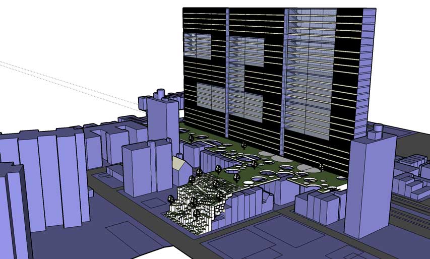
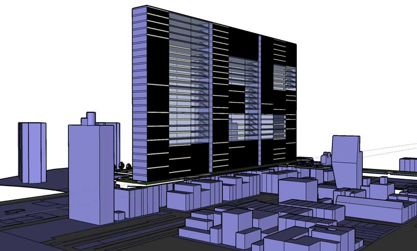
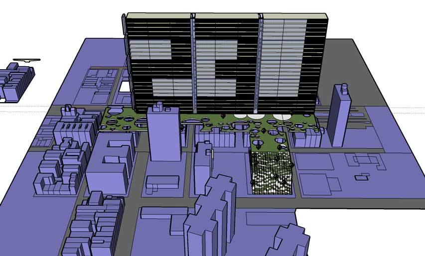
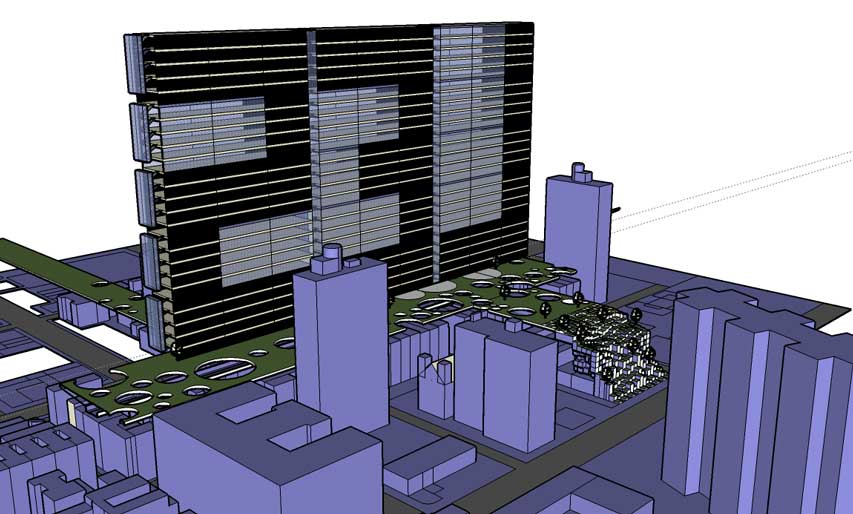
This introduction is as compact as I can shape it, but suffice it to say that the history and issues in urban planning, sociology and architecture inherent in SPURA are complex, controversial and deep. Into the depths, I couldn't resist splashing about with a few ideas in the form of a loose schematic design that is an attempt to sort and fit the various puzzle pieces together into a proposal for what to design for SPURA in the LES. What you will see here in this blogpost is the equivalent of a sketch on a napkin. I used SketchUp to hammer it out, the forms rendered here are meant to be read in the most general, hypothetical terms. For example, I lifted the Essex Street facade from Google, trimmed it, and pasted it on the substrate street blocks to convey the general intention in as few strokes as possible.

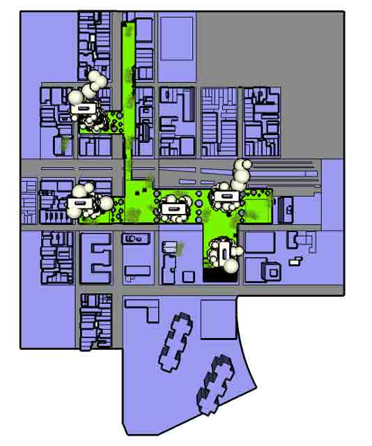
A few notes:
1. Mixed use, super mixed use. The idea of mixed use development is normative today, even though there is some resistance from some quarters in the LES, such as a low income project counterproposal floated recently. I'm suggesting a super charged idea of mixed use: mixed residential classes both in the towers and in the street level blocks, mixed use retail, office and light manufacturing, mixed use everything and everywhere.
2. The park in Seward Park: fuse it with the Lowline with a higher line. In the previous blogpost, I showed the fotos snapped of the Columbia Graduate School proposal for the renovation of the Delancey Street trolly yard into an underground park. They have linked it conceptually with the Highline in Chelsea, and what I am suggesting here is a literal fuse of a below ground park, an above ground park and to the existing Seward Park at street level. I think that the folds and linkages would be very exciting. It would be very interesting to extend their organic hexagonal pattern motif that they used for the skylights into the rest of this design, especially into the freeway overpass style plinths that form the (tower in the) park datum.
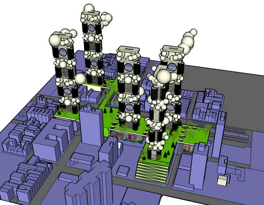
3. Parallel Cities was an ancient urban proposal of mine about the co-existence of the pedestrian city and the car city. I identified the essential problem of urbanism today as a conflict of two seemingly antithetical ideals. One, an ideal of a Jane Jacobs type of human scaled urbanism that is dependent on history (the evolution of a city over time) and geography that constrained urban form to the scale of people. This is fundamentally in conflict with the ideals of imagination that were increasingly being realized technologically with the influence of the automobile and other scale busting forms of technology. The critique is that we can only build a Jane Jacobs type pedestrian scaled urbanism anew as a kind of Disneyland, overly controlled and artificial. In my previous application of Parallel Cities for Los Angeles and for all similar modern city plans, I represented a solution of this schematically as pedestrian island zones within a sea of car-centric urbanism.
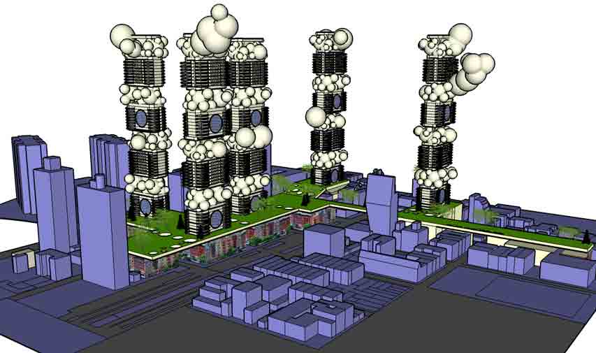
So how can we build within the urban fabric of Manhattan in a way that is in harmony with the existing urban fabric? Robert Moses and others tried to level the existing urban fabric and build the towers in a park scheme, as Le Corbusier once proposed for Paris. Crazy. So building within the level of density that is natural to the ideal of pedestrian urbanism is the way to go, obviously. But the basic dynamic of urban development is that to build you have to contend with the unavoidable reality of the cost of borrowing money, and what one can build today costs much more than what was built in any previous generation. With each generation, more mortgage-paying units will have to be structured into the plan in order to finance urban development, and over time we have achieved auch optimal levels of density as we enjoy in cities such as Manhattan, Toronto, London, Amsterdam, the list is long but finite. The increasing number of units and the square footage they represent (this summer, I recall news reports championing micro living units -a la Japanese Capsule hotels- by the mayor Bloomberg's office in NYC) inevitably engorge urban form with it's sheer mass, and the density level dynamic can overdrive into the nightmare scenario painted so well in movies such as Blade Runner. Like auto driven solutions to urban form, there is a tendency to succumb to scalar inflation that pulls us away from the vision of urbanistic bliss as that dreamt by Jane Jacobs. The design problem with projects such as SPURA is how to integrate a continuity of the urban fabric while simultaneously addressing the constant and increasing pressures of modernity in the form of transportation and finance. The strategy here is a bit more than a have your cake and eat it too kind of thing, it's a sell your part of your cake and eat the rest kind of thing. In this design, it would be the towers that would finance the margin that it would take to make the Jane Jacobs dream come true anew. If you look at the existing division of property in the historic blocks of the LES, they are more numerous and smaller than is possible today. Contemporary normative development strategy would claim larger parcels, bigger massing and lesser diversity of uses at street level, all of which is alien to the existing character of the LES.
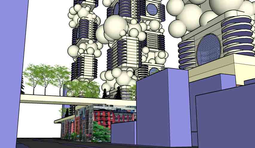
So then, what to do, given all of this, with in the context of the Lower East Side's SPURA? Here is one approach: a superposition of legacy urban blocks of five to seven story buildings with the tower in a park scheme. An urban sandwich.
More Links:
City Planning Commission Approves SPURA Plan
SPURA: Seward Park Mixed Use Development Project
Seward Park Development Proposal
Forty Years of Growth, Except Where It Was Expected
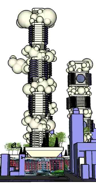
SPURA My Way
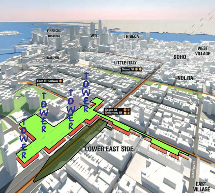
Apropos of this and this...
* The orange blocks = 6 storied buildings in the existing pattern of historical LES urbanism.
* The green = a raised platform of parkland, another elevated highline, fatter this time and not a remnant repurposed. Perforate as needed for light and air below.
* Darker green: a subterranean park made from old Delancy Station, interwoven with the elevated Seward Park above.
* Towers get their air rights from the buildings in the orange zone in exchange for a park and compensation for the costs of building in a more expensive era. When you build, you have to borrow money which has to be paid back, naturally. As time passes, money is worth less, the standards of habitation and the cost of living naturally increase, the more expensive costs of construction seek more rental/lease income in order to pay it back, leading to ever increasing density, and alienating scale.
Transfer the pressure of density aloft to the towers and preserve the scale of the street. I wonder how tall and thick the towers have to be in order to compensate for the costs of the park and the subsidy for the LES blocks below?
The lion layeth with the lamb? Corbusier's Paris plan and the old Paris too? Having your cake and eating away? Robert Moses and Jane Jacobs in collusion, on a date? Is this an ideal that one can only point to and never relish the realization? Maybe.
Maybe not.
LES, Represent!
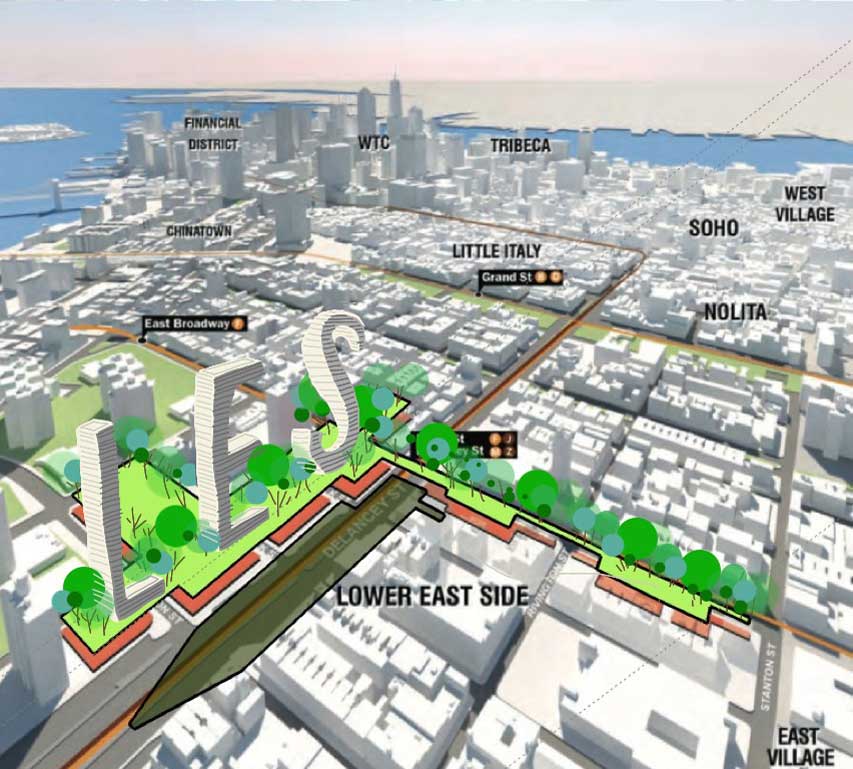
Size the font according to the financing algebra from the air rights traded by the 6 story (classically/historically scaled, LES style) blocks built below.
You do the math.
Background links here, here and here.
Like That, But Different

Background links here, here, here and here.
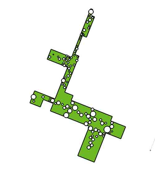
(Click on the image for context.)
SPURA
Background links here,, here, here, here and here.
May 2, 2013
The Last Cigarette
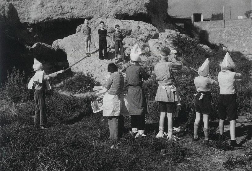
The extremities of reason may have produced the firing squad, but they won't prevent the bullets from arriving at their destination.
This was the thought that formed as I read On Borges, Particles and the Paradox of the Perceived by William Egginton. Here are the first three paragraphs:
In 1927 a young German physicist published a paper that would turn the scientific world on its head. Until that time, classical physics had assumed that when a particle's position and velocity were known, its future trajectory could be calculated. Werner Heisenberg demonstrated that this condition was actually impossible: we cannot know with precision both a particle's location and its velocity, and the more precisely we know the one, the less we can know the other. Five years later he was awarded the Nobel Prize in Physics for having laid the foundations of quantum physics.Very interesting, in that Egginton reminds us that we have been constantly rediscovering what we have already known. A surface read compels us to entertain the idea that the world is but a dream. But entertainment lasts only for so long and then the curtain falls and we return to our prosaic lives. Hume shook the world with the assertion that causality was fiction, and the reverberations can be traced to our post-postmodern present where the boundary between imagination and reality is as problematic as a simultaneous knowledge of position and velocity. One tangible fruit of this intangible reality is that we wouldn't be able to have commerce via the internet without the encryption formulas born of the uncertainty principle. But such fruit aside, we live by and large in a macro world where causality should properly be taken for granted. Paradox lives in the micro world where quarks jostle and reason is pushed past its breaking point. Life is the fraction where the macro is the numerator and the micro is the denominator, the latter vanishing from view the harder we pursue it and the former crowding our view the harder we try to evade it.This discovery has all the hallmarks of a modern scientific breakthrough; so it may be surprising to learn that the uncertainty principle was intuited by Heisenberg's contemporary, the Argentine poet and fiction writer Jorge Luis Borges, and predicted by philosophers centuries and even millenniums before him.
While Borges did not comment on the revolution in physics that was occurring during his lifetime, he was obsessively concerned with paradoxes, and in particular those of the Greek philosopher Zeno. As he wrote in one of his essays: "Let us admit what all the idealists admit: the hallucinatory character of the world. Let us do what no idealist has done: let us look for unrealities that confirm that character. We will find them, I believe, in the antinomies of Kant and in the dialectic of Zeno."
Some people might take cold comfort in Zeno's paradox, but outside of the academy, a cigarette might be a better option.


