September 20, 2013
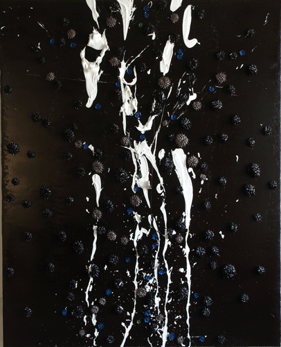
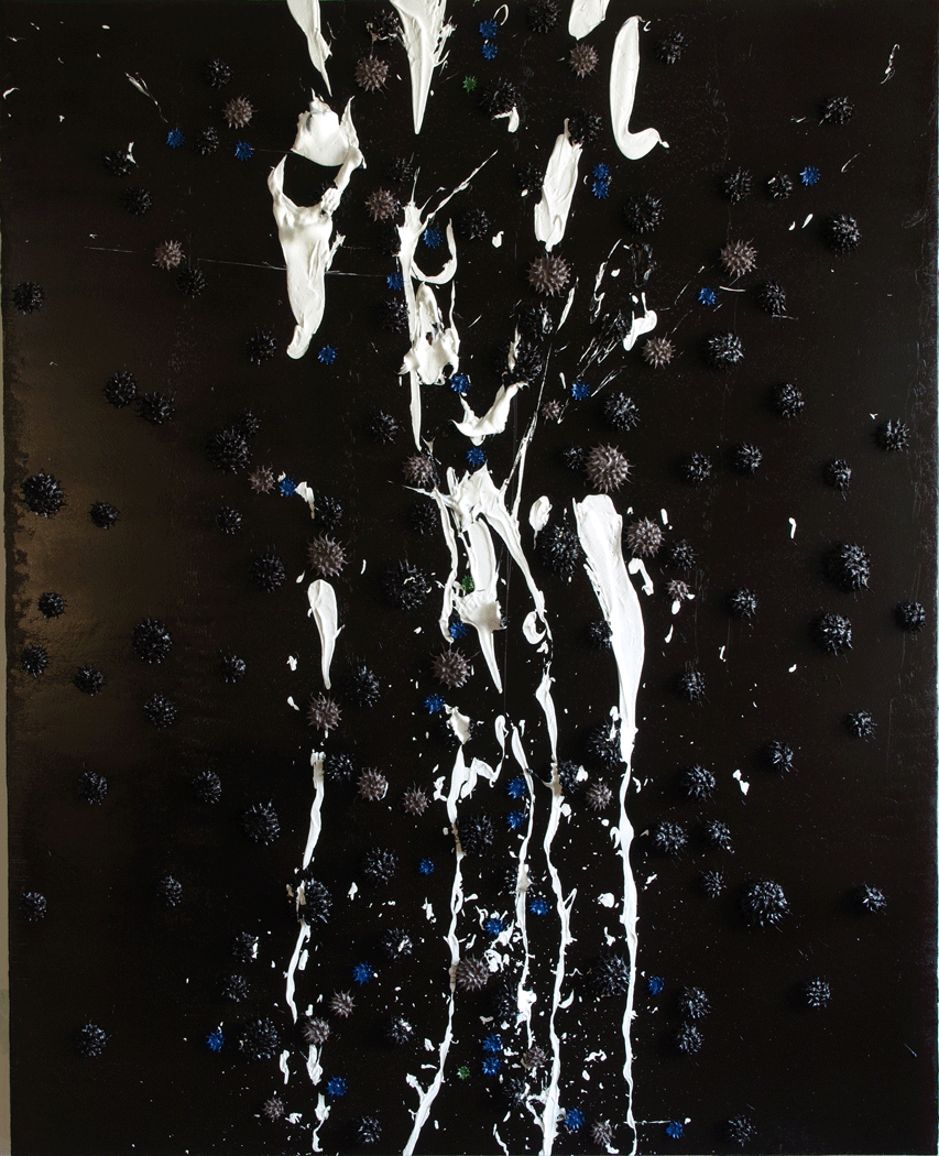
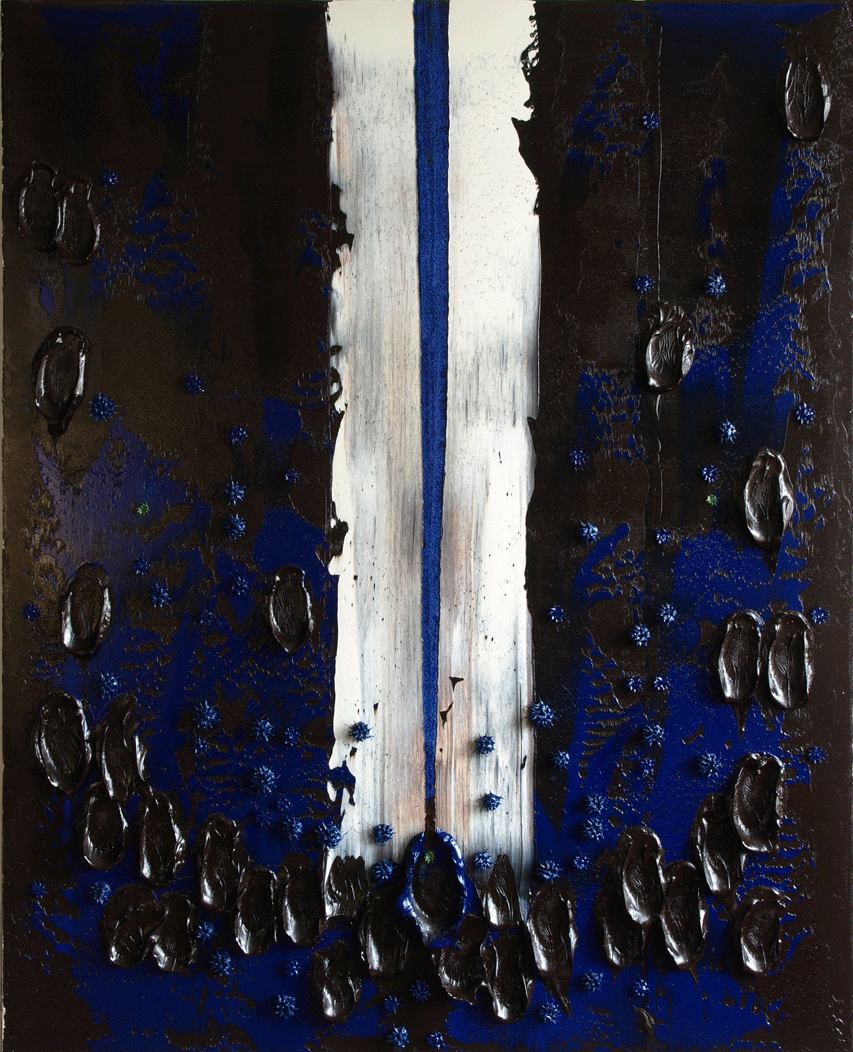
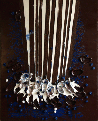
Meanwhile, at the Chicago Art Fair...
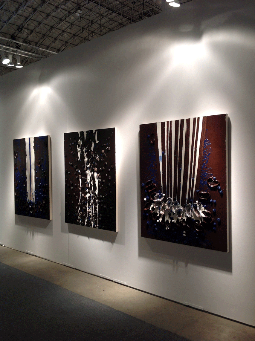
See the Michael Kohn Gallery for more information.
Corbusian Wellsprings
An interesting show is up this season, late summer into the fall at MOMA NYC: Le Corbusier: An Atlas of Modern Landscapes.
The ideas of Le Corbusier congealed in the mere ten years between his 20's and 30's. It's amazing to see how many elements he digested and synthesized during that time. At first, I admire this. How quick, how comprehensive, how synoptic!
Then I begin to wonder if it might also be problematic.
I explicate:
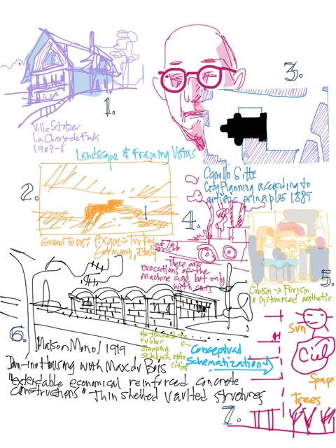
1) Swiss vernacular architecture. I'm looking past the snow laden roof to the blockish, heat conserving form of the buildings as an object in the landscape. Corbusier later broke up and manipulated that form, but it was always in relation to the fundamental prime of a rectangular mass.
2) Landscape and framed vistas, as seen through the traditional conventions of painting. A foundational influence from his various professors, LC's sketchbooks from his grand tours through europe (an enduring influence in architectural education, check out the sketchbooks of Louis Kahn for example), many of LC's designs incorporated picture windows which framed views, turning architectural volumes into a kind of camera.
3) City Planning. He carried Camillo Sitte's landmark book on city planning on several grand tours of Europe, comparing Sitte's theories to the real thing along the way. Cities for LC became the interrelationships between the cubic blocks of individuality that they were composed of. LC formed a critique against his virtual mentor: the nostalgia of the pictorial was an insufficient criteria for ordering cities. Elements of city planning were instead to float free of one another and free of the sentimentality of station point individual perspective. Instead, the LC POV floated free of the earth and the elements of urban design could be composed according to new laws, similar to the Purism of painting (discussed below in #5).
4) The Machine. Late into the Industrial Revolution, the compulsion was strong to emulate the spirit of the age in the forms (and content?) of the things one was making. His coinage of a house that was a machine to live in popularized the analytical breakdown of living patterns and their systemization into an emulation of machine schema.
5) Purism. LC systematized the wildness out of Picasso's Cubism into a device to express his own aesthetic as described by these very bullet points. He purified Cubism. The picture plane was fragmented but Purism had an implicit set of laws for the disposition of the multilayered fragmented elements to slip and slide over and under each other.
6) Concrete. His work with Perret, Hoffman and Behrens no doubt introduced him to the revolution of material innovation in architecture that upended the previous classical epoch and forced thinkers to rebuild the language of architecture. Previously, materials and methods of architecture were relatively stable. Craftspeople garnered knowledge and passed it down through the generations, freeing architects (a contemporary designation, the profession didn't exist as we know it today until the time of Frank Lloyd Wright) to recombine elements from the classical canon: colonnade, pediment, arcade, etc. The explosion of new materials and methods of construction forced architects generation to generation to create a canon anew suitable for the modern era... that is until recent times, when the effort was abandoned altogether in futility since the innovation never stopped.
7) Schematization. We can see in all aspects of LC's work, a recurring tendency to isolate and identify complex phenomenon into constituent elements and arrange them into a well functioning whole.
As always, for all people, our strengths mirror our weakness. LC's capacity to seize the disorienting swirl of emerging modernity and make sense of it is breathtaking, to say the least. He was one of the best of an era and his influence was extensive, as can be seen in Robert Moses, a historical figure that I have become well acquainted with since I arrived in NYC [link]. Like LC, Moses was wrestling with what was perceived as urban squalor, the legacy of urban history engorged as it was with the modern pressure of population flows, the emergence of the automobile, the impact of evolving industrialization. It was just as understandable to respond to these pressures by making urbanism conform to the image of industry as it was understandable to reject this impulse with a defense of intimate urban scale as Jane Jacobs did so famously back in the 60's. The tendency to see the world in schematic terms is powerful and desirable but it reduces life to cyphers, to reposition-able elements in a diagram. People are able to think diagrammatically but we don't live diagrammatically, and this is where the lions of the 20th century towered then fell short. You can see this in his city plans, rubber stamps of housing blocks, warehousing people and reducing cultures into civic flow charts (witness in the USA: Pruitt-Igoe, Cabrini Green), erasing civic history and replacing it with hazily conceived parkland, cities as layers in a purified painting.
The human capacity to think schematically also tends to be thematic too, to be captive to the prevailing spirit of the age. The Enlightenment brought us the Clockwork Universe, today we employ the paradigm of the information age as the mold to recast our problem/solution sets. Houses were machines for living, cities were machines for civics and people were the raw material to be processed by the machine. The 20th century attempted to render us into products, it saw human nature, like nature itself, as something raw and anodyne. And civilization could be simply designed, of course by the most intelligent among us. All we had to do is set up the system, turn it on, let it run and do what it does best: what we had designed it to do. We became products, in these eyes. Like processed food, we made processed civilization.
There is a totalitarian folly that mankind is so susceptible to, a lesson to take to heart.
In many ways, we are still falling short in this way as the "wisdom" of the 20th century transmogrifies into the 21st. ( A flash of self-consciousness: Look! This whole blogpost schematizes LC! Surely he is more than seven bullet points! Surely he is more than an exhibition in a museum! This blogpost is a cautionary note to myself, and still I fall.) The impulse to treat people as cogs in a machine returns in many forms throughout history, a tendency to mis-take the signifier for the signified, to see people not as human beings but as mere symbols, to not be able or willing to drop our categories and let new information disturb the tidy patterns we are prone to play with.
I guess this whole stew is what makes us human after all.
September 19, 2013
Mysteries of Flexagation
Vi Hart is amazing.
Amazing!
She's just migrated her blog here. Wikipedia has an entry on her here.
Hexaflexagons 2
Hexaflexagon Safety Guide">Hexaflexagon Safety Guide
Flex Mex
***
If you like science made accessible like I do, check out Walter Lewin with this YouTube search here, his Wikipedia entry here, more videolectures here, and a NYTimes article here.
***
And more Vi Hart wisdom, Vi Hart on criticism: Vi Hart's Guide to Comments, and They Became What They Beheld: Medium, Message, Youtubery.
September 17, 2013
Timelines
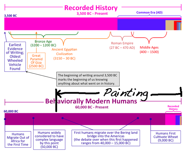
I love timelines. I was planning to make a timeline like this, but I found a set of them on a blog called Wait But Why.
Fabulous work.
My other favorite posts from that blog:
Why Generation Y Yuppies Are Unhappy
7 Ways To Be Insufferable On Facebook
September 16, 2013
September 12, 2013
cuidantes

Conservation of the facade of the Hispanic Society, NYC.
(via LoopCam)
September 11, 2013
Wondrous

Last week Miguel, Mirentxu and I visited NYC's Hispanic Society, located in Manhattan's Washington Heights on Broadway between 155th and 156th streets. Back in the first part of the 20th century, Archer Milton Huntington fell in love with Spain, bought deeply into Spanish art and housed his collection in his Hispanic Society. Here, you'll find El Greco, Zurbarán, Ribera, Murillo, Velázquez and fast forward to the late 19th and early 20th century, Joaquín Sorolla, who was commissioned by Huntington to paint "Visions of Spain", in which I had spun the LoopCam animated GIF above.
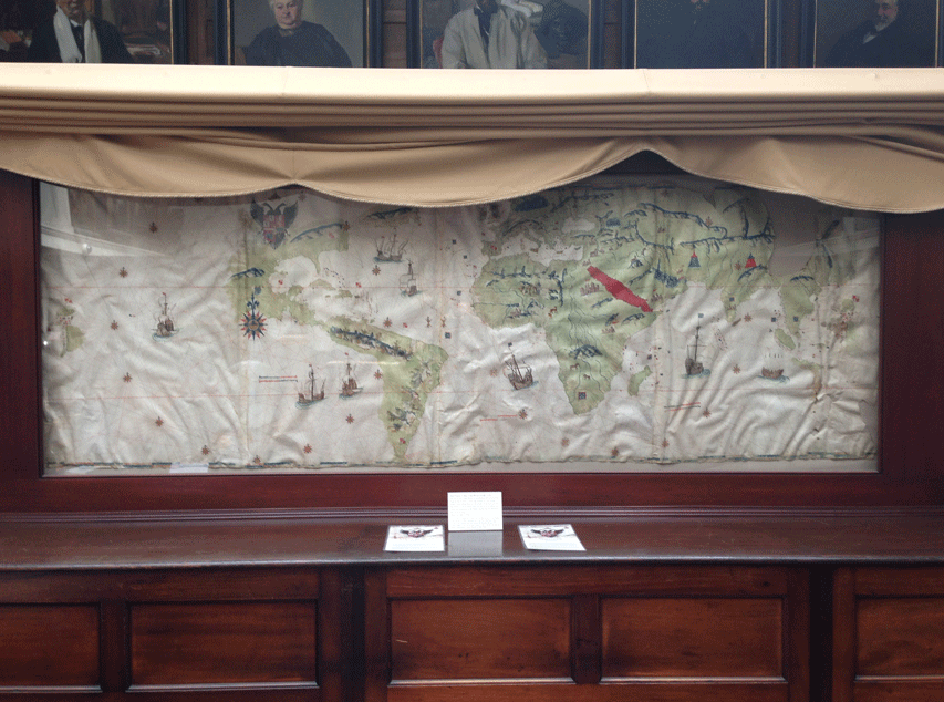
The manuscript collection, extraordinarily rich in material and scope, is the most extensive outside of Spain. It encompasses medieval charters, holograph royal letters, sailing charts, patents of nobility, illuminated bibles, and books of hours, as well as historical and literary manuscripts from the eleventh to twentieth centuries. Its 15,000 books printed before 1701 contain some 250 incunabula (books printed before 1500) as well as unique copies and first editions of many of the most significant works in Spanish literature and history....and even more: protected under a curtain in the center of the library is Juan Vespucci's Map of the World drawn in 1526. Wondrous!
September 6, 2013
Miguel and Mirentxu

My gallerist in Barcelona, Miguel Marcos and Mirentxu Corcoy Bidasolo (laywer, professor and law court judge in Spain) were visiting NYC on a tour of North America this Fall. Here they are, viewing the show of Sol LeWitt at Paula Cooper Gallery in Chelsea.
We visited DIA Beacon earlier in the week, and the sight of LeWitt's wall drawings capped off the DIA experience very nicely. My sense of the Beacon collection was that it was a succinct anticipation of the information age. It was interesting to see the history we lived through as if it is ancient. The work of the minimalists (Walter DeMaria, Donald Judd, Dan Flavin, Fred Sandback, Lawrence Wiener, etc) are preoccupied with seriality, rigor, instruction based production... everything struck me as variations on computer coding.
My thoughts turned to myself and my generation: what are we anticipating today?
From my perspective, Sol LeWitt is the fruit of the PostModern tree (in as much as one can label all that issued after the Abstract Expressionism, the height of the Modern epoch: PostModern). LeWitt is the fruit because his work, which I see in its essence, as art as a set of instructions. Cruising the galleries into the rooms housing the LeWitt wall drawings, there are a couple of pieces (that seem to be early works, I didn't record the info on the wall labels) that include the set of instructions within the drawings themselves. I have long believed that the primary expression of LeWitt's wall works are the instruction sets themselves and only secondarily the execution by the museum or gallery staff (and no doubt the executor of his estate who oversees its' dissemination) who would be tasked with such a job. I tend to focus on the inevitable variations in the execution of these instructions, the gaps in the instruction set originally issued by LeWitt.
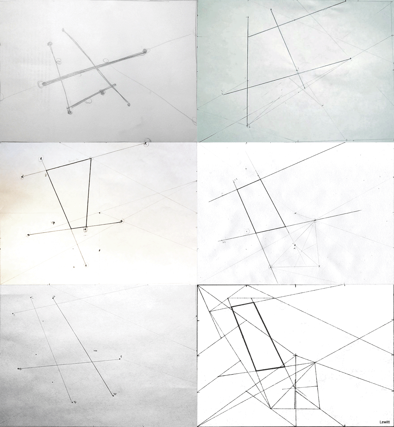
Check out this blogpost that I had found via a Google search that claims that there is a correct and incorrect procedure for executing Sol LeWitt computer code, from an "Electronic Media Studio" taught by a professor Golan Levin. Here is the nub, an animated GIF created by the professor that overlays variations generated by the students over LeWitt's "correct" expression:
1. Color me skeptical.
2. Choose whatever color that you would think is appropriate.
