April 25, 2014
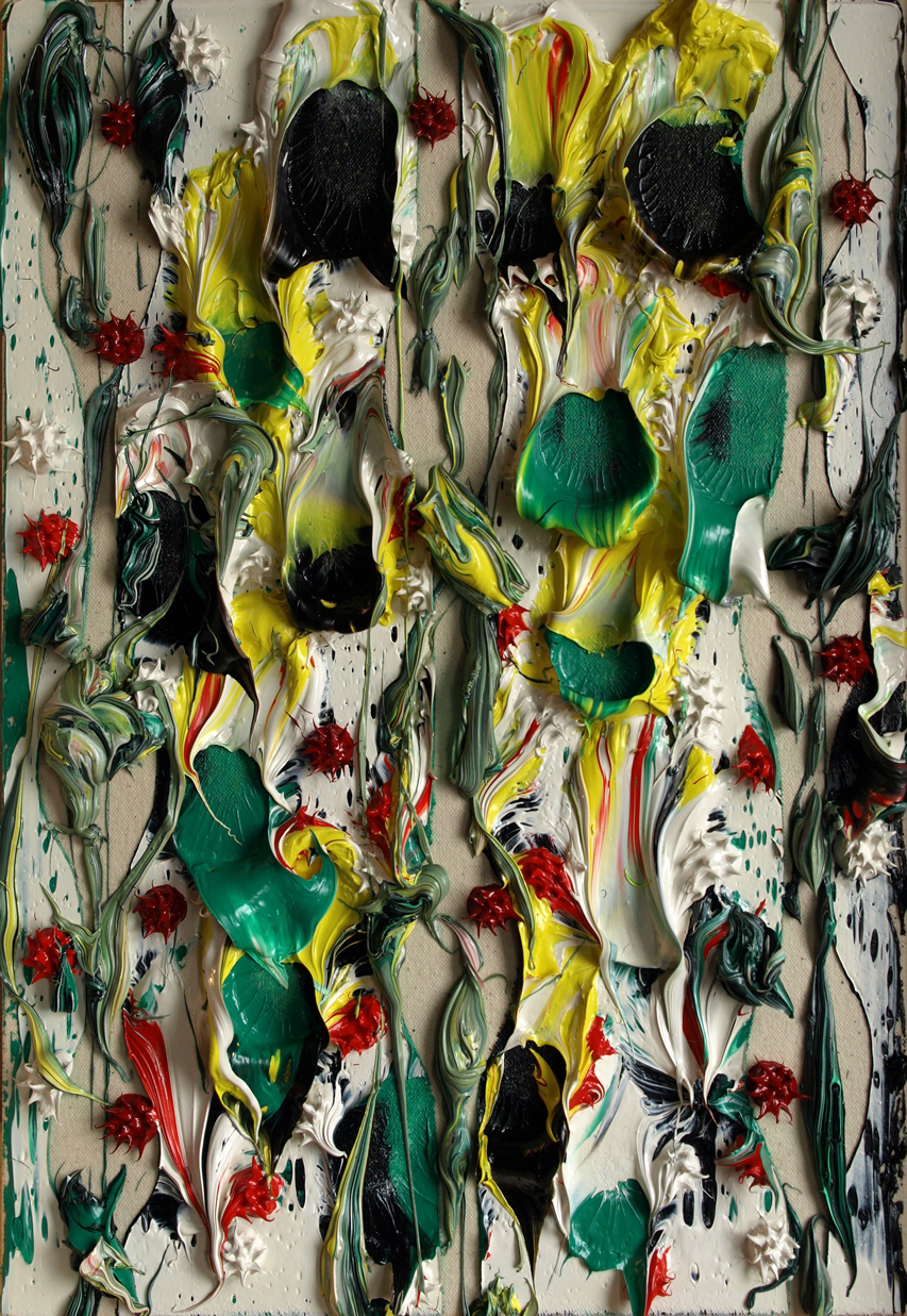
trembles and dances
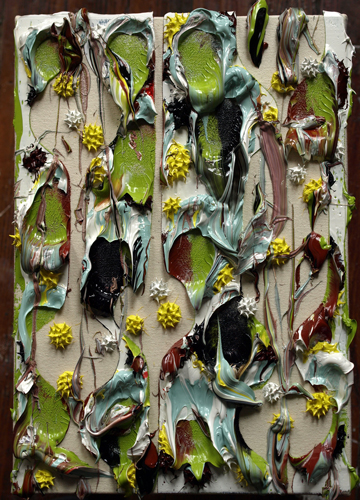
trembles and dances
2014
#449
18"x12"

April 22, 2014
Museums of Art
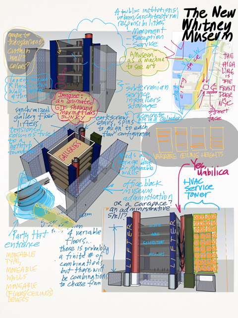
There has been some debate about museum design recently. The discussion ranges from MOMA's impending sacrifice of the lamb, to the anticipation of the New Whitney Museum and if they might have learned something about the needs of exhibition spaces after the era of Marcel Breuer, to Paul McCarthy and Mike Bouchet's Oh-so-delicious LOL ROFL send up of Frank Ghery's Bilbao Museum.
It all boils down to this: artists think that architects are assholes, preoccupied with an urban scaled formalism and that they give the artists the hindmost when it comes to the design of the exhibition spaces... architects think artists are over sensitive prima donnas, that architecture is the mother of the arts (therefore, what much can mama learn from the children?), that artists will adapt to what they are given anyway, and there is ultimately no way to please them.
Both are right to degrees, but when you clear away the egos, it is true that museums have adapted to a wide array of previous uses. The Reina Sophia in Madrid used to be a hospital, the Geffin (they sold their previous name cheap, the Temporary Contemporary) used to be a warehouse, the Tate a power station... So, what about the design of a museum qua museum? Louis Kahn drew a singular section of an art experience and extruded it. Renzo Piano did well with the Menil and the Twombly museums, compressing his Centre Pompidou experience into the roof plane, a thin sandwich of technology controlling light and weather over walls that instead recalled an architecture of eternity, in his Twombly Museum certainly, walls and detailing suggestive of antiquity.
And then I saw his Broad Museum(LACMA)in LA, and was disappointed especially in the multistory half, where the technology spilled out over the pathways willy-nilly and the poetry of the thin tech roof was bloated and slapped on top of a layer cake of floors, rendering the floors below unable to share in the glory of a mediated sky ceiling, made even more evident by the struggle of many escalators to get the visitors to the top floor, the only floor that benefits from the technological light controlling lid.
I'm eager to see the new Meat Packing Whitney Museum next year, I hope that Renzo Piano will pull it off, but from this distance, I'll bet that he has already lost the plot. It seems other people agree, but for different reasons. Aaron Betsky called the new Whitney boring while its still under construction:
The building turns its heavy haunches to the small, mainly brick structures of what used to be the Meatpacking District. The area has become gentrified at a speed and with a lack of inventiveness that is extraordinary, but it still has a scale and texture that offers a welcome respite from most of Manhattan's increasingly rigid and large blocks. The new Whitney, which may be completed sometime next year, will have nothing to do with that. It offers a small set of doors--cowering under a cantilever--to the city, turning its large glass instead towards the ticket-paying patrons' enjoyment of the Hudson River and New Jersey. The architect, Renzo Piano, Hon. FAIA, claims that the lobby's slope will let you see the river from the High Line. If you crouch down and squint, that might be true. The rest of the building is a block with a few nicks and tucks, clad with grayish brown metal panels. I am hard pressed to say anything about it other than that it is big, badly proportioned, unrevealing of anything on the inside, and dull in its appearance.
See the concerns of the architect? From his account, the building didn't further define the remaining graces of the Meatpacking District, the scale of the buildings and the texture of the streets. It almost ignores the welcome mat for the neighborhood, the privelaging of the view corridor of the river through the site and mass of the program is strained without enough effect. It's form is insipid and overly deferential, not even a Breuer's crystallization unbound, much less deconstructed.
So what about the POV from the art world? Jerry Saltz had something to say about the Queens Museum and museum design in general:
Davidson: So you think people will be attracted just because it's new? What happens when it's not new anymore?
Saltz: You know, things have gotten so bad with contemporary museum architecture that I almost don't care anymore what the outside looks like. The single most important thing is how the interior space of a museum works or doesn't work for art. Can you tell me why architects love huge, open, useless vanilla spaces? Instead of this soaring, double-height atrium, the entire second story could have been used for art or cultural artifacts or whatever the hell this museum might want to install. Why do architects give us such terrible space for art?Davidson: I don't always agree with you on this issue, but I do here. The architects at Grimshaw have tied themselves in knots to express the idea of openness. That means lots of glass, high ceilings, few walls, and plenty of space unencumbered by, you know, art. It's the loft principle extended to institutions, and I find that incredibly literal. The Metropolitan Museum is none of those things, yet it's plainly welcoming to everyone. MoMA follows all those rules, and it feels forbidding. What makes a museum open is when admission is cheap or free. Other than that, I think you can go to town putting up walls, and people still aren't going to feel like they're in jail. If what you want is a place for kids to come in and start drawing or making things, then do you really want a huge atrium with polished concrete floors, so that yells of glee go ricocheting around like trapped birds?
Saltz: And what's with that idiotic space-eating twisty staircase? And the obligatory glass-skywalk thing?
I started wondering, just what is the ideal museum layout?
For artists?
The vicissitudes of artists' adaptation aside, why not a museum that adapts to artists, instead? Why not an architecture of vicissitude itself? It would be, shades of Le Corbusier, a machine for art exhibition. It would be stage, backstage, flys, wings, pits and dressing rooms. It would configure and reconfigure itself for every season. It would be a mechanical device that envelops it's function, an oven or microwave that cooks and predigests our dinner, a Mechanno Museum.
Of course, the ultimate Mechano Museum would be a containing volume and a quantity of Utility Fog. Utility Fog, a cloud of atomic-tiny robots that hold hands and configure the interior space at will. Until that day comes, we will have to satisfy ourselves with Gundam Robot Architecture. At every corner of the volume, there should be a spinning drum of stairs, so as to meet landings to the new levels. The exterior faces of the volume could be a kind of curtain wall skin that can be dialed opaque, transparent or in between, with images either projected or LCD'd like Blade Runner. Also at each corner, two crab-like hydraulic arms that hold a basket so that artists can reach the out side surface of the volume. Inside the volume, three or more floors move into different level configurations, moving up and down in concert. Temporary partitions could built as needed either for each show, certain standard dimension walls could be warehoused in the design.
I was wondering how Renzo Piano could have developed the wafer-ization of technology, he put it into a roof plane, what about the walls, the floors? How thin can it get? Louis Kahn mechanized the floors of the Salk Institute, every science floor was a thick service deck. What about thin service decks? How about curtain walls with not only with chameleon skins, but with transparent HVAC ductwork that branches arboreal throughout the view? And while we are building a fine castle in the clouds, how about crystalline pores a la Jean Nouvel's Institut du Monde Arabe, but small, like the pores in our own skin.
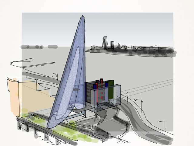
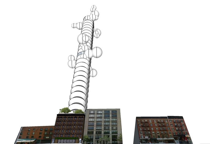
As I was fiddling with the drawing in SketchUp, I tried to fashion an entrance in the pattern of an upside down Guggenheim bowl or a DEVO hat. SketchUp is as simple and plain as you can get in CAD programs, but I became an architect in the years of pencil and paper, so that even using a SketchUp tool as simple as "Follow Me" has its challenges for me. In a flash of a trackpad, my attempt to create a cone fell short and this crazy Calatrava-like form resulted in the drawing below. Well, alright then. I made a mistake and called it kismet. Jerry, here is your obligatory glass-skywalk thing. I'll work in the idiotic space-eating twisty staircase part later.
April 16, 2014
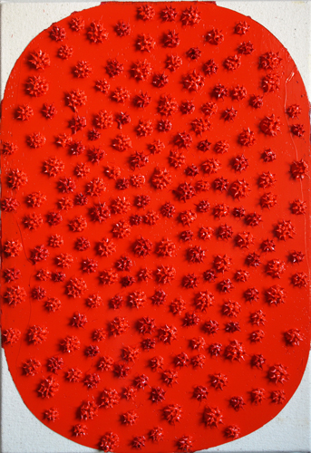
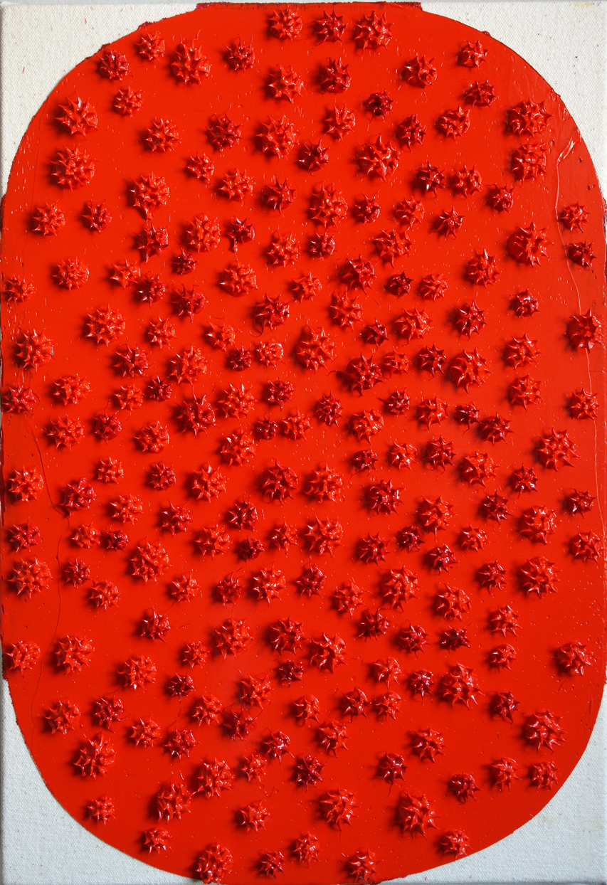
stepped back and aloft

stepped back and aloft
2014
#448
18"x12"
April 13, 2014
A couple of thoughts about Sigmar Polke, "Alibis" at MOMA
Sigmar Polke - Church Windows Grossmünster Zürich from ikonoTV on Vimeo.
I've loved Sigmar Polke's art for a long time. Naturally, I was excited to see the MOMA show Alibis: Sigmar Polke 1963-2010, April 19-August 3, 2014. The show is a retrospective and you get slices of artwork from his beginnings in the 1960's to the early 2000's. I saw what I had expected to see, and a couple of things I had not expected.I didn't expect to see so much of Polke's films in the exhibition. There are also films shot of Polke by his friends, which revealed to me the artist that I had always formed in my mind. The mad imp, he performs head stands on toilet bowls, he strips and jump in the river, he trembles and dances, he dances and trembles, he is something.
At a party, he dons a theatrical nose and fangs and mugs it up not just for the camera but for everyone at the party, jumping in their space, extending his face into exaggerated mixed expressions of delight and menace, a cartoon character jumped from the page to here-and-now life. He is the life of the party but most likely a life outside of the party too. A life of the life!
(Or is he catatonic in the off hours when there is no party? ...yet I want to doubt this. )
At the moment that I was watching these films, I recalled Paul McCarthy's performances and it was if Polke could easily walk into the set of McCarthy's "Painter" (1995). I immediately compared and contrasted the two artists, ratiocinating. Who came first? Were they aware of one another? Did they know that they were kindred spirits? How much of thus is merely a simple reflection of the time, the heyday if the 60's, when imps and forest gnomes abounded?
Later, I was listening to The Partially Examined Life podcast on Henri Bergson (Episode 93: Henri Bergson on How to do Metaphysics), they mention Cantorian infinities and Zeno's Paradox, I googled for more... and along the way, I I thought about Polke.
1. Zeno of Eleaa. His Life
Zeno was born in about 490 B.C.E. in Elea, now Velia, in southern Italy; and he died in about 430 B.C.E. He was a friend and student of Parmenides, who was twenty-five years older and also from Elea. There is little additional, reliable information about Zeno's life. Plato remarked (in Parmenides 127b) that Parmenides took Zeno to Athens with him where he encountered Socrates, who was about twenty years younger than Zeno, but today's scholars consider this encounter to have been invented by Plato to improve the story line. Zeno is reported to have been arrested for taking weapons to rebels opposed to the tyrant who ruled Elea. When asked about his accomplices, Zeno said he wished to whisper something privately to the tyrant. But when the tyrant came near, Zeno bit him, and would not let go until he was stabbed. Diogenes Laërtius reported this apocryphal story seven hundred years after Zeno's death.
Biting the hand that feeds you, that's one way of keeping power honest. The implacable foe to tyranny? Yes, to the worst consequence. Would Sigmar do they same, that is, to bite to the stabbing? McCarthy, probably. Polke would draw the blood, but I suspect he would stop short of the stabbing scene. There's more anger in McCarthy. Dark. Even though his assistants affectionately call him 'Papa Smurf', when he's in character during his performances, I don't see him letting go. But with all these differences aside, all of them are fighting injustice, albeit in different ways.
d. His Method
Before Zeno, Greek thinkers favored presenting their philosophical views by writing poetry. Zeno began the grand shift away from poetry toward a prose that contained explicit premises and conclusions. And he employed the method of indirect proof in his paradoxes by temporarily assuming some thesis that he opposed and then attempting to deduce an absurd conclusion or a contradiction, thereby undermining the temporary assumption. This method of indirect proof or reductio ad absurdum probably originated with his teacher Parmenides [although this is disputed in the scholarly literature], but Zeno used it more systematically.
The method of proof for Parmenides, Zeno, McCarthy and Polke is indirect, or reductio ad absurdum. All elements of their art is pushed to the extreme end of the envelope, but for Polke, he goes to the alchemical dimensions of paint, incorporating that legendary purple or violet that is squeezed from the hindquarters of a multitude of small insects (I'm not going to look this up, my corrupted memory is more entertaining), forbidden toxic colors, smoke from ancient oil lamps. This and all are philosophical arguments pushed just to the brink of total negation, all in the service of keeping us honest.
Or something like that.
The second thing I didn't expect was a video at the end of the show (not the one above), the stream of paintings seemed to stop at 2000. The video is last artwork you see in this show. It is of his creation of stained glass windows in a church in Germany. In it, I learned that Polke apprenticed to a stain glass maker when he was a kid. The film was like a skeleton key to Polke's oeuvre. You can see the fruits of his apprentiship blossom, his use of sliced agate is stunning in its material glory, luscious and AbEx in the way materiality is used to touch G-d. His reference imagery is shown and you can get a glimpse of his method of collage, the liberties he takes with the image, the latitude he gives his method of representation to his medium and the degree he allows the image to stay as it is found, ripped from civilization's information stream.
April 11, 2014
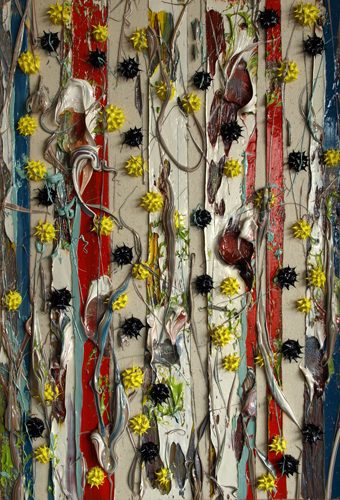
buoyantly from the depths
buoyantly from the depths
2014
#446
18"x12"

April 8, 2014
Parallel City LES
Notes for a film treatment: Imagine You've Got Mail with Robert Moses and Jane Jacobs as the leading roles where they first encounter each other in a Reddit chat room disputing methods of urban planning and through twists of improbably irony, they fall in love online. High jinks ensue. As the plot line unfolds,they unfold each others' ideology and eventually intertwine them with difficulty along the way, love conquers all and the film ends with a wonderfully improbable marriage.
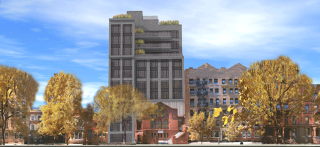
Recent news in NYC: a 150 year old church on the ropes, located on 16th Street in Chelsea is desperate to find a way to afford a much needed renovation. They agree with a developer to trade its' air rights for their architectural and progammatic salvation. You can read up on the news here, and here. The focus of the complaints from the neighborhood centers on the hulking mass of the proposed development and the ugliness of the design. By ugliness, I assume that this refers to the anodyne modernism and insensitivities of a scale that both ignores the experience from the street and the literal crowding of the architectural legacy of the church itself. The designer suffocated the church with the building, probably straining to pack in the program that will eventually pay for the project under the height limits imposed by city zoning codes. Who knows? Maybe if the lid wasn't mandated so low by law, they could have designed enough of a vitrine of space around the church so as to pull off poetry and the enthusiasm of the neighborhood along with it.
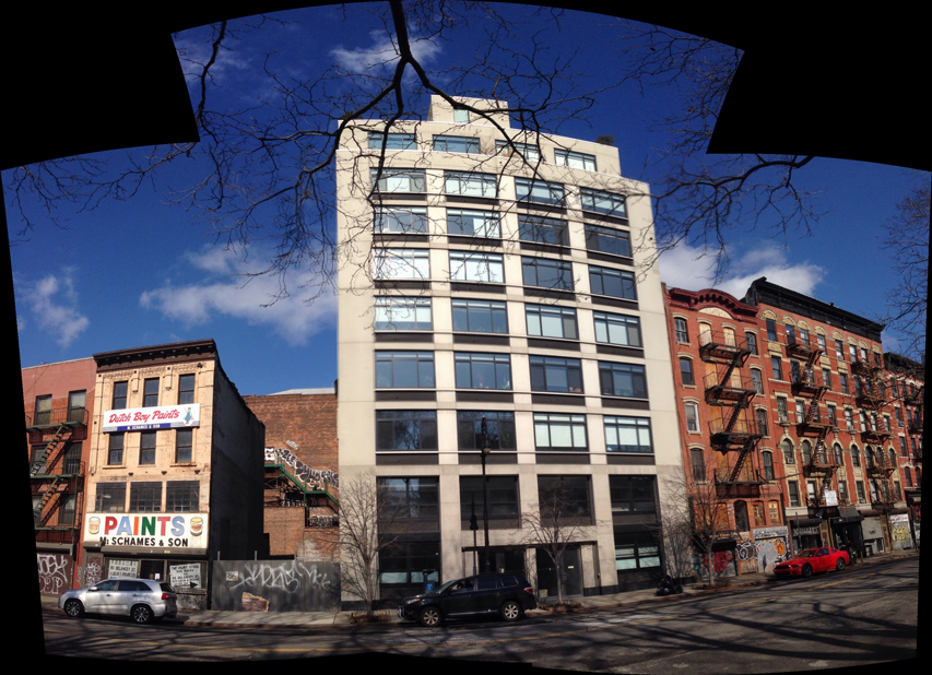
The image above is of a building in the Lower East Side (LES) located on 7 Essex Street, I submit this as an example of the kind of architecture of our time, an anodyne modernism generally typical to any city around the world. This building is flanked by two abandoned, dangerously derelict structures and an empty lot. In their heyday, they were threads in the fabric of the tenement buildings that characterized the LES. Back in the days that minted the historical identity of the LES, the tenements were oppression incarnate, but they began as single family housing that remained when the successful moved uptown. A template established, more tenements were built within the 25'x100' lots and waves of immigrant populations compressed their families into this part of the city, eventually imparting a rich history of concentrated human experience. That was then and this is now. Time dissolves pain and the rich concentration of humanity of that era is remembered with fondness. What should we now expect to be built on these properties today and into the future?
7 Essex is not horrible, it's not interesting. It merely suffices and this is the most we are capable of in the current matrix of law, regulation and aesthetic temperament. Merely sufficing is the best and the most we can do these days. Architecture and urban development has come to this because a generic identity will probably attract the fewest arrows from the multitude of opinions that could easily stop construction cold in its tracks. The building conforms to city code, it steps back as the code allows, it does everything our city asks and only what the city asks. It is detailed minimally because the budget doesn't allow exuberance. Every aspect of the building is generic. Anodyne, the world beyond the modern, beyond the postmodern.
Step back, and you can see the aerial context, step back further and you can see the magnificent street wall of Essex Street below Grand and above Canal. There are other, better elevations, but this one can be seen at a distance. This portion of Essex is a poignant expression of the architectural legacy of the LES. Streets contained by six and seven story buildings on either side, the properties and small and numerous, creating facades proportionally narrow and because of the era that these buildings were built, the architectural detailing is simple and grudgingly ornamented to the standards of its time, even the fire escapes inadvertently filigree the street wall in staccato order.
There exists no similar standard of adornment and decor today since the vapors of architectural classism had been rinsed of ornament by the withering critique of modernist aesthetic theory. If you want to catch up on this, start with Adolf Loos and his historic manifesto, Ornament and Crime. Meanwhile, the values of a rich and rewarding urban experience finds its' exemplar in cities that created a standard from the limitations of space and time. We have travelled far from the days where horses were the mode of transportation but it is the buildings that we had built then that cannot be built today due to the limitations of cost and an "evolved" aesthetic temperament. Cities like New York and San Fransisco benefited from the constraint of land, of the circumscription of island and peninsula, they benefited from the circumstance of history and so the pressures of density was not allowed the relief of an escape to the suburb. We were able to mark our world with a scale relevant to human beings, but over time, we have created a world at a scale relevant to the dimension of our imagination, which we have found to be so vast that we have yet to plumb its extents. Can we choose? Can we toggle between the two? Can we design our world so that we can enjoy both? How can we build gracefully in legacy cities such as NY and SF, while remaining realistic to our time (an era which I maintain is marked by a refined appreciation of transgression, whether this is called modernism, postmodernism or what will follow in this wake) and to urban values bequeathed to us by history and civilization?

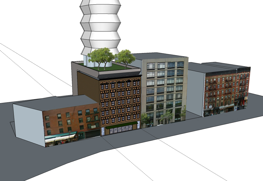
What I have advanced in previous blog posts (see My Spura, Collated) is a marriage of Robert Moses and Jane Jacobs. I propose a new zoning code that describes an envelope of building that describes and protects a street wall somewhere around seven stories tall, and consigns an arena of density to be stepped back and aloft, beginning with a perforated plinth at the eighth story level, a datum that should provide an elevated park (a higher high line) and sky lobbies for the pencil thin towers that rise above. Here is a rough schematic diagram of this idea.
Think for a minute what the developers were willing to pay for the ability to build out a parcel in Chelsea: three luxury apartments, a 3,000-square-foot community room, an extensive rennovation of a 150 year old church and an undisclosed sum of money which no doubt the church will use to build out its congregation in the future... all of this can deliver 14 condo units in Manhattan. Imagine sums of this dimension applied to a six or seven story urban street wall, with each building created with a remarkable amount of attention to detail, to human scale and delight.
Urban Evolutions
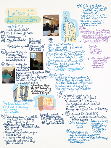
This is a page of notes scribbled last week during a small presentation on urbanism, gentrification and the Lower East Side, apparently sponsored by the Manny Cantor Center and the online and print magazine The-Low Down.
While there is nothing absolutely ground breaking that was discussed, the panel of architects and developers were forthcoming and informative, and among them was the revelation of Joyce Mendelsohn, a local community activist who wrote LES remembered and revisited. (An informative interview can be found in Cupblog here.) All together, the people who spoke that night were positive and no one spoke badly about other actors (either present or not) involved in the changes being wrought in the bottom right side of Manhattan.
There was much focus on the conservation of architectural history. Of course, there was a slightly different agenda that I would prefer:
1) What could be done to pace and time the unfolding of gentrification (my pet idea: that gentrification is best when it is slow) so as to allow an opportunity to involve the local legacy population to integrate themselves into the dynamic of local business and ownership of private property? Low-Down LES had celebrated James Fuentes in their magazine a couple of years ago. James grew up in the LES and after he graduated from school, he opened up his gallery on Delancey and has done quite well for himself since. At the moment, the James Fuentes Gallery is having a show reprising the Real Estate Show (open until April 27th), a vintage barrio art exhibit that protested the gentrification (ironically, oh the turns of irony!) that changed the LES from the charming yet scary no-go-zone of the 1970's to the (mildly) irritatingly pleasant yes-go zone of today.
and
2) How can spontaneous clean up and improvement by the local residents be encouraged? I'm thinking about broom, rakes and plastic bags, about people getting together to get the fountain to work again in Seward Park, to fix the paving stones there, small stuff that a person might see and have the time and inclination to put right without having to engage layers of bureaucracy to get anything done.
Two more notes to append to this blogpost:
-Let's graphically analyze the LES:
-A central and recurring problem haunts the efforts to improve urban neighborhoods: How do you build to replace or augment an aging and degraded urban property without either obliterating the existing scale with the inevitable increase in unit density (the number of residential and commercial tenants and owners)... or ...otherwise create an artificial simulacrum, a Disneyland, a pastiche of urbanism that we have come to love throughout the years of urban history?
Of course, I intend to provide an answer to these questions in the next blogpost.
April 3, 2014
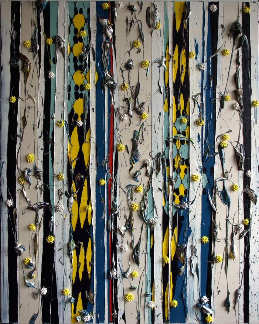
adamantine determination...

adamantine determination... unflinching testimony
2014
#445
60"x48"
