October 28, 2015
The Grad School Crit
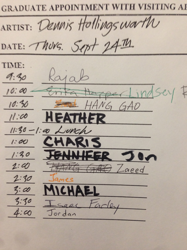
If you've scanned my Timeline Bio, you'll notice that I studied architecture in undergraduate school. My education was a plan I hatched when I was a sailor,. In the idealism of my youth, I wanted a solid foundation for the fine art graduate school that followed, and so it was. The transition between schools was dramatic. Architecture crits are usually large, public affairs. Since the agenda involves wrangling the various systems of architecture (structure, enclosure, procession, urban, environmental, etc.), there are a lot of objective criteria to probe and see if the student can orchestrate them all elegantly. Exactly how the student wrangles them all puts the critique into the subjective zone that we know as art. Usually, the student is required to convey a parti, much akin to the literary thesis, an expression of the design that should be both graphic and verbal. The number of architects and professors involved as judges can range between two to as many as ten and the best critiques become a clash between them, sometime agreeable and sometimes not and the student is left to sort out which streams of advice is best suited to their design. It's a huge public affair and the young neophyte architect develops a tough hide over the years of undergraduate education.
My entry into art school was a revelation. Art crits are private, solitary affairs. Professors and visiting artists are scheduled for one on one visits and the large group critiques are rare events that happen at the end of the term or shortly before graduation. They tend to wards the psychological and when a critique goes bad, they resemble psychological therapy. I figure that the reason for this tendency is that the realm of objective criteria in art is either small or hard to detect. In architecture, the design is usually found through an intersection of a Venn diagram involving the desires of the client, the city the design is situated, the environment, the realities of construction. The solution set is sought out in the intersection of these issues. Rarely is the vision of the designer is included in the Venn, and this is a problem in architectural education that the establishment is only dimly aware of. By contrast, art's Venn diagram begins with the vision of the artist, and what the art educational environment is dimly aware of is that an artist bubbles out their own matters in question, issues generated by the worldview of the artist. So as a result, art critiques can result in meandering probes, looking for anything to anchor onto, ranging from speculations of what the market might accept (horrible! no one knows this!), to what fits the current aesthetic paradigm (usually, the personal agenda of the critic, a sad projection), to dry mechanical solution sets regarding technique.
Well, I have my own method (the ultimate point of this post). It's a two part affair. First, I look for personal vision. Who are you? What are you all about? Second, I probe into their vista of art history.
Young artists usually imitate the art they like. It's an almost inevitable starting point. I forget now just who was the historical figure it was who said (it might be Gombrich) that to ascertain who you are, simply and strongly imitate the art you like and inevitably there will be differences. In those differences, there you are. It becomes difficult for the critique when the young artist is imitating in a several and vague manner, spotting the variables becomes tough work. The job gets tougher when the artist doesn't own up to their emulations.
In the best studio visits, the young artist shines out. Arenas of concern and fascination become indisputable. The project of critique becomes an effort to polish out anything that interferes with that gleam, and to reveal as best one can where else their path might lead.
Once we've established a datum of personal vision, I look for their understanding of art history. Yes, history is a flux of opinion but with time and distance, there are concatenations. I want them to be aware of history, to anticipate what their place is within the stream of history and have a strong attitude about it. We are living in a particularly difficult time because there exists a general and vague notion that we have come to the end of history. Recent periods of art history even toyed with the utopian idea that all that is possible today are footnotes and additions to the bibliography of what was once art history. My counter to that insidious impression is that if that were true, there would be no use for artists at all. The implicit premise of an art students existence is that they intend to be the authors of the next chapter of art history. So, I don't accept complacency in this regard. If a young artist is manifesting tropes of Pop Art, for example, I ask them what they think about that particular historical period and why it is yet relevant in our time. Was not Pop Art sufficient or is there more to say -TODAY- within its language? I must say that finding art students who have such a fix is rare. This is understandable. Matriculating through an education is a navigation through a blizzard of information. But as one approaches graduation, it is important to have created a intellectual compass by that time. It's important to have mentors who demand something more than complacency in oneself.
This assessment of art history together with the anticipation of the character of their vision gives me as a critic a basis to say anything halfway relevant concerning what they are making as artists. I want to be of service to them. Moreover, I visit art school studios with a quiet anticipation to be surprised and delighted. Challenged, even.
October 26, 2015
October 19, 2015
October 18, 2015
Masking Immanence

Thoughts of limitlessness and a strange desire. I know that last summer will run interference. What can I do, but move forward?
Wings: angels.
Halo.
Wings: left and right.
Infinity, the multitude.
Eyes, easy on the eyes.
Rays.
Oh, Lord.
October 9, 2015
FRONT Gallery
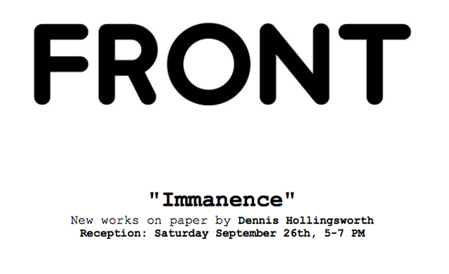
If you are in the Houston area, check out my paintings on paper, up until October 24th.


October 7, 2015
October 3, 2015
Picasso Sculpture: Motifs

Touring the eleven galleries of MoMA's Picasso Sculpture, I started to note the spectrum of motifs that drove his artwork. So I drew them as in a sketchbook catalog survey.
In a
But oh, what a range of motifs!
Visiting the Roy Lichtenstein show at Gagosian (24th Street Chelsea), I marveled at how Lichtenstein could range through a catalog of motifs himself, and what was facilitating for him was a characteristic signature method of drawing and rendering. Picasso too, engineered his characteristic signature style of drawing in the development of Cubism, and with it romped through a whole encyclopedia of visual themes like Pan strutting his stuff in his forest. Therefore, it's not enough to want to romp in motif-land. An artist needs a signature style to make that happen.
October 1, 2015
HOUSTON!
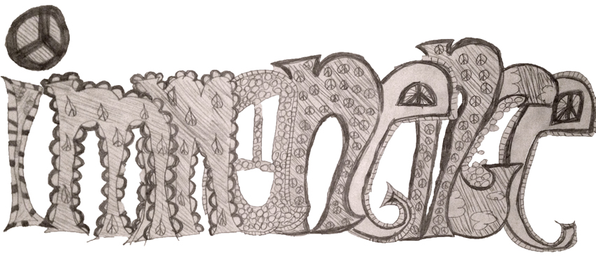
It's been a week since Stephanie and I flew to Houston, Texas to open a show at Front Gallery, a creation of our dear friends (since grad school), artists Aaron Parazette and Sharon Engelstein. Readjustment to life in NYC afterwards has been prolonged, much like returning from Spain, since there are so many wonderful aspects of both places (and indeed, our indigenous friends) that make departure somewhat bittersweet.
Above image, a rendering of the title of the exhibition by Aaron and Sharon's daughter Joy. Eleven years old and a well named young lady she is.

We arrived in the late afternoon, the drive from the airport on Houston's girdled downtown freeway belt allowed us to see the city skyline in rotation, which reminded me of the same dynamic perspective as in Los Angeles. Aaron and Sharon live in the neighborhood of Montrose, a place which also includes the University of St. Thomas, the Menil Museum in its' multidimensional glory: a supercool Dan Flavin permanent Menil exhibition in a former supermarket, the Twombly Museum (Renzo Piano's creative zenith, IMHO) and to top off my probably incomplete list, the Menil is breaking ground for a new building dedicated to art on paper.
Front Gallery is literally the front room of their home, a former living room that was sacrificed to art with the ease of closing a pair of frosted French doors. They've had a distinguished history of exhibitions there, featuring the wide and unique community of Houston artists in depth.
After settling in, we walked to their local park to listen to a concert by a local band as the sun set. It was a nice moment, enjoying music in the Fall Texas air and darkening skies with the neighbors. Here's a favorite image of mine, too big to fit in the horizontal format of this blogpost. After this, great Mexican food of course... can't get that in NYC.

Entry to the Hiram Butler Gallery: stately, echoes of Marfa, almost Japanese feeling, old school gallery elegance. Inside was James Sienna's typewriter drawings which conjured in my mind, the minimalism you would see at NY's DIA, and Joseph Havel's drawings, which we seemed to see everywhere we went that week in Houston. Also, we bumped into Jack Davidson's painting in the back room, a wonderful surprise.
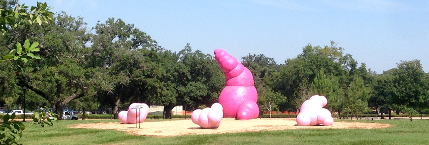


Every significant city celebrates a limited number of artists as an emblematic role in the makeup of their identity. To this kind of urban mascot goes the resources of the city, so crucial they are in calibrating civic importance, a kind of proof that the city has demonstrated the capacity to nurture the arts.

Aaron showed me his mural at the University of Houston's University Student Union ("Remembering Next Summer", 2014).


Above are two stills from a video documenting Aaron's design and construction of a crosswalk in Houston.
Some cities have only one, some cities have several, in some cities the list of artists are living and dead, in some younger cities the list is of only the living and in some they are only the dead. Barcelona celebrates Antoni Tapies. Chicago, I'm guessing would have a list of five to ten. Los Angeles' list could start with Ed Ruscha and trail off into twelve or fifteen more. New York's list would need a table of contents and a bibliography. Houston has a deep bench indeed, many of the artists on the list are living and thriving. Aaron and Sharon are definitely on Houston's list.

(This blogpost follows a linear timeline, and right about here, I was invited to critique the graduate students at the University of Houston, an event I will devote a few thoughts in a subsequent blogpost. let this be a marker for that.)


Aaron and Sharon introduced us to Nestor Topchy as we visited his studio in his acre sized compound in Houston's North Loop. Click this link for a better description and photo presentation than I can muster here. It was a wonderland and a testament to how Houston has given artists the capacity to realize their dreams in a scale and accessibility that no other city in the USA can compare to. Nestor is a hoot, an affable madman, a connoisseur of quirk, a cultural reservoir of deep Eastern Europe and yahoo yanqui Americana... he exceeds any superlative I can muster.


The exhibition was full of people, a great turnout. I felt honored to be the beneficiary of Aaron and Sharon's deep investment in the Houston community, the type of people scaled several cross sections, an interesting bunch.
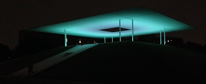
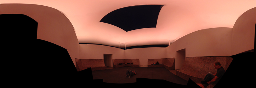

Time with Aaron means a dense pack of talk, ideas and art experiences, and the last day in Houston couldn't be left to a simplistic wake up and drive to the airport for a noontime flight back to NYC. We had set our alarms for 5:45am and drove to Rice university to see James Turrell's "Skyspace" as the dawn broke that Sunday. I am aware that I can be a harsh critic and I was ready to sneer at the strange overtones of nostalgia that I expected to experience that morning, but as we exited the campus, I had to doff my cap to the artist and the university who was willing to invest so much property and assets to making this happen. With images like this manifesting and dissipating before you, it's tough to draw too much blood in a vigorous critique.
So, I'll hold in reserve little kvetches about how when a designer fails when he/she uses signs to direct human involvement as in here and here, and how the seats should have been contoured to the reclining body or the perforated covers for the lights seemed irrelevant and a visual clutter to what should have been a knife edged minimalism.

Returning home to NYC from Houston felt a bit like it was earlier in the month when we returned from Spain.
Bittersweet.
