December 19, 2023
PRICELESSNESS
There exists in the real world of art, an operational paradox: the extrinsic value of art is based on an invested intrinsic value. Intrinsic value is further based on an idea, a conviction, a leap of faith about the priceless.
The price of art depends on the unwillingness to part with it.
The exigency of life eventually overcomes the ideal and someday the sheer unwillingness to part with an object will meet a price that conquers it, which in turn ratchets the price of art, reifying its worth.
*
*
*
"And then I realized... like I was shot... like I was shot with a diamond... a diamond bullet right through my forehead. And I thought: My God... the genius of that. The genius. The will to do that. Perfect, genuine, complete, crystalline, pure."
-Col. Kurtz
Apocalypse Now
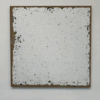
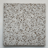
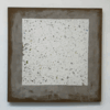
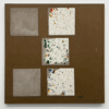
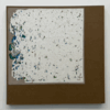
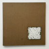
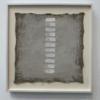
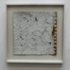
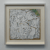
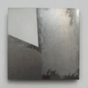
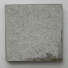
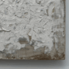
Robert Ryman: 1961-1964
Robert Ryman: 1961-1964
David Zwirner Gallery, 537 W. 20th Street, NYC
November 9, 2023--February 3, 2024
Goya, Duchamp and Ryman.
If I were to cite the artists who had influenced me, these are the three that come readily to mind.
Francisco José de Goya y Lucientes, Henri-Robert-Marcel Duchamp and Robert Ryman.
It was Goya's painting, "Saturn Devouring His Children" that had me spellbound as I stood before it when I was thirteen years old. I knew deep down inside at that moment that I would be an artist, a painter. I have recounted this event elsewhere in this weblog.
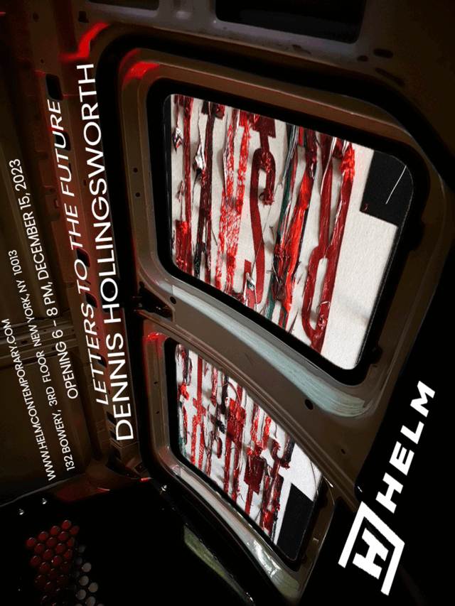
In the history of Modern Art, Marcel Duchamp is impossible to ignore. Postmodernism wouldn't be the same without him, perhaps it wouldn't have existed. I understand his polemic against painting as "merely retinal" as the necessary artifice of argumentation in order to move into a more conceptual direction in art. Apart from his stature, two aspects stand out for me. Duchamp is the exemplar of the ultimate independence of the artist. Chalk it up to anarchism or his reading the books of Max Stirner, Duchamp followed inspiration whenever it hit him and wherever it led him. The second recourse I found to Duchamp was regarding chance and the fugitive nature of materials. When I discovered the malfunction of my use of titanium white pigment around 2013, it was his acceptance of the damage to his Large Glass that inspried me to steer into the skid and discover a new realm of painting that I would have never considered otherwise. I've painted a few paintings in direct tribute to Duchamp. If you are reading this before the end of January 2024 and want to see an example, I have one hanging in my solo show at HELM Contemporary, 132 Bowery, NYC.
But this post is supposed to focus on Robert Ryman, and there's an excellent exhibition in town featuring his painting at David Zwirner Gallery: Robert Ryman: 1961 - 1964.
In the summer of 2017, I started to act on gathering thoughts about the shear weight of my paintings, typically canvas stretched over wood panels. I began daydreaming about what a lighter support could look like, and I thought of Robert Ryman's treatment of the object nature of painting. Already, the nature of my project was to focus on the fact of physical paint, to derive a formal vocabulary from impasto that rivals, that adds to the optical nature of color, line, tonality, etc. Already into the base assumption of my painting, the doorway to what I started to call the Ryman Code was open, waiting for me to walk through it. In Ryman's works, every aspect of a physical painting from the paint in each layer, to the linen/canvas, to the [snip: not the wood, more about that later] wire, to the brackets, to the screw on the wall... each physical component was distinct and expressive.
A non trivial detail in Ryman's rather thin bio is his experience as a jazz musician, a saxophonist, when he had first arrived in NYC in 1953. Lost somewhere in my YouTube stream is a video about Bill Evans talking about his work in the early 60's, not coincidentally during the period of time Ryman was making those paintings in the Zwirner show. Evans talked about how he wanted to assemble a group of musicians and play in such a way that each one would be distinct and full throated. This is exactly Ryman's program.
Let componentization be a word. Each component in the entirety of Ryman's physical paintings sings full throated. Notice that when people refer to painting, the support falls away. Painting in common everyday parlance nearly achieves the disembodied two dimensional flatness of Greenbergian fame. People don't generally consider the material fact of painting. Paintings are habitually considered to be windows to an imagined place, but for Ryman, the material existential fact of a painting in all of its aspects, parts and pieces are the place, the destination of his works.
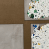
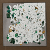
Within the realm of paint-on-canvas, components reside. In this exhibition, during the years '61 - '64, there were slippage between the parts and pieces: pencil lines, mask, washes, color daubs and finally / famously, his white daubes. Even his signature was an equal player in the band. All are discrete, and almost, almost but not quite, interchangeable. There is slippage between layers, slippage between components and slippage between precision and caprice.
But for all the apparent movement, the ranks stay in order. Ryman's painting is like an exploded diagram. Paint is not used as the adhesive to a wall, supporting a facture of wires, brackets and linen. All stays in place, Bill Evans is still the band leader. Even within the realm of Ryman's painting proper, the troops remain in ranks. Pencil plans may change and move laterally, but they stay in the rear. Washes don't veil. Curiously, in the painting proper, there is a whole adventure of color daubs that is concealed with white paint, sometimes with precision and sometimes with caprice. This layer is almost like Ryman's secret life, his weekend in Vegas. But what is common to layers colored and white is a consistency of brushload and expenditure. I can see him in his studio, in my mind's eye: brush in hand, a charge from the palette, a gyration with the wrist -the cameraman cuts to a close up of his unusually large glassy spectacled eyes, wide almost to his temples, crowned by his owl-like wizard eyebrows- a gyration of his wrist until the exhaustion of paint material. Reload.
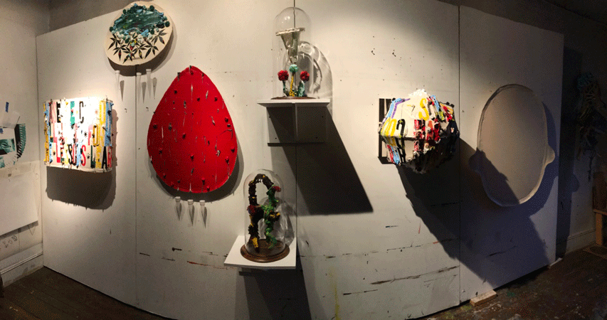
(Studio: December, 2017)
*
*
*
PostScript 1: Was Ryman the proto-autist?
PostScript 2: During the seven years from arrival to NYC to his exit from MoMA security service, what was his making? I read somewhere that he noodled paint on museum postcards. Reminds me of Richter's paint spattered Polaroid photographs. Note that there is no arc in Ryman's oeuvre, or at least it's really, really flat. Not like Rothko, whose early works are starkly different from his mature paintings. His arc is like a climb up El Capitan.
PostScript 3: Ryman never treated the wood stretchers like the other elements in his work. They're missing. I wonder if this is because he never had a chop saw in his studio?
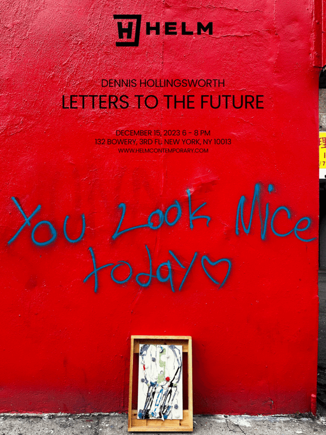
December 15, 2023
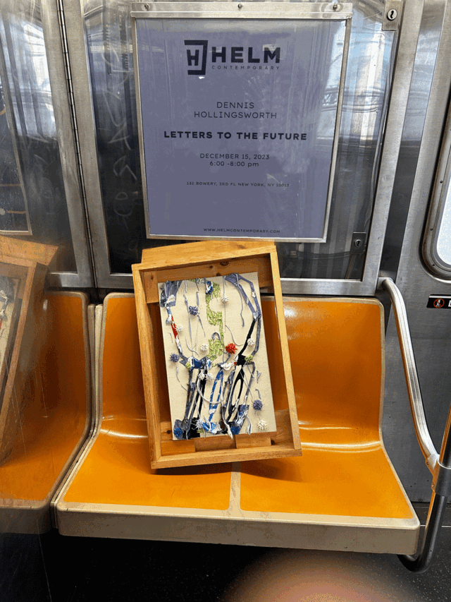
Kismet 4 Social Media
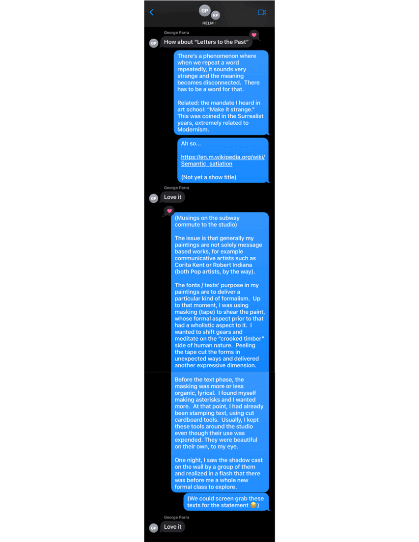
Three examples of how I like to approach social media. I don't know what irritates me more, Instagram's cookie cutter format or the artists who capitulate to it. I keep asking myself, WWMRD? What would Man Ray do? I'm not saying that what follows below are up to this standard, but it's a standard that I aspire to. It's all an about a mix of kismet, being alert to special encounters, stretching the parameters of media and simply having fun, adventure with it all. Two contemporary exemplars that immediately come to mind: Raymond Pettibon's Twitter channel and Dennis Cooper's weblog.
Enough said about that. Three examples follow.
Inception
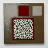
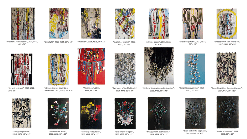
This is the initial selection of works for Letters to the Future. Subsequent modifications challenged the curatorial premise, but so far the logic holds: the text paintings and their precursors.
